


1/only It's a Wonderful Life thread (merge of the three current threads)
 11-09-07 | 08:36 AM
#276
Senior Member
Joined: Jan 2007
Posts: 260
Likes: 0
Received 0 Likes
on
0 Posts
Originally Posted by PatrickMcCart
Pleasantville was not colorized, but rather grayscalized.
Also in many shots the characters had to completelly recolorized to look very neutral color, as long the color interference was too strong to be reduced locally, and some scenes on the end, when the grass an trees turn to color needed to look very neutral too, since there should be not a sun to shine yellow over it. So a lot of things got colorization tools to get neutral colors, or even complete recolorized in specific situations.
You can note that the complete recolorized scenes looks just a bit artificial, but nice.
So yes, it had lot of colorized FX :-)

This shot of Jeff Daniles and Joan Allen show a peculiar situation when the B&W character got ligh reflex from the color character near hin and from color painting bright in background . Interesting...

 11-09-07 | 07:06 PM
#280
DVD Talk Special Edition
Joined: Sep 2002
Posts: 1,030
Likes: 0
Received 0 Likes
on
0 Posts
From: Georgia, USA
Originally Posted by Droog
Does anyone have any specs on the R1 release coming next Tuesday?
11-10-07 | 12:42 PM
#282
Senior Member
Joined: Jan 2007
Posts: 260
Likes: 0
Received 0 Likes
on
0 Posts
The B&W it's the very same edition. BUT THE COLORIZED EDITION IS SHARPER MORE CRISP ETC. THE QUESTION IS: WHY THEY DIDN'T UDES THE CRISPER AND SHARPER TRANSFER (OR ENCODING) TO A NEW b&w EDITION? iT WOULD BE JUST THE COST OF A NEW ENCODING.
11-10-07 | 03:44 PM
#283
Senior Member
The Curse of the Cat People (1944) is a remarkably good film to view on a double bill with It's A Wonderful Life. Don't let the horror title fool you, it is not a horror film but more of a fantasy film. When I first watched it last year, I was immediately struck by the similarities between the two films. Even more amazing is that it predates It's A Wonderful Life by 2 years!
11-10-07 | 04:59 PM
#284
DVD Talk Special Edition
Joined: Sep 2002
Posts: 1,030
Likes: 0
Received 0 Likes
on
0 Posts
From: Georgia, USA
Originally Posted by Alfred Bergman
The B&W it's the very same edition. BUT THE COLORIZED EDITION IS SHARPER MORE CRISP ETC. THE QUESTION IS: WHY THEY DIDN'T UDES THE CRISPER AND SHARPER TRANSFER (OR ENCODING) TO A NEW b&w EDITION? iT WOULD BE JUST THE COST OF A NEW ENCODING.
11-11-07 | 10:57 AM
#285
Suspended
I'm eagerly awaiting my copy by mail. (It has shipped on Friday from Amazon.com.) I notice that DVDBeaver mentions that four audible pops have been eliminated from the 60th Anniversary edition's soundtrack in the new colourized version. I just want to say that I think it's too bad they couldn't have gone whole hog and sweetened the mono sound into an optional 5.1 Dolby version that would have isolated the beautiful Dimitri Tiomkin music score. This was tried in the latest (B&W) A Christmas Carol (1951) and the results are wonderful, most of the time the music coming loud and clear from the surround speakers, leaving the front image open to the dialog and sound effects - which are also dispersed throughout the system for eerie effects.
11-11-07 | 11:02 AM
#286
Suspended
Originally Posted by Drop
Of those color shots the only one that looked good to me was the Donna Reed. It looks fairly natural, the other ones look obviously colorized. It's all in the skin, and it's too brown, too one-tone. In any goven shot it looks like there are no more than 10 colors being used. There's still a lot of improvements to be made, a lot.
11-11-07 | 12:07 PM
#287
Needs to contact an admin about multiple accounts
Joined: Sep 2007
Posts: 36
Likes: 0
Received 0 Likes
on
0 Posts
Originally Posted by baracine
This "one-tone" look is intentional, as has been mentioned somewhere. The golden hue of the colourized version does not aim to reproduce the glory of Technicolor but to evoke the nostalgia of Christmas Past - especially in the flashbacks, and, let's face it, this film is made up of flashbacks and/or dream sequences for most of its running time. The colourists also wanted to preserve the "noirish" aspects of the film. Another commentator - or possibly the same - has also commented on the vividness and modern look of the dance at the gym/swimming pool scene, which I can't wait to see.
--------------------------------------------------------------------------
http://www.dvdtown.com/reviews/its-a...rful-life/5330
�And the colorized version? This isn�t the old computer-generated one that looked like a diorama in motion and made everyone want to charge Ted Turner with pitchforks for even having the audacity to suggest that old films should be colorized.
The colors added to this 1946 film look absolutely natural, as if it were always in color. And color spreads a nice blanket of warmth over this holiday classic, so that it feels cozier than ever. With color, you also notice details in the film that may have been lost in black and white--like a skull that the miserly Mr. Potter (Lionel Barrymore) keeps on his desk, or the antics of the various strange pets that Uncle Billy (Thomas Mitchell) keeps at the Building & Loan.
In the past, I�ve been one of those black-and-white purists who were opposed to colorizing movies under any circumstance. But this new full-color "It�s a Wonderful Life" has made a believer out of me. It looks that good.
Not every film shot in black-and-white was a director�s choice based on aesthetics, I�m reminded. Sometimes black-and-white was simply a budgetary decision, and with a film like this--set during the colorful Christmas season and sprinkled as liberally with small-town Americana as it is Hollywood snowflakes--I can�t imagine a valid artistic reason for choosing black and white over color.
�Whether we like it or not, color makes that big of a difference for today�s young people, and it might be the thing that ensures that this film will remain a popular annual tradition for future generations.
Paramount finally got it right. Whether you prefer it in black-and-white or color, this edition of "It�s a Wonderful Life" looks better than ever.�
________________________________________
http://blogs.nypost.com/movies/archi...tra_georg.html
��It is impressive and probably the best colorized movie to date. Legend Films' latest effort very respectfully works around the almost noir-ish cinematography by Joe Biroc, Joseph Walker and the un-credited Victor Milner. Color draws attention to the Jack Okey's incredibly detailed set decoration for Mr. Gower's drugstore, for instance. Probably the best sequence in color is the fabled swimming pool dance, including very intricate shadow lighting that would never have been used in an actual color film of the era (Legend adopts the more recent convention of stressing the golden side of the spectrum, particularly in the flashbacks to the 1920s).
________________________________________
http://www.dvdbeaver.com/film/DVDCom...derfullife.htm
\\\Disc 2 has the colorized edition of the film (also dual-layered and progressive). To be fair - it looks quite impressive and unless I was reviewing I would probably never have indulged in a viewing. But I am and I did. I'd seen the film so many times that watching it in color was a kind of neat change - I admired the colorization - the look in Donna Reeds eyes - but I, of course, cannot recommend this to those who have not seen the film before. But to those who keep it as a holiday staple with the family huddled near and the cold wind whistling outside - it might make the leap to those in the family who 'don't like black and white films' (savages that they might be). It seemingly does not contain the below mentioned audio 'pops'. I am kind of keen on this technology and it's amazing to see how far it has come
________________________________________
http://www.saworship.com/article-pag...ry.php&ID=4029
I have never been a fan of colorization, because old black and white classics were lit with b&w film in mind. Shadows and texture added to the look and mood of a film and the addition of computer coloring seemed to detract from those qualities. But with an improved technique of colorization, some pictures have actually taken on a new exuberance. It�s A Wonderful Life is one of those. The look is simply splendid, even to the point of enhancing the production.
.
11-12-07 | 07:29 AM
#289
Suspended
I've been watching the excellent French documentary Movies Dream In Color on the 2-disc set Discovering Cinema.
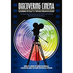
It's interesting to know that the documentary makes the point that when cinema was invented, audiences were partly disappointed that it didn't preserve the advances in colour that were made in the magic lantern and other projected images for entertainment purposes and that cinema's early years, with Path� and Gaumont in France, and many others in England, was a quest for artificially colored images: tinting, toning, painted on, hand-stenciled or mechanically stenciled on, until various other "natural" colour processes came into existence: additive colour projection, subtractive colour projection, Technicolor, Agfacolor and Kodachrome.
It's a great set for lovers of colour, only hindered by the fact that the film's numerous extras are 25 fps PAL to NTSC with a lot of ghosting, especially in the ground-breaking Technicolor 20-min short, La Cucaracha (1934).
Last edited by baracine; 11-12-07 at 07:31 AM.
11-12-07 | 07:47 PM
#291
DVD Talk Special Edition
Joined: Sep 2002
Posts: 1,030
Likes: 0
Received 0 Likes
on
0 Posts
From: Georgia, USA
The difference:
The majority of hand-stenciled color films were meant to be shown that way. Greed was supposed to have gold stenciled in. Pathe released some features stencil colored all the way through. Colorization today is entirely after the fact on films that were never intended to have color added. While some allowance can be made in the case of Ray Harryhausen's films that he's supervising, it's not the same thing.
It was an interesting novelty even then. This is why it took photographic processes to make color truly viable.
In the case of Georges Melies films, he did prefer for his films to be hand-colored. Many have new 35mm prints with genuine hand-stenciling added.
But colorization doesn't work for all B&W films. Colorizing Charlie Chaplin or Buster Keaton films would be a total waste of money and time. It's second-guessing what they wanted and saying "We're adding color to make them better."
11-12-07 | 09:03 PM
#292
Needs to contact an admin about multiple accounts
Joined: Sep 2007
Posts: 36
Likes: 0
Received 0 Likes
on
0 Posts
Originally Posted by PatrickMcCart
The difference:
The majority of hand-stenciled color films were meant to be shown that way. Greed was supposed to have gold stenciled in. Pathe released some features stencil colored all the way through. Colorization today is entirely after the fact on films that were never intended to have color added. While some allowance can be made in the case of Ray Harryhausen's films that he's supervising, it's not the same thing.
It was an interesting novelty even then. This is why it took photographic processes to make color truly viable.
In the case of Georges Melies films, he did prefer for his films to be hand-colored. Many have new 35mm prints with genuine hand-stenciling added.
But colorization doesn't work for all B&W films. Colorizing Charlie Chaplin or Buster Keaton films would be a total waste of money and time. It's second-guessing what they wanted and saying "We're adding color to make them better."
The majority of hand-stenciled color films were meant to be shown that way. Greed was supposed to have gold stenciled in. Pathe released some features stencil colored all the way through. Colorization today is entirely after the fact on films that were never intended to have color added. While some allowance can be made in the case of Ray Harryhausen's films that he's supervising, it's not the same thing.
It was an interesting novelty even then. This is why it took photographic processes to make color truly viable.
In the case of Georges Melies films, he did prefer for his films to be hand-colored. Many have new 35mm prints with genuine hand-stenciling added.
But colorization doesn't work for all B&W films. Colorizing Charlie Chaplin or Buster Keaton films would be a total waste of money and time. It's second-guessing what they wanted and saying "We're adding color to make them better."
Patrick - both Ray and I agree with you. I've heard Ray say many times that there are films that should be colorized and there are films that should not. He goes on to say that one needs the wisdom to tell the difference.
There is one thing you said that I definitely don't agree with. We never add color to "make them better". Our films are a color interpretation of the original and, unlike remakes (which are widely accepted) our intention is not to replace the original. In fact we enhance the original black and white with full restoration as part of the colorization process. Also, every film we produce is accompanied by the black and white original.
.
Last edited by Barry Sandrew; 11-12-07 at 09:39 PM.
11-12-07 | 10:06 PM
#294
Senior Member
Joined: Jan 2004
Posts: 570
Likes: 0
Received 0 Likes
on
0 Posts
From: Simi Valley, CA
Originally Posted by Barry Sandrew
Patrick - both Ray and I agree with you. I've heard Ray say many times that there are films should be colorized and there are films that should not. He goes on to say that one needs the wisdom to tell the difference.
There is one thing you said that I definitely don't agree with. We never add color to "make them better". Our films are a color interpretation of the original and, unlike remakes (which are widely accepted) our intention is not to replace the original. In fact we enhance the original black and white with full restoration as part of the colorization process. Also, every film we produce is accompanied by the black and white original.
There is one thing you said that I definitely don't agree with. We never add color to "make them better". Our films are a color interpretation of the original and, unlike remakes (which are widely accepted) our intention is not to replace the original. In fact we enhance the original black and white with full restoration as part of the colorization process. Also, every film we produce is accompanied by the black and white original.
Yes, this is true. Ray Harryhausen himself is behind the recent and upcoming colorized versions of his own early Columbia films but their are folks out there who find even this to be an abomination. There are those who will be fervently against this on ANY level. Even though Legend is restoring and releasing BW versions of films also they are STILL getting hammered about this which tells you which side of the argument has no compromise.
11-12-07 | 11:27 PM
#295
Needs to contact an admin about multiple accounts
Joined: Sep 2007
Posts: 36
Likes: 0
Received 0 Likes
on
0 Posts
Originally Posted by Carcosa
Yes, this is true. Ray Harryhausen himself is behind the recent and upcoming colorized versions of his own early Columbia films but their are folks out there who find even this to be an abomination. There are those who will be fervently against this on ANY level. Even though Legend is restoring and releasing BW versions of films also they are STILL getting hammered about this which tells you which side of the argument has no compromise.
.
Last edited by Barry Sandrew; 11-14-07 at 11:39 AM.
11-15-07 | 06:31 AM
#298
Suspended
Originally Posted by dolphinboy
I have it. One of versions is actually in color!
I just got mine in the mail tonight and I will be posting my impressions. P.S.: Glenn Erickson (DVD Savant) wrote me that the reason he didn't review the colour version is that (and I quote) "colorization is BAD". I'm very disappointed in my old friend.

Last edited by baracine; 11-15-07 at 05:02 PM.
11-15-07 | 06:33 PM
#299
Suspended
I went directly to the colour version and came back to check the B&W version. I own the Republic edition, which was THX-certified and made from the original negative. This B&W version (the 60th Anniversary edition transfer) is a little bit more cleaned-up. The extras are the same as they were on the Republic and 60th Anniversary editions so the major selling point here is the colour and I wasn't disappointed. All through both versions, by the way, the bitrate pretty much seems stuck on 10, which makes these discs super-SuperBit editions...
The colour is nothing short of miraculous. I was of course awed by the general quality and inventiveness of the colourization process at first even if I understand that this is a reinterpretation that wouldn't have been even possible without the groundwork of the original art direction, lighting and rich B&W photography. But I must say that the overall colour presentation doesn't distract at all from the drama and the qualities of the original B&W film. If anything, it makes it a better film, with more detail, more texture, more things to see, more realistic touches that are lost in the B&W version, in a word, more involvement in the story and a sense of heightened reality.
DVD Savant (Glenn Erickson) wrote to me that he doesn't like the fact that colourized films "rewrite history" and I have to admit that he's probably right about that, in the sense that no major studio would have financed the colour photography of a 2-hour non-musical meandering existential morality lesson bordering on socialism like It's A Wonderful Life back in 1947. So what we are seeing is a bit like a glimpse into a parallel universe where enlightened producers would have financed quality colour films like this one, where colour is used for psychological effect and not just to dazzle.
The result is just glorious, even when it doesn't mimic the obvious sheen and glamour of Technicolor: the hazy golden tones of the childhood scenes and Mr. Gower's drugstore, the spot-on recreation of the roaring twenties (with seafoam-coloured flapper tulle dresses like my mother used to tell me about), the liveliness of the comedy scenes, the neon lights of Pottersville, the extra poignancy of the dramatic scenes where everything seems to shift into dreariness - including the colours - and the absolute EC-comics eeriness of the "dream" sequence where everything has taken on a film noir fatalistic quality. I could go on: the natural aspect of the snow scenes both in the daylight and at night and the lovely summer moonlight courting scenes, the you-are-there quality of the interiors, the added life given the matte paintings, Violet's dresses, Uncle Billie's brown squirrel, the homey atmosphere of the happy family scenes alternating with more lugubrious passages, the Matisse-inspired Russian peasant blouse of the female patron at Nick's Bar, the shimmer of the high school swimming pool, Donna Reed's luminous smile, Zuzu's petals. Colour allows many gradations from brand new modern and cheery to drab, ancient and lived-in, that are only hinted at and not properly seen in B&W and for this, I think It's A Wonderful Life is a better film and its narrative qualities are actually improved in this colour version. It tells the story more convincingly.
The only thing that would allow a casual observer not familiar with the B&W film to guess this is a colourization is, as usual, the skin tones. Although they are realistically varied from one character to the next, they still rely on a rather limited palette centered on copper tones in each individual face. But this a very minor quibble that doesn't take away from the overall success of the process. And this could also be interpreted as the fact that the people of Bedford Falls are not made up like Hollywood stars in a Technicolor musical - except for Violet, of course.
I'm also sure it's an illusion that the 2.0 mono actually sounded a lot more vivid while I was watching the colour film. This version is especially recommended for people who think they have seen this film too many times and could use a fresh look at it from a different perspective.
Last edited by baracine; 11-16-07 at 08:53 AM.
11-16-07 | 10:17 PM
#300
Senior Member
Joined: Jan 2007
Posts: 260
Likes: 0
Received 0 Likes
on
0 Posts
Originally Posted by baracine
The only thing that would allow a casual observer not familiar with the B&W film to guess this is a colourization is, as usual, the skin tones. Although they are realistically varied from one character to the next, they still rely on a rather limited palette centered on copper tones in each individual face. But this a very minor quibble that doesn't take away from the overall success of the process. And this could also be interpreted as the fact that the people of Bedford Falls are not made up like Hollywood stars in a Technicolor musical - except for Violet, of course.
I still wonder what could Legend Films do with large budget, to segment 200% more objects or each object in more regions.
-