


Superman discussion (was cast, now merged)
 04-20-05 | 07:21 AM
#326
Banned
Joined: Nov 2003
Posts: 3,220
Likes: 0
Received 0 Likes
on
0 Posts
I just read the "Water Under the Bridge" article at the Superman site and wow, fantastic read.
It's really sad about what could have been in Superman II, it could have been so much more and Donner's comments are 100% on the money.
And I was struck by this at the very end of the article:
Indeed! The footage is there, I sincerely hope WB let's Donner finally have his cut.
It's really sad about what could have been in Superman II, it could have been so much more and Donner's comments are 100% on the money.
And I was struck by this at the very end of the article:
Before we finish - Donner’s Superman2 footage is out there, in a vault, at Pinewood in England. Please don't let it rot!

 04-20-05 | 03:48 PM
#329

Moderator
http://www.supermanhomepage.com/news.php

BlueTights.net posted the following report on their website:
Hey guys, a bit of news today on another Super-Alumnist. We're hearing from a source close to the production that Jack Larson will be making a cameo appearance in "Superman Returns" as a bartender. Larson hails back to the "Adventures of Superman" TV series from the fifties, in which he played Superman's Pal, Jimmy Olsen.
Larson will be back with his fellow "Adventures" co-star Noel Niell, who's already been cast in a cameo role in Superman Returns.
Hey guys, a bit of news today on another Super-Alumnist. We're hearing from a source close to the production that Jack Larson will be making a cameo appearance in "Superman Returns" as a bartender. Larson hails back to the "Adventures of Superman" TV series from the fifties, in which he played Superman's Pal, Jimmy Olsen.
Larson will be back with his fellow "Adventures" co-star Noel Niell, who's already been cast in a cameo role in Superman Returns.
04-20-05 | 05:05 PM
#330
DVD Talk Hero
Cool. Too bad George Reeves is no longer with us. A cameo from him would have been sweet. 
04-21-05 | 06:22 AM
#332
Banned
Joined: Nov 2003
Posts: 3,220
Likes: 0
Received 0 Likes
on
0 Posts
04-21-05 | 10:08 AM
#335
Banned
Joined: Nov 2003
Posts: 3,220
Likes: 0
Received 0 Likes
on
0 Posts
04-21-05 | 12:13 PM
#336
DVD Talk Ultimate Edition
Joined: Sep 1999
Posts: 4,681
Likes: 0
Received 0 Likes
on
0 Posts
From: Chicago, IL
Originally Posted by QuiGonJosh
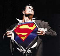
It was an animated gif. of the Alex Ross Superman changing drawing animated so it looks like he rips it open and flies off. I saw it on some message board.
 04-22-05 | 12:23 AM
#338
DVD Talk Gold Edition
Joined: Jan 2001
Posts: 2,984
Likes: 0
Received 0 Likes
on
0 Posts
From: Raleigh, NC
Here is a link to the first official preview pic in USA Today...
http://www.usatoday.com/life/movies/...uper-man_x.htm
http://www.usatoday.com/life/movies/...uper-man_x.htm

 04-22-05 | 01:32 AM
#342
DVD Talk Ultimate Edition
Hmm, I'm not digging it. So I guess I'll be the first spoil sport. No big deal though. Still don't like Routh as Superman, and the S is too small. I also don't care for the raise emblem.
04-22-05 | 01:35 AM
#343

DVD Talk Hall of Fame
Is that Routh? Doesn't look like him. Not too crazy on the shrinking of the shield, but I'll wait for better quality pictures before I make any further judgements. Still looking good overall.
04-22-05 | 01:57 AM
#344
DVD Talk Godfather
Joined: Jul 2000
Posts: 54,199
Likes: 0
Received 1 Like
on
1 Post
From: City of the lakers.. riots.. and drug dealing cops.. los(t) Angel(e)s. ca.
The S is far to small. one thing that always bugged me is that with batman they make the suit look all muscle bound, but with superman they don't even try to show the muscle mass. He's the one that should be getting that treatment.
04-22-05 | 04:39 AM
#347
DVD Talk Godfather
Joined: Jul 2000
Posts: 54,199
Likes: 0
Received 1 Like
on
1 Post
From: City of the lakers.. riots.. and drug dealing cops.. los(t) Angel(e)s. ca.
USAToday... I doubt they would post a fake..
Better image...

Not only is the S waaaaay to fuck'n small, it should be Birthright sized, but the boots make him look stubby. there is way to much dead space in his chest/stomach area where the symbol should be bigger.
Better image...
Not only is the S waaaaay to fuck'n small, it should be Birthright sized, but the boots make him look stubby. there is way to much dead space in his chest/stomach area where the symbol should be bigger.
04-22-05 | 04:44 AM
#348
Banned
Joined: Nov 2003
Posts: 3,220
Likes: 0
Received 0 Likes
on
0 Posts
Originally Posted by Jackskeleton
The S is far to small. one thing that always bugged me is that with batman they make the suit look all muscle bound, but with superman they don't even try to show the muscle mass. He's the one that should be getting that treatment.
Here's a High-Res pic:
http://www.brandonrouth.com/gallery/...upesHi_001.jpg
04-22-05 | 04:48 AM
#349
Banned
Joined: Nov 2003
Posts: 3,220
Likes: 0
Received 0 Likes
on
0 Posts
Originally Posted by Jackskeleton
USAToday... I doubt they would post a fake..
Better image...
Not only is the S waaaaay to fuck'n small, it should be Birthright sized, but the boots make him look stubby. there is way to much dead space in his chest/stomach area where the symbol should be bigger.
Better image...
Not only is the S waaaaay to fuck'n small, it should be Birthright sized, but the boots make him look stubby. there is way to much dead space in his chest/stomach area where the symbol should be bigger.

This is the first pic, you haven't seen it motion, you haven't seen him fly, etc. What makes the suit work is the performance. I mean the guy's wearin blue suit, red underwear, and a cape. The performance brings it to life and makes you believe. I mean look at the screen-test of Reeve, he looked pretty damn goofy, but once he started acting, he sold it, I think Routh can do the same. Plus I just think the suit looks good.
04-22-05 | 05:04 AM
#350
DVD Talk Godfather
Joined: Jul 2000
Posts: 54,199
Likes: 0
Received 1 Like
on
1 Post
From: City of the lakers.. riots.. and drug dealing cops.. los(t) Angel(e)s. ca.
Motion or not, You can't tell me that if there's nipples on a bat suit, that Motion will make it any better. The S is waaaaaaaaay to small. It's not being anal, it's being observant. There is far to much free space there on the suit where a red symbol should be. The tip of the insigna should be overlapping on about the top area of the six pack area. The S here is stopping short.
This is how big the S should be


want to compare with old school? Fine, lets do so.

Can you honestly tell me that the S is big enough or perfectly the right size? Honestly? Look at the comic book version and look at the old film version. Either way, the new one is far to small and the boots don't help much.
Remember, this character will be moving quickly, flying over in the sky and a small S on his chest wont cut it as being what it should be as an indicator of who he is. Besides, it's Superman's S. that's like shrinking the Bat logo or bringing Shazam's lighting symbol down several sizes.
This is how big the S should be
want to compare with old school? Fine, lets do so.
Can you honestly tell me that the S is big enough or perfectly the right size? Honestly? Look at the comic book version and look at the old film version. Either way, the new one is far to small and the boots don't help much.
Remember, this character will be moving quickly, flying over in the sky and a small S on his chest wont cut it as being what it should be as an indicator of who he is. Besides, it's Superman's S. that's like shrinking the Bat logo or bringing Shazam's lighting symbol down several sizes.
Last edited by Jackskeleton; 04-22-05 at 05:08 AM.