


Peter Pan : Platinum Edition ----> 3/6/2007
 03-09-07 | 09:29 AM
#101
Suspended
Jungle Book PE trailer here: http://disney.go.com/disneyvideos/an...ms/junglebook/
 03-09-07 | 09:37 AM
#102
Suspended
Irony of ironies: The official Disney website Peter Pan PE trailer uses footage from the "uncorrected" 2002 transfer: http://disneyvideos.disney.go.com/mo...s/5266503.html
03-09-07 | 11:48 AM
#103
Suspended
I wote Robert E. Seletsky who wrote this article about the problems with the Wizard of Oz transfers (http://www.dvdbeaver.com/film/articl..._reactions.htm) for DVD Beaver and he wrote this back:
Robert's Dracula article: http://www.dvdbeaver.com/film/articl...a_misfires.htm
Dear Benoit,
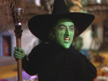
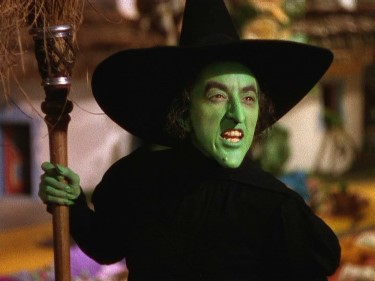
This does not surprise me at all. But evidently with Peter Pan, they have gone quite horribly wrong. Are the engineers blind? With Oz, the colors are *saturated* in the 2005 transfer rather than altered substantially and the focus softened. And as I wrote, even the 1999 transfer cannot be entirely trusted because there, the colors are far too muted to represent the 3-strip Technicolor of the period. The last MGM DVD (1998) seems most closely to represent the color palette of the original--unrestored though it is, and curiously, it's closer to the 2005 version than the 1999 in that respect.
I was interested that the discolored new Peter Pan was zoomed *out*, giving us more information on the sides--far preferable, whereas the 2005 Oz is zoomed *in*, giving us less. I wish they'd leave old films alone at the 1.37:1 aspect ratio and picture-box as necessary to fit the 1.33:1 TV AR. With most TV monitors one would never even see black borders of picture-boxing (which don't bother me at all anyway) because overscanning would never bring them into the frame. You should read my views on this awful "zooming in" practise as applied to earlier films with their squarer 1.19:1 AR--like my DRACULA (1931) piece on the same DVDBeaver site.
All the best,
Robert
Last edited by baracine; 03-10-07 at 09:40 AM.
03-09-07 | 12:54 PM
#104
DVD Talk Legend
Originally Posted by baracine
"Global Warming Edition"?
TFF! I spit my drink out reading this. My desk and laptop thank you!
 03-09-07 | 03:42 PM
#105
DVD Talk Special Edition
Joined: Sep 2002
Posts: 1,030
Likes: 0
Received 0 Likes
on
0 Posts
From: Georgia, USA
Originally Posted by baracine
Warner Studios 1999 transfer (Notice the white background.)
Warner 2005 transfer (2-disc & 3-disc Editions) (White's all gone!)
As for Peter Pan, everyone is comparing it to an old laserdisc, which is ridiculous. Just because it's more saturated doesn't mean it's correct. A lot of old pre-DVD transfers pumped up the color on Technicolor films. If someone could just track down some 35mm dye-transfer frames, we'd have a better idea of the color timing. Disney screws a lot of stuff up, but it's annoying to see something that finally looks right be blasted. I'm surprised how the 2007 is getting criticized while people are overlooking the DVNR and edge enhancement on the previous 2002 DVD.
Last edited by PatrickMcCart; 03-09-07 at 03:53 PM.
03-09-07 | 05:20 PM
#106
Suspended
Originally Posted by PatrickMcCart
Technicolor live-action tends to have off-white white levels (usually amber or gold tinged), anyways .
The 2005 transfer looks exactly like the 1998 re-issue dye-transfer print I saw back in 2004.
As for Peter Pan, everyone is comparing it to an old laserdisc, which is ridiculous.
Just because it's more saturated doesn't mean it's correct. A lot of old pre-DVD transfers pumped up the color on Technicolor films. If someone could just track down some 35mm dye-transfer frames, we'd have a better idea of the color timing. Disney screws a lot of stuff up, but it's annoying to see something that finally looks right be blasted. I'm surprised how the 2007 is getting criticized while people are overlooking the DVNR and edge enhancement on the previous 2002 DVD.
DVNR (Digital Video Noise Reduction) is a bad thing but taking the trademark blue out of Technicolor digitally is a good thing?
Last edited by baracine; 03-09-07 at 08:24 PM.
03-09-07 | 08:40 PM
#107
DVD Talk Hero
Originally Posted by PatrickMcCart
As for Peter Pan, everyone is comparing it to an old laserdisc, which is ridiculous. Just because it's more saturated doesn't mean it's correct. A lot of old pre-DVD transfers pumped up the color on Technicolor films. If someone could just track down some 35mm dye-transfer frames, we'd have a better idea of the color timing. Disney screws a lot of stuff up, but it's annoying to see something that finally looks right be blasted. I'm surprised how the 2007 is getting criticized while people are overlooking the DVNR and edge enhancement on the previous 2002 DVD.
It's obvious that the colors in the new version are incorrect. I cannot fathom how you can look at the comparison frames and state that it "finally looks right"
03-09-07 | 09:12 PM
#108
DVD Talk Special Edition
Joined: Sep 2002
Posts: 1,030
Likes: 0
Received 0 Likes
on
0 Posts
From: Georgia, USA
Originally Posted by DVD Josh
No, your statement that it's "over saturated" is ridiculous. Your statement that comparing it to the LD is ridiculous, is also, ridiculous.
It's obvious that the colors in the new version are incorrect. I cannot fathom how you can look at the comparison frames and state that it "finally looks right"
It's obvious that the colors in the new version are incorrect. I cannot fathom how you can look at the comparison frames and state that it "finally looks right"
03-09-07 | 10:26 PM
#109
Suspended
Originally Posted by PatrickMcCart
Based on what, the previous transfers?
Last edited by baracine; 03-09-07 at 10:41 PM.
 03-10-07 | 10:00 AM
#111
Suspended
What we have here is revisionism of the worst kind...
If any of the "Nine Old Men" that Disney is proud to parade around in their making-of documentaries are still alive today, they are probably dying of shame and sorrow after seeing this latest DVD transfer of Peter Pan.
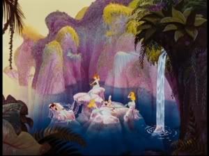
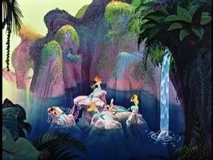
The so-called restorers of DTS Images who did this job are like dwarves standing on the shoulders of giants - the people who pioneered, perfected and used Technicolor - who have the technical power to destroy 50-plus years of history and tradition by simply turning a knob on their consoles and saying: "Oh, let's make the Darling household look like Martha Stewart's latest line of home decor accents for a change!" or "Let's make Mermaid Lagoon look like the entrance hall to the Rodeo Drive Barbie Superstore! My 4-year old daughter just loves when we shop there!"
If any of the "Nine Old Men" that Disney is proud to parade around in their making-of documentaries are still alive today, they are probably dying of shame and sorrow after seeing this latest DVD transfer of Peter Pan.
The so-called restorers of DTS Images who did this job are like dwarves standing on the shoulders of giants - the people who pioneered, perfected and used Technicolor - who have the technical power to destroy 50-plus years of history and tradition by simply turning a knob on their consoles and saying: "Oh, let's make the Darling household look like Martha Stewart's latest line of home decor accents for a change!" or "Let's make Mermaid Lagoon look like the entrance hall to the Rodeo Drive Barbie Superstore! My 4-year old daughter just loves when we shop there!"
03-10-07 | 04:09 PM
#112
DVD Talk Special Edition
Joined: Sep 2002
Posts: 1,030
Likes: 0
Received 0 Likes
on
0 Posts
From: Georgia, USA
Originally Posted by baracine
Exactly. Because the previous transfers were based on a chemical restoration of the original Technicolor elements before the revisionist digital colour manipulation of know-nothing computer nerds who have never seen a Technicolor film on a screen bigger than a PlayStation and have totally missed the point about Technicolor's marvels.
Technicolor isn't just about bright colors. One benefit of Technicolor is the ability to go with vibrant to subtle color schemes, as demonstrated by Gone with the Wind. As the years went on, re-issues ended up pumping up the colors to the point of looking cartoonish (especially the 1990s re-issue). Then again, adjusting to meet sensibilities of today's audiences isn't that different from colorization... which isn't a bad thing, right?

Just look closer at the 2002 DVD and you'll see greyish whites, while the 2007 consistently has milky whites. Michael's pajamas look really weird in bright pink, while a subtle pink looks more correct. Wendy's lips probably shouldn't stick out as much as Tinkerbell's glow. Skin tones shouldn't look sunburnt.
Last edited by PatrickMcCart; 03-10-07 at 04:12 PM.
03-10-07 | 04:45 PM
#113
Suspended
...and Mermaid Lagoon shouldn't be so flagrantly vaginal.
And the film was already shot in colour. It didn't need to be re-colourized for post-9/11 sensibilities.
And the film was already shot in colour. It didn't need to be re-colourized for post-9/11 sensibilities.
Last edited by baracine; 03-10-07 at 04:53 PM.
03-10-07 | 11:47 PM
#114
Senior Member
This is just one of the Disney remastering jobs that have been questionable. There was a thread on these boards a few years ago about the platinum edition of Beauty and the Beast being too bright, while the original release was suitably dark and gloomy in the appropriate parts.
03-11-07 | 09:15 AM
#115
Suspended
Originally Posted by cerulean
This is just one of the Disney remastering jobs that have been questionable. There was a thread on these boards a few years ago about the platinum edition of Beauty and the Beast being too bright, while the original release was suitably dark and gloomy in the appropriate parts.
It's as if, out of simple force of habit, none of the reviewers take time to compare transfers and they automatically rubberstamp anything that comes out of the Disney vaults with the usual malarkey boilerplates: "painstakingly restored", "never looked better", etc.
This home theater forum has tackled the issue with lots of screen caps ( http://www.hometheaterforum.com/htf/...d.php?t=253014 ) of the various editions and complaints from reviewers that (1) Disney isn't very forthcoming with free advance copies and (2) the Disney site doesn't even show excerpts from its actual 2007 edition, as if it had something to hide. Also see this Ultimate Disney forum: http://www.ultimatedisney.com/forum/...ic.php?t=18606
I have also written to DVD Beaver and DVD Savant about the issue and await reactions.
Last edited by baracine; 03-13-07 at 07:07 AM.
03-11-07 | 09:29 AM
#116
DVD Talk Hero
Originally Posted by PatrickMcCart
Just because there's a traditional restoration does not mean the transfer made from it is accurate. I think it's slightly pompous to describe LDI's staff as such. You've spent countless hours going over films frame-by-frame and would know the details about what goes into a film transfer? As a video editing student, I know that know-nothing computer nerds wouldn't last a day in the industry (at least beyond internship). Most video labs have actual video projection rooms. It's not the 1990s anymore where it's all viewed on a CRT monitor.
Technicolor isn't just about bright colors. One benefit of Technicolor is the ability to go with vibrant to subtle color schemes, as demonstrated by Gone with the Wind. As the years went on, re-issues ended up pumping up the colors to the point of looking cartoonish (especially the 1990s re-issue). Then again, adjusting to meet sensibilities of today's audiences isn't that different from colorization... which isn't a bad thing, right?
Just look closer at the 2002 DVD and you'll see greyish whites, while the 2007 consistently has milky whites. Michael's pajamas look really weird in bright pink, while a subtle pink looks more correct. Wendy's lips probably shouldn't stick out as much as Tinkerbell's glow. Skin tones shouldn't look sunburnt.
There's something wrong with this transfer, plain and simple. The Mermaid lair shows these problems very nicely. Color pallete is shifted, sharpness is notably decreased, and a nice "haze" has set in.
I'll give you that it's possible that BOTH transfers might be incorrect. But there's definitely something wrong with the PE. check out this nice collection of screenshot comparisons:
http://www.hometheaterforum.com/htf/...7&postcount=21
Every single one is better on the SE than the new PE, ESPECIALLY in the flesh tones dept. Tink is YELLOW FFS in the PE!!
Last edited by DVD Josh; 03-11-07 at 09:32 AM.
03-11-07 | 09:40 AM
#117
Suspended
DVDJosh, in your post in the Review thread, you wote:
My question: What is DVDT? DVD Talk? (Pardon my ignorance.)
As for Patrick, he is also involved in the Home Theater Forum discussion and got confused. Which explains his mention of the laserdisc in this thread. HTF has lots of side-by-side screen shots from the two previous laserdisc editions as well as the two previous DVD editions.
And, for what it's worth, I'm not 80 years old but I do remember seeing Peter Pan on the big screen during its first re-issue. And the PE sure doesn't show the film I remember!
The main thread in DVDT is filled with comparison SE/PE pics, and the screenshots just don't match with this reviewers opinion.
As for Patrick, he is also involved in the Home Theater Forum discussion and got confused. Which explains his mention of the laserdisc in this thread. HTF has lots of side-by-side screen shots from the two previous laserdisc editions as well as the two previous DVD editions.
And, for what it's worth, I'm not 80 years old but I do remember seeing Peter Pan on the big screen during its first re-issue. And the PE sure doesn't show the film I remember!
Last edited by baracine; 03-11-07 at 09:43 AM.
03-11-07 | 09:50 AM
#118
DVD Talk Hero
Originally Posted by baracine
DVDJosh, in your post in the Review thread, you wote:
My question: What is DVDT? DVD Talk? (Pardon my ignorance.)
As for Patrick, he is also involved in the Home Theater Forum discussion and got confused. Which explains his mention of the laserdisc in this thread. HTF has lots of side-by-side screen shots from the two previous laserdisc editions as well as the two previous DVD editions.
And, for what it's worth, I'm not 80 years old but I do remember seeing Peter Pan on the big screen during its first re-issue. And the PE sure doesn't show the film I remember!
03-11-07 | 11:09 AM
#120
Suspended
Originally Posted by baracine
Pardon my ignorance again  : Yellow FFS?
: Yellow FFS?
5. F.F.S.
stand for For F#$$ SAKES. Used in Online Games Such as CoH CoV WoW
F.F.S. I got Pwned!
F.F.S. There are way to many bosses here.
stand for For F#$$ SAKES. Used in Online Games Such as CoH CoV WoW
F.F.S. I got Pwned!
F.F.S. There are way to many bosses here.
03-11-07 | 12:45 PM
#123
Suspended
Originally Posted by Bill Needle
I bought the PE, and despite the best efforts of this thread we enjoyed it thoroughly as we watched it last night.
Last edited by baracine; 03-11-07 at 02:03 PM.
03-12-07 | 10:02 AM
#124
Moderator
Originally Posted by baracine
...and Mermaid Lagoon shouldn't be so flagrantly vaginal.
And the film was already shot in colour. It didn't need to be re-colourized for post-9/11 sensibilities.
And the film was already shot in colour. It didn't need to be re-colourized for post-9/11 sensibilities.
you mean the toning down of the redness in the skin colours of the Indians... ?
03-12-07 | 11:07 AM
#125
Suspended
I was only kidding about "post 9/11 sensibilities". But it is more and more evident to me that the shifting of all colours to the yellow end of the spectrum was done as a radical gesture to make the film look modern and contemporary and to distance it as much as possible from the glistening and vivid animation of the Technicolor era, which must now be considered "old-fashioned".
With this much gold and yellow in the picture, lamplight looks much warmer and the film takes on the look of a live film like the recent live version of Peter Pan, for instance. Everything else follows: Big, yellow patches in the middle of Neverland, a Mermaid Lagoon that looks like a close-up of female reproductive organs with blonde pubic hair, toned-down pinkish Indians, Mr. Smee dressed in baby blue, zebra-skin cushions that have gone from bluish-black to middle brown, a goldenrod-tunic Peter Pan, a yellow-skinned Tinker Bell, etc.
With this much gold and yellow in the picture, lamplight looks much warmer and the film takes on the look of a live film like the recent live version of Peter Pan, for instance. Everything else follows: Big, yellow patches in the middle of Neverland, a Mermaid Lagoon that looks like a close-up of female reproductive organs with blonde pubic hair, toned-down pinkish Indians, Mr. Smee dressed in baby blue, zebra-skin cushions that have gone from bluish-black to middle brown, a goldenrod-tunic Peter Pan, a yellow-skinned Tinker Bell, etc.