


Peter Pan : Platinum Edition ----> 3/6/2007
 03-07-07 | 03:16 PM
#76
DVD Talk Hero
Originally Posted by bookcase3
Except the transfer doesn't seem to be a negative issue in many reviews I've read -- e.g., DVDTalk, DVDFiles -- which have said the PQ is superb. I'm okay with the Platinum Edition.
It's obvious - the transfer on the PE is not as good as the previous edition. You can see it in all of the comparison pics posted in this thread. If a reviewer can't tell that, then there is an issue.
 03-07-07 | 03:26 PM
#77
DVD Talk Legend
Has it occurred to anyone that the previous editions transfer may have been tinkered with beyond what the movie was supposed to look like originally? Granted, side by side the previous edition's screenshots look sharper and more colorful.. but perhaps the new transfer was going for a cleanup and restoration of the original film elements without "enhancing" them artificially?
Just something to throw on the table.
Just something to throw on the table.
03-07-07 | 03:47 PM
#79
DVD Talk Reviewer/ Admin
Joined: Sep 1999
Posts: 31,755
Received 2,844 Likes
on
1,880 Posts
From: Greenville, South Cackalack
Originally Posted by baracine
What's a PQ? 
03-07-07 | 03:49 PM
#80
Suspended
What PixyJunket is saying is that they could have decided to not correct the colour digitally and instead go with a Technicolor print whose yellow level is severely out of whack. I don't think that is very likely... I saw Peter Pan in a theatre when I was a kid and remember a very "blue" film...
Granted they had to do something to justify the third edition of this title, they maybe responded to some criticisms of Cinderella to the effect that it looked "too clean" and decided to make this one look grotty. Maybe by upping the yellow level, you can make everything more luminous? I just don't know.
One thing they did do which is a response to criticism is zoom out the picture which was outrageously cropped in the SE and give a little more punch to the 5.1 mix which was really timid in the SE as well.
As for reviewers, many of them admit to not having seen the previous versions of Peter Pan or else believe that the Disney people can do no wrong and have solid reasons for every decision they make.
Last edited by baracine; 03-07-07 at 05:29 PM.
03-07-07 | 04:14 PM
#82
DVD Talk Hero
Originally Posted by PixyJunket
Has it occurred to anyone that the previous editions transfer may have been tinkered with beyond what the movie was supposed to look like originally? Granted, side by side the previous edition's screenshots look sharper and more colorful.. but perhaps the new transfer was going for a cleanup and restoration of the original film elements without "enhancing" them artificially?
Just something to throw on the table.
Just something to throw on the table.
Now someone mentions the cropping issue, and I would agree, that is a problem. I think it might very be accurate to say that there is no release of this film with both accurate cropping and color palette.

 ... This is getting silly.
03-07-07 | 08:19 PM
... This is getting silly.
03-07-07 | 08:19 PM
#85
Suspended
I couldn't stand it anymore so I went out and rented the PE.
The picture is exactly like the screen caps show: The contrast is subdued and the bitrate is not very high. The colours are slanted, not so much towards yellow as towards gold. Everything is imbued with a golden glow which makes Tinker Bell the real heroine of the story and brings out the golden highlights on everything from Mr. Darling's cuff links to the golden ornaments on Hook's ship. Peter Pan's tunic is at times almost goldenrod instead of Lincoln green. There is no true blue sky, just a variant of Egyptian Blue. Neverland sometimes looks like your lazy neighbour's parched garden. The skies are often milky white or beige. You already know about the labia-pink Mermaid Lagoon... The funny thing is, once you accept that the action takes place in Neverland in the fall, with lots of brown, yellow and orange leaves everywhere, you learn to accept it. It's a wild, one might say "experimental", concept that must have been arrived at after much joint-smoking at DTS Digital Images (the restorers). It's not so much a restoration as a revision. And then, not so much a Technicolor restoration as an Eastmancolor restoration (little joke here). It's very strange.
On the down side, the Redskins have turned a politically correct pink. On the plus side, every brown and yellow surface is made to shine unnaturally, even at night, and lots of things are visible in the dark that weren't before. The reverse is true in the daytime.
More revisionism: I noticed a slight shimmy in the London cityscape at night just before the camera pans up to Neverland has been eliminated in this version. Can they do that?
In the indoor scenes, this slant towards yellow makes sense as it replicates the warm, nostalgic, homey glow of lamplight. Otherwise... The best thing I can say is that it gives the viewer a brand new (though some might say old-fashioned) perspective on a film he's seen maybe too often and the total effect is dream-like and reminiscent of a yellowed full-colour illustration in an old picture book. A quick look at the numerous art galleries in the extras will remind you that there should have been a whole lot more green and blue everywhere according to the original artwork.
As the picture is slightly zoomed out compared to previous versions, this too adds to the majesty and delicacy of the action. It's less "in your face".
Where the PE really shines, though, is in the sound department which might persuade me to buy this edition. The whole soundtrack (dialog, singing voices, orchestra, sound effects) has been completely rethought, refurbished and rechannelled creatively for 5.1 (in French and Spanish too). There is a lot of work evident also in the original mono track. But in the Enhanced home theatre mix (the word "enhanced" appears three times on the cover), very interesting things happen. The dialog is mostly in the center speaker but the music comes regularly through the other four speakers. At some points, individual instuments are made to come through all the surround speakers (like the harp, when Peter appears on the rooftop, instead of the flute, like you might guess). The sound of instruments and voices has been given more resonance. It is less harsh, dry or abrupt. The children voices are almost bearable in this version. There is nothing grating in the brass or in any other part of the orchestra. Everything sounds modern, natural and free-flowing. Of course, the sound effects have been amplified with bass and the mix makes good use of directional effects (Tinker Bell's glockenspiel and c�leste, the crocodile's ticking clock, Peter's ghostly voice in Skull Rock). The whole film becomes a symphony where the music takes center stage without overshadowing the character voices, which are now disentangled from the surrounding music. This is another element that adds to the dream-like quality of the whole and one that I like very much. By comparison, the 5.1 mix of the SE and the 4.0 mix of the LE was only fat, untreated mono with lots of harshness in the loud passages and instability in the soft ones.
Last edited by baracine; 03-08-07 at 07:29 AM.
03-08-07 | 06:57 AM
#87
Suspended
Originally Posted by DVD Josh
Well there you go folks. Glad I got the SE. Damn Disney, unacceptable.

Last edited by baracine; 03-08-07 at 07:24 AM.
03-08-07 | 08:22 AM
#89
DVD Talk Special Edition
Joined: Dec 2004
Posts: 1,132
Likes: 0
Received 0 Likes
on
0 Posts
From: Boston, MA
While it may be true that the PQ of the Platinum release isn't as "great" as the previous release, I haven't seen this in years, have no direct comparison, so I'll be satisfied the one time a year I might pull this out and watch it.
03-08-07 | 12:43 PM
#91
Senior Member
Originally Posted by baracine
On the down side, the Redskins have turned a politically correct pink.
"Fix" them, and everything else follows.
03-08-07 | 01:32 PM
#92
Suspended
Originally Posted by Feathers McGraw
Just a guess, but I wouldn't be surprised if that was the entire reason for the colour shift. Weren't they *extremely* red before?
"Fix" them, and everything else follows.
Just a guess, but I wouldn't be surprised if that was the entire reason for the colour shift. Weren't they *extremely* red before?
"Fix" them, and everything else follows.

Fix the little guy's colour, even if it means robbing the greenery of its green...
03-08-07 | 09:58 PM
#96
DVD Talk Reviewer
Originally Posted by baracine
Yeah, I like the yellow jungle and the orange banana... Very refreshing!
Haha, brilliant

But anywho, now that I'm aware of this issue, it bothers me. As somebody else said in the thread way earlier, if this wasn't brought to my attention I never would have noticed it. But, reviewers based their review on what they saw on the screen in front of them, and really had no complaints about picture quality, a tad bit softer or not. But that color change... that really baffles me. And the fact that they did the same thing with the upcoming Jungle Book PE that's coming out in October? I have to worry about that, ALREADY?! What's next? Gray dalmations? An orange Pinocchio? Kind of bothersome. I'm sure that Disney decided to go with this for their own reasons that we'll never understand, but I'm curious as to why. Is it because they're trying to recreate the picture quality to represent a warm picture so they feel somewhat technologically advanced, and won't have to hear about how we force an unnatural blue-ish tint on everything here?
03-09-07 | 06:39 AM
#97
Suspended
Originally Posted by mzupeman2
Haha, brilliant
But anywho, now that I'm aware of this issue, it bothers me. As somebody else said in the thread way earlier, if this wasn't brought to my attention I never would have noticed it. But, reviewers based their review on what they saw on the screen in front of them, and really had no complaints about picture quality, a tad bit softer or not. But that color change... that really baffles me. And the fact that they did the same thing with the upcoming Jungle Book PE that's coming out in October? I have to worry about that, ALREADY?! What's next? Gray dalmations? An orange Pinocchio? Kind of bothersome. I'm sure that Disney decided to go with this for their own reasons that we'll never understand, but I'm curious as to why. Is it because they're trying to recreate the picture quality to represent a warm picture so they feel somewhat technologically advanced, and won't have to hear about how we force an unnatural blue-ish tint on everything here?
But anywho, now that I'm aware of this issue, it bothers me. As somebody else said in the thread way earlier, if this wasn't brought to my attention I never would have noticed it. But, reviewers based their review on what they saw on the screen in front of them, and really had no complaints about picture quality, a tad bit softer or not. But that color change... that really baffles me. And the fact that they did the same thing with the upcoming Jungle Book PE that's coming out in October? I have to worry about that, ALREADY?! What's next? Gray dalmations? An orange Pinocchio? Kind of bothersome. I'm sure that Disney decided to go with this for their own reasons that we'll never understand, but I'm curious as to why. Is it because they're trying to recreate the picture quality to represent a warm picture so they feel somewhat technologically advanced, and won't have to hear about how we force an unnatural blue-ish tint on everything here?
I can only hope that the 1999 chemical restoration of the film hasn't been trashed and that it will still be available for future generations when this current "goldification" lunacy ends...
Last edited by baracine; 03-09-07 at 07:23 AM.
03-09-07 | 07:37 AM
#98
Suspended
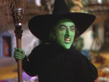
The same thing happened, to a lesser degree, with the latest Wizard of Oz digital restoration. Because Technicolor has a tendancy to photograph pure white as bluish, they tweaked the colours away from blue so that Judy Garland's blouse - which was pinkish on the set to correct the bluish-white effect - turned pink again and her periwinkle dress turned lilac and the emerald-green Emerald City turned yellowish-green. Bastards!
 03-09-07 | 08:54 AM
#100
Suspended
This original Disney cel (for sale here: http://www.animationartgallery.com/WDCK177.html ) seems to establish that there were once yellow bananas in a green jungle in that film.
