


Peter Pan : Platinum Edition ----> 3/6/2007


 03-14-07 | 10:17 AM
#152
Senior Member
Joined: Feb 2005
Posts: 333
Likes: 0
Received 0 Likes
on
0 Posts
here are some shots from Singin' in the Rain, tee one on top is from the old snapper edition and the other one is from the special edition...
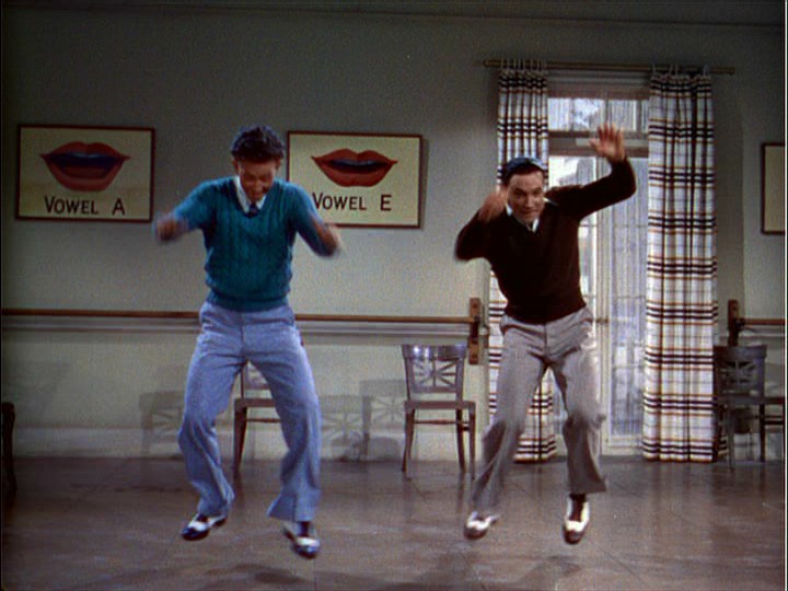
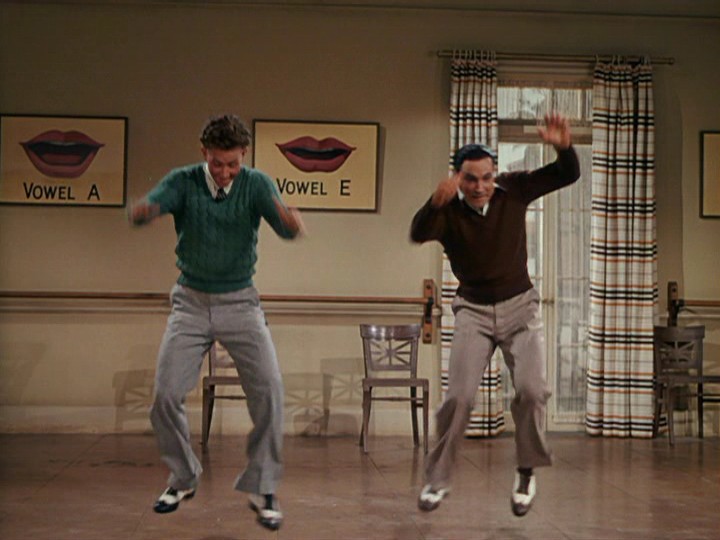
both were taken from Dvdbeaver...it just shows what a remastering process can do..what if the new color are truer to what they were?
both were taken from Dvdbeaver...it just shows what a remastering process can do..what if the new color are truer to what they were?
03-14-07 | 10:23 AM
#153
Banned
Joined: Mar 2004
Posts: 925
Likes: 0
Received 0 Likes
on
0 Posts
From: Pacific Northwest
The colors seem to shift around during the movie no matter what version you watch. From the color of the feather in Pan's hat to the clothing each character wears. I even noticed Hook's hook changes from silver, to gold, and back to silver again. Hardly the best animated film when it comes to consistant color schemes.
03-14-07 | 10:29 AM
#154
Moderator
Originally Posted by Frenzal Rhomb
here are some shots from Singin' in the Rain, tee one on top is from the old snapper edition and the other one is from the special edition...
both were taken from Dvdbeaver...it just shows what a remastering process can do..what if the new color are truer to what they were?
both were taken from Dvdbeaver...it just shows what a remastering process can do..what if the new color are truer to what they were?
03-14-07 | 10:33 AM
#155
DVD Talk Hero
Originally Posted by bookcase3
Judging from the two images directly above (posted by baracine), I hate to say that I prefer the PE.
03-14-07 | 10:34 AM
#156
DVD Talk Hero
Originally Posted by Frenzal Rhomb
it just shows what a remastering process can do..what if the new color are truer to what they were?
03-14-07 | 02:59 PM
#157
Suspended
The Singing in the Rain transfer took the "blue edge" off the glorious Technicolor print, aiming for more realism. But in the new PE transfer of Peter Pan, it's more than an adjustment.... First of all, animation films don't aim for realism and second, the original costume colours are unrecognizable... They really went overboard.
Last edited by baracine; 03-14-07 at 03:03 PM.
03-14-07 | 03:10 PM
#158
Moderator
Originally Posted by baracine
The Singing in the Rain transfer took the "blue edge" off the glorious Technicolor print, aiming for more realism. But in the new PE transfer of Peter Pan, it's more than an adjustment.... First of all, animation films don't aim for realism and second, the original costume colours are unrecognizable... They really went overboard.
03-14-07 | 08:20 PM
#159
DVD Talk Special Edition
Joined: Sep 2002
Posts: 1,030
Likes: 0
Received 0 Likes
on
0 Posts
From: Georgia, USA
Originally Posted by DVD Josh
But it's not. Look at the original cells. The PE isn't even close.
Originally Posted by Giles
really - ewwww it looks the print was rinsed in urine.
One of the R2 DVDs did this with Black Narcissus and ended up making skin tones too pale and losing the amber tinge on the image. Gone with the Wind's 4-disc SE transfer also brought back the sepia tinge intended for the film (the 1999 DVD took out a lot of the sepia tint). GWTW was also confirmed to have a 1939 dye-transfer print as reference for the 4K restoration's color timing.
Originally Posted by cardaway
The colors seem to shift around during the movie no matter what version you watch. From the color of the feather in Pan's hat to the clothing each character wears. I even noticed Hook's hook changes from silver, to gold, and back to silver again. Hardly the best animated film when it comes to consistant color schemes.

Last edited by PatrickMcCart; 03-14-07 at 08:22 PM.
03-14-07 | 08:50 PM
#160
DVD Talk Hero
Originally Posted by PatrickMcCart
They're cel reproductions, not those used in the actual photography. The production artwork would shed light onto the proper coloring, but cels made decades later are not reference.
03-14-07 | 09:09 PM
#161
DVD Talk Special Edition
Joined: Sep 2002
Posts: 1,030
Likes: 0
Received 0 Likes
on
0 Posts
From: Georgia, USA
Originally Posted by DVD Josh
I am honestly at a loss as to what it will take for you to see the absolute obvious.
03-15-07 | 09:01 AM
#162
Suspended
Originally posted by PatrickMcCart
In darker scenes, Pan tends to have brighter greens while they're less saturated in sunny scenes (like that shot).
In darker scenes, Pan tends to have brighter greens while they're less saturated in sunny scenes (like that shot).
03-15-07 | 12:36 PM
#163
DVD Talk Special Edition
Joined: Sep 2002
Posts: 1,030
Likes: 0
Received 0 Likes
on
0 Posts
From: Georgia, USA
Originally Posted by baracine
This scene takes place at night.
03-15-07 | 12:48 PM
#164
Moderator
Originally Posted by PatrickMcCart
If that's the fight near the end of the film, it's at dusk. The shot of Peter jumping down at "This time you've gone too far!" you can see him pass from the shadows into the sunlight. The shadows under Pan and Hook are straight under, so the sunlight would be directly overhead. It's kind of hard to keep track since it switches from day to night a lot during the film and the lighting isn't realistic. Then again, it's Neverland.
 03-15-07 | 01:15 PM
#165
DVD Talk Special Edition
Joined: Sep 2002
Posts: 1,030
Likes: 0
Received 0 Likes
on
0 Posts
From: Georgia, USA
Originally Posted by Giles
that must be Michael Jackson's excuse as well...
03-15-07 | 01:28 PM
#166
Suspended
Originally posted by PatrickMcCart
If that's the fight near the end of the film, it's at dusk. The shot of Peter jumping down at "This time you've gone too far!" you can see him pass from the shadows into the sunlight. The shadows under Pan and Hook are straight under, so the sunlight would be directly overhead. It's kind of hard to keep track since it switches from day to night a lot during the film and the lighting isn't realistic. Then again, it's Neverland.
If that's the fight near the end of the film, it's at dusk. The shot of Peter jumping down at "This time you've gone too far!" you can see him pass from the shadows into the sunlight. The shadows under Pan and Hook are straight under, so the sunlight would be directly overhead. It's kind of hard to keep track since it switches from day to night a lot during the film and the lighting isn't realistic. Then again, it's Neverland.
Late afternoon: Fight at Skull Rock and rescue of Tiger Lily/Lost Boys captive
Sunset: Celebration at Indian Encampment. Song.
Later that night (dark of night): Lost Boys back at Hangman's Tree. Song. Kidnapping.
Still later that night: Peter Pan rescues Wendy.
The light source on Hook's ship is exclusively the lanterns on deck and (possibly) the moon. And it still doesn't explain why Peter Pan turns that horrible wilted corn colour...
Last edited by baracine; 03-15-07 at 04:56 PM.
03-15-07 | 02:58 PM
#167
DVD Talk Hero
Originally Posted by PatrickMcCart
The reproductions aren't even accurate since they don't have the shadow of the mast over Captain Hook. Not to mention that baracine posted two images of the same cel (but two different backgrounds) and the colors are different between the two. The signed one shows Hook with a dark red (very close to the color on the PE), while the other is bright red. In darker scenes, Pan tends to have brighter greens while they're less saturated in sunny scenes (like that shot). Makes just as much sense as Tinkerbell being less saturated because of her glow (which was pointed out on another forum as being accurate to the 1953 prints).
03-15-07 | 06:10 PM
#168
DVD Talk Special Edition
Joined: Sep 2002
Posts: 1,030
Likes: 0
Received 0 Likes
on
0 Posts
From: Georgia, USA
Originally Posted by DVD Josh
Let's not worry about the cels and repros. Look at Peter. His costume isn't even green anymore. That should tell you right away something is wrong.
Last edited by PatrickMcCart; 03-15-07 at 06:21 PM.
03-15-07 | 07:52 PM
#169
Suspended
Originally Posted by PatrickMcCart
I don't know what the reference color timing is supposed to be, but neither does anyone else here unless they've seen a dye-transfer print or actual production artwork. If the 2007 isn't accurate, neither is the 2002.
03-15-07 | 08:22 PM
#170
DVD Talk Hero
Originally Posted by PatrickMcCart
I don't know what the reference color timing is supposed to be, but neither does anyone else here unless they've seen a dye-transfer print or actual production artwork. If the 2007 isn't accurate, neither is the 2002.
PETER PAN = FOREST GREEN
PE = PUKE GREEN
SE = FOREST GREEN
PE = WRONG
SE = RIGHT
PE DOES NOT EQUAL SE
03-15-07 | 09:42 PM
#172
DVD Talk Special Edition
Joined: Sep 2002
Posts: 1,030
Likes: 0
Received 0 Likes
on
0 Posts
From: Georgia, USA
Originally Posted by baracine
About the 2007 transfer: the operation was a great success but the patient died...
This is just an endless argument and isn't going anywhere. I'm hoping someone has some dye-transfer 35mm print samples that can be posted here so we know for certain. I'm just annoyed that different color timing is being made such a big deal while some of you are ignoring all the issues on the previous DVD. The colors can be easily adjusted on a monitor (crank up saturation and nudge the hue a tiny bit) to look "more pleasing."
Last edited by PatrickMcCart; 03-15-07 at 09:52 PM.
03-15-07 | 11:10 PM
#173
Senior Member
Joined: Dec 2006
Posts: 641
Likes: 0
Received 0 Likes
on
0 Posts
Originally Posted by PatrickMcCart
The 2002 is more like the body going missing.
The colors can be easily adjusted on a monitor (crank up saturation and nudge the hue a tiny bit) to look "more pleasing."
The colors can be easily adjusted on a monitor (crank up saturation and nudge the hue a tiny bit) to look "more pleasing."
03-16-07 | 06:52 AM
#174
Suspended
Originally Posted by PatrickMcCart
The 2002 is more like the body going missing.
This is just an endless argument and isn't going anywhere. I'm hoping someone has some dye-transfer 35mm print samples that can be posted here so we know for certain. I'm just annoyed that different color timing is being made such a big deal while some of you are ignoring all the issues on the previous DVD. The colors can be easily adjusted on a monitor (crank up saturation and nudge the hue a tiny bit) to look "more pleasing."
This is just an endless argument and isn't going anywhere. I'm hoping someone has some dye-transfer 35mm print samples that can be posted here so we know for certain. I'm just annoyed that different color timing is being made such a big deal while some of you are ignoring all the issues on the previous DVD. The colors can be easily adjusted on a monitor (crank up saturation and nudge the hue a tiny bit) to look "more pleasing."
And why should you ask for the dye-transfer 35 mm print samples? They were certainly used as reference in the photochemical Technicolor restoration of the film (as seen in the 2002 edition), but they were no use at all for the digital restorers who just went their own pig-headed way. And since you discount the evidence of your eyes in all other examples, you would probably discount that evidence too. It's a question of NOT wanting to see and being impervious to all logic...
The new yellowed transfer has you so confused you can't even tell day from night.
But you can always go back to Mary Blair's colour scheme for guidance:
Red Men = Red
Peter Pan = Green
Blue everywhere
Mary Blair's colour concept for the Indian Encampment: The Red Men are red.
Mary Blair's Mermaid Lagoon: Peter Pan is dressed in green.
Lots of blue everywhere.
Last edited by baracine; 03-16-07 at 07:21 AM.
03-17-07 | 11:18 PM
#175
DVD Talk Reviewer
I watched this finally last night. Everything looked pretty natural, actually. To me eyes at least anyway. I couldn't imagine more color, so much would have looked over saturated.