


IMDB title/actor pages re-layout

 09-17-10 | 04:59 PM
#28
DVD Talk Legend
Re: IMDB title/actor pages re-layout
When I visit IMDb using Firefox browser, I get the old layout.
When I use Google Chrome, I get the new (suckier) layout.
When I use Google Chrome, I get the new (suckier) layout.
09-17-10 | 05:09 PM
#29
DVD Talk Special Edition
Joined: Jun 2002
Posts: 1,358
Likes: 0
Received 0 Likes
on
0 Posts
From: Earth
Re: IMDB title/actor pages re-layout
I noticed the switch yesterday. It now resembles some tween girls myspace page.
Yet another site with a simple and usable interface subjected to the whole "progress" thing.
Terrible!
Yet another site with a simple and usable interface subjected to the whole "progress" thing.
Terrible!
09-17-10 | 06:22 PM
#30
DVD Talk Legend
Re: IMDB title/actor pages re-layout
Hate it.
09-17-10 | 06:35 PM
#31
DVD Talk Legend
09-17-10 | 06:37 PM
#32
DVD Talk Hall of Fame
Re: IMDB title/actor pages re-layout
Saw this on another board. If you have an account click on your account and select the first two under site preferences. That seems to work for the time being.
09-17-10 | 11:11 PM
#33
DVD Talk Legend
Re: IMDB title/actor pages re-layout
I hate Hate HATE this. I have to scroll down all the way to the bottom to access all the links, which were previously available as a side navigator. What moron thought that was good design?
09-17-10 | 11:25 PM
#34
DVD Talk Ultimate Edition
Re: IMDB title/actor pages re-layout
Seeing the new layout for the first time; ackward... emphasizing superficial celebrities/photos/trailers rather than more indepth reviews or background information? Fail...
 09-18-10 | 12:32 AM
#36
Re: IMDB title/actor pages re-layout
 I hate it. Only changes we need now are in Washington.
09-18-10 | 06:22 AM
I hate it. Only changes we need now are in Washington.
09-18-10 | 06:22 AM
#38
DVD Talk Limited Edition
Re: IMDB title/actor pages re-layout
I really don't get why registered users can't get the option to keep the old layout.
Lucky I still get the old layout in IE. Thank God for IE Tab for Chrome.
Lucky I still get the old layout in IE. Thank God for IE Tab for Chrome.
09-18-10 | 08:06 AM
#39
DVD Talk Legend
Re: IMDB title/actor pages re-layout
I hate it. Takes way longer to find the information I'm looking for, time I really don't want to invest just to find a simple fact. Time to look for an alternative (if one exists). -kd5-
09-18-10 | 10:23 AM
#40
DVD Talk Platinum Edition
Re: IMDB title/actor pages re-layout
I don't like it either. It's very cheesy looking and makes the page seem like it was put together by a tween. Especially since you have to drop down the list in order to see people's full resumes.
09-18-10 | 11:20 AM
#41
TOTY Winner 2018 and Inane Thread Master
Joined: Dec 2003
Posts: 54,191
Received 1,735 Likes
on
1,422 Posts
From: "Are any of us really anywhere?"
Re: IMDB title/actor pages re-layout
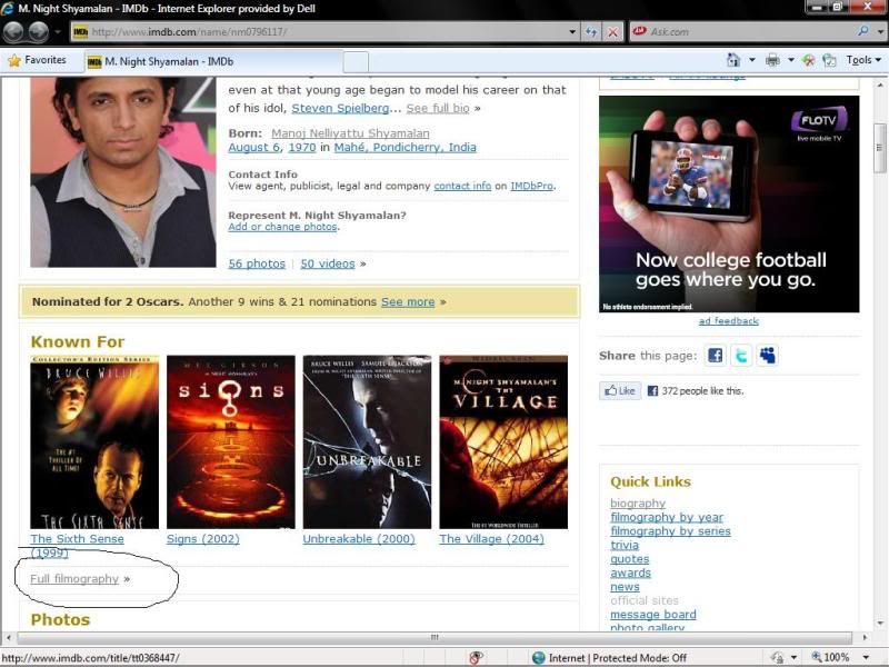
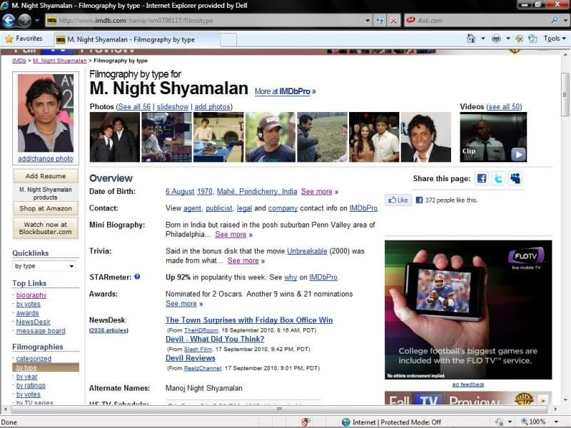
not going to appease everyone, but if you just hit the Full filmography tab it pretty much goes back to normal for individuals:
for movies, just scroll all the way down and hit combined details:

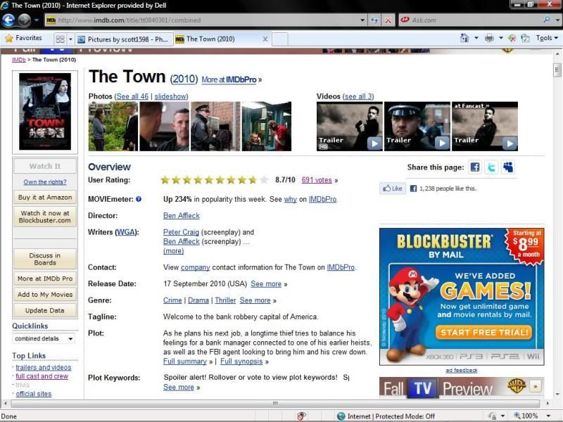
for movies, just scroll all the way down and hit combined details:
09-18-10 | 07:06 PM
#43
DVD Talk Legend
Re: IMDB title/actor pages re-layout
It seems like some sites are just getting too image-heavy. I didn't even like it when IMDB added the actors' pictures in the cast listing, and they're too tiny to see anyway.
Metacritic also changed its layout recently, so that everything has its own image now. I liked the simple list better, because I could get links to all of the games for a certain console on one page. Now, everything is divided between multiple pages and it just takes longer.
Metacritic also changed its layout recently, so that everything has its own image now. I liked the simple list better, because I could get links to all of the games for a certain console on one page. Now, everything is divided between multiple pages and it just takes longer.
09-19-10 | 02:12 PM
#44
DVD Talk Godfather
Re: IMDB title/actor pages re-layout
It looks terrible to me too. It would be more tolerable if they didn't have all those pictures at the top, but even still the old view was far better. It had all the important details right at the top where they were easily viewable, and links to more information readily available. Dumping them down at the bottom is a silly move.
I like the Showtimes on the right side, and the bigger poster image. Having clips and trailers easily accessible can be nice too, but everything else sucks. I sent in feedback, although im not sure if that will help.
I like the Showtimes on the right side, and the bigger poster image. Having clips and trailers easily accessible can be nice too, but everything else sucks. I sent in feedback, although im not sure if that will help.
09-19-10 | 04:18 PM
#45
Re: IMDB title/actor pages re-layout
I'll agree with the majority on this one: I definitely do not like the new look for IMDB.com. I hope they bring back the old layout/look... I rely heavily upon IMDB.com for information but couldn't really care less about it looking like this. It makes it take longer to get to the details I'm looking for which is a major drag.
09-19-10 | 04:19 PM
#46
Re: IMDB title/actor pages re-layout
It seems like some sites are just getting too image-heavy. I didn't even like it when IMDB added the actors' pictures in the cast listing, and they're too tiny to see anyway.
Metacritic also changed its layout recently, so that everything has its own image now. I liked the simple list better, because I could get links to all of the games for a certain console on one page. Now, everything is divided between multiple pages and it just takes longer.
Metacritic also changed its layout recently, so that everything has its own image now. I liked the simple list better, because I could get links to all of the games for a certain console on one page. Now, everything is divided between multiple pages and it just takes longer.
 09-20-10 | 09:19 AM
#48
DVD Talk Hall of Fame
Re: IMDB title/actor pages re-layout
I hate it but I wish they'd decide if they want to use it or not. It keeps changing from the old to the new to the old to the new layout everyday.
I prefer the old but if you are going to go with the new - let me at least get used to it.
I prefer the old but if you are going to go with the new - let me at least get used to it.
09-20-10 | 05:11 PM
#50
Banned
Joined: May 2006
Posts: 20,052
Received 169 Likes
on
127 Posts
From: Conducting miss-aisle drills and listening to their rock n roll
Re: IMDB title/actor pages re-layout
IMDb has spent the last 10 years getting worse and worse one little baby step at a time. What started as an excellent resource for real research has devolved into a television commercial for new releases. Now they have these ads where the whole border of every screen is an ad. And the ads aren't even for movies. Last week it was fucking Olive Garden all day.