


Ugliest/Worst Blu-ray cover art
 10-15-08 | 02:18 PM
#1
Thread Starter
DVD Talk Special Edition
Ugliest/Worst Blu-ray cover art
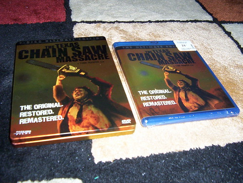
I just watched the Texas Chainsaw Massacre on Blu-ray which is probably the worst picture quality I have seen in the format to date. Of course 90% of that had to do with the source material, but what struck me more was how ugly the cover art was. I guess it fits the tone of the film, but it is just plain ugly!
Aside from the brutal Touchstone/Miramax swoosh artwork, what is the worst you've seen? Just for fun!
Aside from the brutal Touchstone/Miramax swoosh artwork, what is the worst you've seen? Just for fun!
 10-15-08 | 02:23 PM
#2
DVD Talk Special Edition
Joined: Oct 2006
Posts: 1,055
Likes: 0
Received 0 Likes
on
0 Posts


 10-15-08 | 03:58 PM
#4
DVD Talk Gold Edition
Bet this is high on your upcoming must-see list. 
Anyway, the answer is clearly Hancock. That cover nearly blinded me.
Anyway, the answer is clearly Hancock. That cover nearly blinded me.
10-15-08 | 04:22 PM
#6
DVD Talk Special Edition
Joined: Oct 2006
Posts: 1,055
Likes: 0
Received 0 Likes
on
0 Posts
10-15-08 | 04:30 PM
#8
Thread Starter
DVD Talk Special Edition
Oh, I also forgot about "The Mist". They changed it to that awful monochromatic crapfest. L.A. Confidential was going to be changed, but they thought the better of it, thank goodness.
10-15-08 | 04:55 PM
#9
DVD Talk Special Edition
Joined: Oct 2006
Posts: 1,055
Likes: 0
Received 0 Likes
on
0 Posts
 HERETIC!!
One cover image that I've never been fond of was "Pan's Labyrinth". To me it just looks like a Rush album cover or something. Not that there's anything wrong with that . . .
10-15-08 | 05:55 PM
#12
DVD Talk Special Edition
Joined: Oct 2006
Posts: 1,055
Likes: 0
Received 0 Likes
on
0 Posts
How about "Daredevil"? The movie was highly criticized for both its ridiculous S&M take on the Daredevil costume and its ridiculous Ben Affleck, prancing about in said costume. Apparently the marketing strategy behind the Blu-ray cover was to provide audiences with a better look at both, so we could all see just how wrong we'd really been. They should get extra credit, too, for the totally bizarre inclusion of the "Jon Favreau Cameo" sticker.

"Transformers". Hundreds of millions of dollars to make and market the movie and all they could come up with for cover art was a big robot head? They had, like, 287 different posters for this thing, and that's the image they chose??

And "Dark City". Because nothing says "darkness" like a predominantly white cover featuring Daredevil's great-grandfather . . .

"Transformers". Hundreds of millions of dollars to make and market the movie and all they could come up with for cover art was a big robot head? They had, like, 287 different posters for this thing, and that's the image they chose??
And "Dark City". Because nothing says "darkness" like a predominantly white cover featuring Daredevil's great-grandfather . . .
Last edited by applesandrice; 10-15-08 at 06:06 PM. Reason: adding pictures (linked from their respective reviews at highdefdigest) to prevent thread suckage
10-15-08 | 05:58 PM
#13
DVD Talk Godfather
This thread sucks without pics.
10-15-08 | 09:49 PM
#14
DVD Talk Legend
The cover for the SE of Stranger than Fiction is pretty bad:
http://www.dvdtimes.co.uk/content.php?contentid=68967
http://www.dvdtimes.co.uk/content.php?contentid=68967
10-16-08 | 12:23 PM
#15
DVD Talk Ultimate Edition
It's the same artwork as the Sept. 26th 2006 DVD release. I like the artwork, but the Oct. 14th 2003 DVD release was more simpler. I prefer the newer artwork, though.
10-16-08 | 01:01 PM
#17
DVD Talk Special Edition
Joined: Oct 2006
Posts: 1,055
Likes: 0
Received 0 Likes
on
0 Posts
10-25-15 | 09:39 PM
#19
Re: Ugliest/Worst Blu-ray cover art
 10-25-15 | 09:42 PM
#20
DVD Talk Hero
Re: Ugliest/Worst Blu-ray cover art
 10-25-15 | 10:25 PM
#21
DVD Talk Hero
Re: Ugliest/Worst Blu-ray cover art
The worst offenders are typically minor catalog releases that have a name actor as the only thing going for them from a marketing standpoint. A couple of older, forgotten Tom Cruise and Alec Baldwin movies from the 80s received bizarrely photoshopped giant heads of the actors as their covers. The photoshop jobs are so bad the actors look closer to human dolls than actual people.
 10-26-15 | 08:35 AM
#23
DVD Talk Legend
Re: Ugliest/Worst Blu-ray cover art
Even Ray Liotta looks like he's wondering where Joe Pesci is.

