


Legend Films' latest: "She", "Things To Come", etc.
 12-20-06, 09:25 AM
#101
Senior Member
Join Date: Apr 2004
Location: Bolton, United Kingdom
Posts: 365
Likes: 0
Received 0 Likes
on
0 Posts
Originally Posted by baracine
What is HTF?
 12-20-06, 09:40 AM
#102
DVD Talk Special Edition
Join Date: Jul 2000
Location: Upstate, NY
Posts: 1,192
Likes: 0
Received 0 Likes
on
0 Posts
Yes, I was reading that thread over there as well. I'm also hoping Barry wouldn't mind answering a question about their newly released 'John Wayne In Color' set. It appears to my eye, that these are the colorized prints used from the 1980 releases of the Lone Star films. Compared to Legend's "My Man Godfrey" and "Terror By Night" (in which the colors are magnificent looking), the colors on "Blue Steel" and "Sagebrush Trail" are dull...and the prints are pretty faded.
12-20-06, 07:28 PM
#103
Needs to contact an admin about multiple accounts
Join Date: May 2006
Posts: 84
Likes: 0
Received 0 Likes
on
0 Posts
Originally Posted by John Hodson
A couple of disturbing comments at the HTF on March of The Wooden Soldiers:
I wonder if Barry would care to comment?
I wonder if Barry would care to comment?
Another misconception needs to be addressed. Colorization using the Legend Films system does not alter in any way the underlying luminance or gray scale and we never modify the gray scale before or during the colorization process. The colorized version and the black and white version are identical in that two copies of the restored high definition digital frames are created. One for the black and white version and one for the colorized version.
Last edited by Barry_Sandrew; 12-20-06 at 07:36 PM.
12-21-06, 12:49 AM
#105
Member
Join Date: Jan 2006
Posts: 73
Likes: 0
Received 0 Likes
on
0 Posts
i dont care if a movie is colorized or not, as long as the movie is good.....besides it's better to release the movie in black and white and in color ......................it's better if the colorization process is made with extreme caution and beautifully made...............................................................yeah, the wages of fear in colorized version should have also been released by criterion for better comparison and appreciation of its fans
12-21-06, 07:42 AM
#107
Suspended
Thread Starter
Originally Posted by uebetan12@yahoo
iyeah, the wages of fear in colorized version should have also been released by criterion for better comparison and appreciation of its fans

BTW, Legend Films' Little Shop of Horrors made it to DVD Savant's list of the most impressive DVDs of 2006: http://www.dvdtalk.com/dvdsavant/s2193pick.html
12-21-06, 10:32 AM
#108
Senior Member
Join Date: Apr 2005
Posts: 363
Likes: 0
Received 0 Likes
on
0 Posts
Originally Posted by uebetan12@yahoo
yeah, the wages of fear in colorized version should have also been released by criterion for better comparison and appreciation of its fans
12-21-06, 02:34 PM
#109
DVD Talk Legend
Join Date: Sep 1999
Location: Building attractions one theme park at a time.
Posts: 10,800
Received 82 Likes
on
49 Posts
Originally Posted by baracine
BTW, Legend Films' Little Shop of Horrors made it to DVD Savant's list of the most impressive DVDs of 2006: http://www.dvdtalk.com/dvdsavant/s2193pick.html
It's not on his Most Impressive List. It's on his Recommended List along with a couple hundred more.
But the year was mostly one pleasant surprise after another. Here, in alphabetical order, are discs or disc sets from 2006 that Savant heartily recommends:
Legend's DVD of The Little Shop of Horrors is desirable because it has a good B&W transfer of the original feature, intact and in good shape, with clear audio. The movie has been around on miserable public domain copies for so long, Savant thought he'd never find a decent video version. Corman took out a trade ad a long time ago to proclaim that his film wasn't in the public domain, but with little effect. Some sources have stated that the producer didn't fully copyright any of his Filmgroup productions, to avoid the cost of sending a print to the Library of Congress.
Legend's modus operandi is the colorization of public domain films, and this title gets treated almost identically to their House on Haunted Hill from last year. As paint-by-numbers video goes, it's not bad, although Savant will never get used to the 'one orange fits all' hue assignment for human faces. The purist in me can overlook the colorized version when there's a decent B&W alternative to be enjoyed. The transfer isn't 16:9 enhanced, but as Gravis Mushnik might say, "Is it perfect you should be wanting?"
The extras are pretty much a wash. Mike Nelson's commentary is a slack set of jokes (The Filmgroup logo is likened unto a set of Reese's Peanut Butter Cups) that ignore the fact that the original is a comedy classic. It's difficult to make witless observations about something that's genuinely brilliant, and come off as anything but an idiot. Actually, the old MSTK3000 could occasionally get away with just that by being extremely clever, but nothing of the kind happens here. Nelson decides that Gravis Mushnik is a 'growly old bear' and proceeds to make lame bear jokes. It's that bad.
A "Gallery of Killer Plants" is a no-kidding look at real insect-eating greenery. "Man-Eating Plants" is an ill-judged non-joke betrayed by the hyphen in the word "Man-eating." True to form, Legend 'enhances' the film credits on the box by adding six Legend producers and art directors as if they were creatives responsible for The Little Shop of Horrors. I tell ya, it's tough work writing notes to the colorization people in India. Like I say, there's a good, plain B&W transfer of this funny film on Legend's disc to make the rest of the nonsense bearable.
Movie: Excellent
Video: Very Good (B&W Version)
Sound: Good +
Supplements: Colorized version, comedy commentary by Mike Nelson, Gallery of Killer Plants, Man-Eating Plant gag short.
Definately not in the Top Ten of Most Impressive. But being on the Recommended List isn't a bad thing.
Last edited by The Valeyard; 12-21-06 at 02:43 PM.
12-21-06, 05:52 PM
#110
Senior Member
Join Date: Oct 2002
Posts: 437
Likes: 0
Received 0 Likes
on
0 Posts
Originally Posted by Falc04
Yes, I was reading that thread over there as well. I'm also hoping Barry wouldn't mind answering a question about their newly released 'John Wayne In Color' set. It appears to my eye, that these are the colorized prints used from the 1980 releases of the Lone Star films. Compared to Legend's "My Man Godfrey" and "Terror By Night" (in which the colors are magnificent looking), the colors on "Blue Steel" and "Sagebrush Trail" are dull...and the prints are pretty faded.
12-26-06, 04:45 PM
#111
Needs to contact an admin about multiple accounts
Join Date: May 2006
Posts: 84
Likes: 0
Received 0 Likes
on
0 Posts
Originally Posted by ken_572002
Hey Barry...I'd be curious to to know about this as well. Any comment?
I disagree that the film is faded and that the color is dull compared to My Man Godfrey. Indeed it's difficult if not impossible to compare the titles. My Man Godfrey is obviously a different genre than a western and therefore requires a different approach to color design. It's not our intent to make all films look brand new nor have them all look the same. As a creative process, it's our feeling that each film should look appropriate for the year they were originally lensed but with the addition of Legend color... had color film been available to the producers and directors at the time.
Last edited by Barry_Sandrew; 12-26-06 at 09:00 PM.
12-27-06, 03:07 PM
#112
DVD Talk Special Edition
Join Date: Jul 2000
Location: Upstate, NY
Posts: 1,192
Likes: 0
Received 0 Likes
on
0 Posts
Originally Posted by Barry_Sandrew
The John Wayne releases, as all releases by Legend Films are newly telecined in high definition from various film prints or negatives and subsequently restored using our proprietary restoration software . In addition, the John Wayne films have all new scoring by Legend Films. The original release of these John Wayne titles had no scoring due to budgetary reasons and was obvious by its absence.
I disagree that the film is faded and that the color is dull compared to My Man Godfrey. Indeed it's difficult if not impossible to compare the titles. My Man Godfrey is obviously a different genre than a western and therefore requires a different approach to color design. It's not our intent to make all films look brand new nor have them all look the same. As a creative process, it's our feeling that each film should look appropriate for the year they were originally lensed but with the addition of Legend color... had color film been available to the producers and directors at the time.
I disagree that the film is faded and that the color is dull compared to My Man Godfrey. Indeed it's difficult if not impossible to compare the titles. My Man Godfrey is obviously a different genre than a western and therefore requires a different approach to color design. It's not our intent to make all films look brand new nor have them all look the same. As a creative process, it's our feeling that each film should look appropriate for the year they were originally lensed but with the addition of Legend color... had color film been available to the producers and directors at the time.
Anyway, a BIG thanks for releasing them. I look forward to the next 3 John Wayne films you are releasing come Spring '07.
12-30-06, 04:59 AM
#114
Senior Member
Join Date: Oct 2002
Posts: 437
Likes: 0
Received 0 Likes
on
0 Posts
Thanks for replying Barry. After watching the 3 John Wayne films, I have to admit that they are the best looking (and sounding) versions of these Lone Star films I've ever seen. It says inside the DVD jackets that 3 more are coming....I'll be looking forward to that.
01-16-07, 05:00 PM
#115
Senior Member
Join Date: Jan 2007
Posts: 260
Likes: 0
Received 0 Likes
on
0 Posts
Hi Barry
I suspect that a poor print, like 16mm, tends to dificult colorizatrion, since turns more dificult to your automatic and semiautomatic toold detect edges and gradients from a heavy grain texture frames. Also intense flicker and spatial flicker distorts the gray gradient which is based the color gradient choosed to cover the B&W.
If you spent let's say a X value to colorize "She", would be different if instead you of this yuo had veen approached by a director offering a budget of 400% of the X budget? Would be thwe tecnical quality bether, maybe with more carefull segemntation of objects, or segment the human skin in more areas in turn to make it look more natual?
Regards
Alfred
01-16-07, 05:57 PM
#116
Senior Member
Join Date: Jan 2007
Posts: 260
Likes: 0
Received 0 Likes
on
0 Posts
Improvemnts to solve the patel look of colorization
Hi Barry
If you didn't mind I have a friendly sugestion.
I believe it's possible to improve even more the colorization process, even having you the best technology worldwide.
There are algorithm able to estimate 3D form of object easier than never. It can estimate shape by countorns or by shadows relations. Other algorithms analyze a moving sequence of a object and automaticly give a 3D field. The tridimentional information would help your colorization algorithms to add color variance that are not already well calculated, causing some few artificial effect noticeable by accurate viewer.
Despite of huge improviment over ealrlier atempts in 80's and 90's, the basis of colorization process it's still the image segmantation of the 2D surface of frames. Each object in frame it's rotoscoped in order to fill with a color gradient varing colors a bit from a dak to brigh pixels. Today the delineation rotoscope it's very precise and less time consuming, allowing you to use isolate bether all objects, textures, transparences, and due computer processing and memory been higher you have a huge palette to use. But there are still limitations that enforces you to choose pastel color in turns to hide a bit characteristics that would be easily noticed case had you opted for strong colors.
Those limitations are lack of depth, since the consideration to apply color come from a 2D plane, and lack of few color interaction as light sources, walls, hue reflection. The objects that have no easily noticeable reflex are not colorized with those variances, only strong sources as abatjour reflex are separated ad proper colors applied.
The pastel look of colors are a option comunly used to try to hide flat look provenient from 2D analize limitations, otherwise a strong color pallete would unmask the weak side of the process.
The good point is that you already have all obejcts isolated in layers, which it's a prety good start to the tridimentional calculation, making everything easier. With all isolated would be less time consuming and less expensive to get deepth of objects.
Those algorithms would need to be adapted to you technology, software in a easy and fast interface. According to your realises I asume you have been upgrading your technology constantly, since the improvments was noticeable comparing earlier realises to resent ones.
Do you have a own programing department, reponsible to upgrade the software?
I wish we could debate ways to turn colorization more and more natural.
Best regards
Alfred
01-17-07, 12:27 PM
#117
Senior Member
Join Date: Jan 2007
Posts: 260
Likes: 0
Received 0 Likes
on
0 Posts
I invete everyone to take a look on those still coloriztions in this page:
http://www.dvdbeaver.com/film/1/alberto/web/alberto.htm
http://www.dvdbeaver.com/film/1/alberto/web/alberto.htm
01-17-07, 01:47 PM
#118
Suspended
Thread Starter
Originally Posted by Alfred Bergman
I invete everyone to take a look on those still coloriztions in this page:
http://www.dvdbeaver.com/film/1/alberto/web/alberto.htm
http://www.dvdbeaver.com/film/1/alberto/web/alberto.htm
and Nosferatu:
[Not that I approve of that sort of thing, you understand.]
Last edited by baracine; 01-17-07 at 01:50 PM.
01-17-07, 02:41 PM
#119
DVD Talk Legend
Join Date: Sep 1999
Location: Building attractions one theme park at a time.
Posts: 10,800
Received 82 Likes
on
49 Posts
Originally Posted by baracine
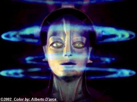
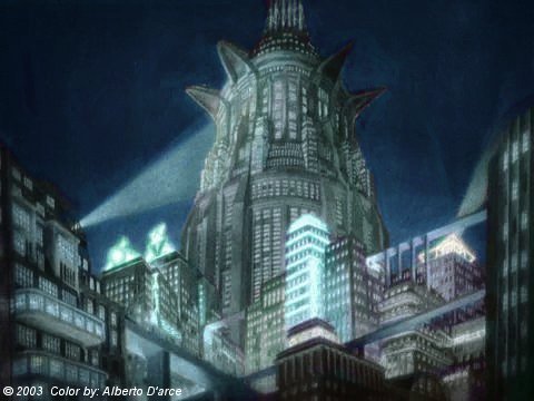
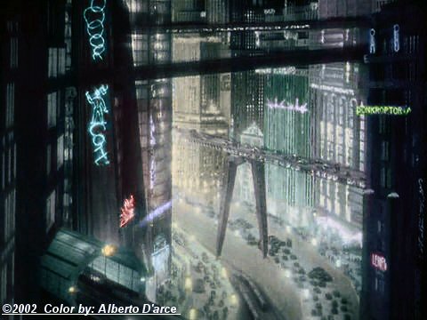
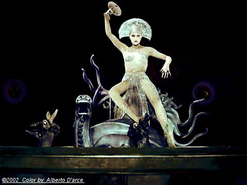
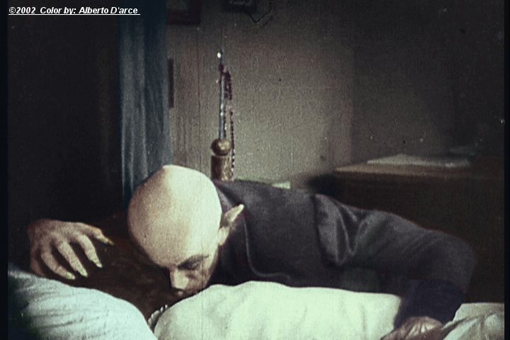
Alfred Bergman is Alberto D'Arce and these are some of his mouth-watering colourizations of scenes from Metropolis:
and Nosferatu:
[Not that I approve of that sort of thing, you understand.]
and Nosferatu:
[Not that I approve of that sort of thing, you understand.]
Metropolis looks too garish to my eyes but I'm sure others would rejoice.
I will admit that the Nosferatu pix looks very well done and on par to what could have been achieved at the time it was made.
Found out this weekend that Legend is releasing The Three Stooges: Swing Parade in March. Really looking forward to this one (for the obvious reasons).
01-17-07, 02:49 PM
#120
Suspended
Thread Starter
Quote:
Originally posted by Ambassador
Boy, I sometimes get the feeling I've entered some Bizarro world when I visit this forum!
Originally posted by Ambassador
Quote:
Originally Posted by uebetan12@yahoo
yeah, the wages of fear in colorized version should have also been released by criterion for better comparison and appreciation of its fans
Originally Posted by uebetan12@yahoo
yeah, the wages of fear in colorized version should have also been released by criterion for better comparison and appreciation of its fans
Criterion already has two editions of Cocteau's La Belle et la B�te in print ("Beauty and the Beast"). Both of them feature, as an alternate soundtrack, Philip Glass' operatic score for this film, in which he took the French dialogue from the film, shortened it to make it fit his bland and repetitive, uninspired music, which was then sung by obviously non-French speaking singers. The result is atrocious. It robs the dialogue of every bit of poetry and believability it once possessed, sometimes with absurd results. Since Glass makes absolutely no effort to make the French language flow naturally according to the French tonic accent, the sung words don't have any particular meaning or rhythm and sometimes convey the exact opposite of what they meant in the original text. Furthermore, the bad French pronunciation (what the French call "speaking French like a Spanish cow") is an insult to the original, not to mention the outrage of assuming that one can improve on Georges Auric's original score. Glass also commits obvious blunders like adding song birds to a night scene (er, don't birds sleep in the night time?), etc.
My point is this: If this kind of musical and artistic rape is permissible in the audio portion of a Criterion edition of a film classic, why the hell should we be deprived of the colourized, estate-approved version of Le Salaire de la peur as a valid extra? I believe a competent colourization is at least as much a valid work of art or addition as an "opera" inspired by a film that didn't need improvement on its music score in the first place.
Please compare Philip Glass' anaemic Overture to Georges Auric's Opening Titles.
Here's another heapin' helpin' of Philip Glass' musical porridge - The brother and his friend send an arrow flying into the sisters' room (hurl!)
[It's almost impossible, even for a French-speaking person who has memorized the script like I have, to understand most of what goes on here. But particularly offensive is the phrase "Vous avez failli tuer le Cabriole"/"You almost hit the dog", which, in this version, is just a throwaway deprived of any emotion, just one example among a thousand of Philip Glass' music's life-robbing properties.]
Last edited by baracine; 01-17-07 at 03:53 PM.
01-17-07, 07:08 PM
#121
Senior Member
Join Date: Jan 2007
Posts: 260
Likes: 0
Received 0 Likes
on
0 Posts
Originally Posted by The Valeyard
Metropolis looks too garish to my eyes but I'm sure others would rejoice.
I will admit that the Nosferatu pix looks very well done and on par to what could have been achieved at the time it was made.
Found out this weekend that Legend is releasing The Three Stooges: Swing Parade in March. Really looking forward to this one (for the obvious reasons).
I will admit that the Nosferatu pix looks very well done and on par to what could have been achieved at the time it was made.
Found out this weekend that Legend is releasing The Three Stooges: Swing Parade in March. Really looking forward to this one (for the obvious reasons).
Hi Valeyard . Thank for enjoy Nosferatu colorization. Those specific metropolis coloring was from faded video captures, so the colors over the fadded B&W didn't fit so well. Today I can adjust contrast very well, avoiding few problems.
01-18-07, 09:46 AM
#122
Suspended
Thread Starter
Originally Posted by Alfred Bergman
Hi Valeyard . Thank for enjoy Nosferatu colorization. Those specific metropolis coloring was from faded video captures, so the colors over the fadded B&W didn't fit so well. Today I can adjust contrast very well, avoiding few problems.
01-18-07, 07:41 PM
#123
Needs to contact an admin about multiple accounts
Join Date: May 2006
Posts: 84
Likes: 0
Received 0 Likes
on
0 Posts
Originally Posted by Alfred Bergman
Hi Barry
If you didn't mind I have a friendly sugestion.
I believe it's possible to improve even more the colorization process, even having you the best technology worldwide.
There are algorithm able to estimate 3D form of object easier than never. It can estimate shape by countorns or by shadows relations. Other algorithms analyze a moving sequence of a object and automaticly give a 3D field. The tridimentional information would help your colorization algorithms to add color variance that are not already well calculated, causing some few artificial effect noticeable by accurate viewer.
Despite of huge improviment over ealrlier atempts in 80's and 90's, the basis of colorization process it's still the image segmantation of the 2D surface of frames. Each object in frame it's rotoscoped in order to fill with a color gradient varing colors a bit from a dak to brigh pixels. Today the delineation rotoscope it's very precise and less time consuming, allowing you to use isolate bether all objects, textures, transparences, and due computer processing and memory been higher you have a huge palette to use. But there are still limitations that enforces you to choose pastel color in turns to hide a bit characteristics that would be easily noticed case had you opted for strong colors.
Those limitations are lack of depth, since the consideration to apply color come from a 2D plane, and lack of few color interaction as light sources, walls, hue reflection. The objects that have no easily noticeable reflex are not colorized with those variances, only strong sources as abatjour reflex are separated ad proper colors applied.
The pastel look of colors are a option comunly used to try to hide flat look provenient from 2D analize limitations, otherwise a strong color pallete would unmask the weak side of the process.
The good point is that you already have all obejcts isolated in layers, which it's a prety good start to the tridimentional calculation, making everything easier. With all isolated would be less time consuming and less expensive to get deepth of objects.
Those algorithms would need to be adapted to you technology, software in a easy and fast interface. According to your realises I asume you have been upgrading your technology constantly, since the improvments was noticeable comparing earlier realises to resent ones.
Do you have a own programing department, reponsible to upgrade the software?
I wish we could debate ways to turn colorization more and more natural.
Best regards
Alfred
If you didn't mind I have a friendly sugestion.
I believe it's possible to improve even more the colorization process, even having you the best technology worldwide.
There are algorithm able to estimate 3D form of object easier than never. It can estimate shape by countorns or by shadows relations. Other algorithms analyze a moving sequence of a object and automaticly give a 3D field. The tridimentional information would help your colorization algorithms to add color variance that are not already well calculated, causing some few artificial effect noticeable by accurate viewer.
Despite of huge improviment over ealrlier atempts in 80's and 90's, the basis of colorization process it's still the image segmantation of the 2D surface of frames. Each object in frame it's rotoscoped in order to fill with a color gradient varing colors a bit from a dak to brigh pixels. Today the delineation rotoscope it's very precise and less time consuming, allowing you to use isolate bether all objects, textures, transparences, and due computer processing and memory been higher you have a huge palette to use. But there are still limitations that enforces you to choose pastel color in turns to hide a bit characteristics that would be easily noticed case had you opted for strong colors.
Those limitations are lack of depth, since the consideration to apply color come from a 2D plane, and lack of few color interaction as light sources, walls, hue reflection. The objects that have no easily noticeable reflex are not colorized with those variances, only strong sources as abatjour reflex are separated ad proper colors applied.
The pastel look of colors are a option comunly used to try to hide flat look provenient from 2D analize limitations, otherwise a strong color pallete would unmask the weak side of the process.
The good point is that you already have all obejcts isolated in layers, which it's a prety good start to the tridimentional calculation, making everything easier. With all isolated would be less time consuming and less expensive to get deepth of objects.
Those algorithms would need to be adapted to you technology, software in a easy and fast interface. According to your realises I asume you have been upgrading your technology constantly, since the improvments was noticeable comparing earlier realises to resent ones.
Do you have a own programing department, reponsible to upgrade the software?
I wish we could debate ways to turn colorization more and more natural.
Best regards
Alfred
Alfred.
I appreciate your input. However, your assumptions regarding the Legend Films process is off the mark. We don't use traditional rotoscope and layering is unnecessary. I believe your assumptions are based on a familiarity with Photoshop. We do automatically address light sources when appropriate in a manner that uses 3D approximation within the 2D image. However it's done in a way that is much different than you have speculated in your post.
It is not our intention to make evey film look "natural". Colorization is not meant to level all films to a common denominator. Indeed each film is treated as a unique entity and color designed accordingly. SHE was originally produced as a fantasy by Cooper. However when RKO cut his budget at the last minute Cooper was forced to shoot the film in black and white. Ray Harryhausen worked with our designers in San Diego in an effort to fullfill the color vision of his mentor, Merian C. Cooper and to bring his fantasy film into the realm of color.
It is not always appropriate to apply saturated colors to a vintage film. Our technology automomatically adjusts the saturation so that it is appropriate to the age of the film. The objective is to enhance the film without being intrusive.
Thanks,
Barry
Last edited by Barry_Sandrew; 01-19-07 at 09:30 AM.
01-19-07, 06:19 PM
#124
Senior Member
Join Date: Jan 2007
Posts: 260
Likes: 0
Received 0 Likes
on
0 Posts
Thank you Barry
I honestly doubt that any other company's president would have courage to go to a forum and respond so many questions.
Watching Swing Parade clip, despite of the small screen, seens the skin colorization present some improvement over the earlier realises.
Color cheek would be excelent to family films. No colorization technology was able to add color cheek precisilly yet. You will probably be the first to achieve that.
Woman in Green clip it's not available. Wooden Soldiers's clips have much flickering, as recorded from a screen or something, and so do'nt represent well the good edition on DVD.
One chalenging to colorization: In B&W photographiic direction, specially in early cinema days, there was very common to use color filter to change the contrast to specific colors on set. So in many films, even from great prints, there is "shinning faces, as result of pink or red filter, that bright white skin; and also some bright leaves or threes, due use of green filters, or white sky due use of blue filter. Those characteristic makes difficult to colorize the image, and we get funny faces and whited leaves.
A comamdement of colorization, as you confirmed, is that colorization don't alter the original tones of B&W. I ask: why not do that in some few cases?
If you could perfect isolate the skin, threes and leaves, perhaps would got bether effect if turn dow a little bit the tones. Would require extreme precision delineation, so precise as used in image compositions.
Been colorization a creative process I see no harm about, specially because today you offer the colorized and the B&W in the same DVD, despite of the desatured colorized edition be near the same of thew B&W.
Some curiosity about your restoration process: Lowry Digital Images managed to recover image contrast from third generation prints for Sunset Boulevasrd and Roman Holiday restoration. They recovered hiden tones in dark and bright areas, resulting in a pleasant natural contrast. Why not try something like that before colorize a tranfer froma contrast print?
The color when added to contrast print tranfers got weird, since are not contrast print colors. Contrast print colors have constrating hues and contrasting saturation, for example geeting skin with the darker portions more red and the brighter portions more yellow.
The flicker in old prints need bether atention. The local flickering (flicker not homogeneous distrubuted along frame are) wasn't correct for Things to come.
Maybe some aperture correction (image sharpning) would be welcome to fuzzy or out of focus scenes.
Regards
A. Bergman