


Legend Films' latest: "She", "Things To Come", etc.
 06-13-07 | 10:27 AM
#276
Needs to contact an admin about multiple accounts
Joined: May 2006
Posts: 84
Likes: 0
Received 0 Likes
on
0 Posts
Originally Posted by Alfred Bergman
Sorry Folks, I mistake up, due a error in a informative page that told me Orthochromatic wasn't well sensitible to blue. WRONG INFORMATION FROM NET :-(
THE TRUE IS TRAT ORTHOCHROMATIC IT'S SENSITIBLE TO BLUE AND GREEEN, BUT NOT TO RED.
SO THAT WHY SKY IT'S ALWAYS BRIGHT, NOT DUE CONTRSTY IMAGE OR SKY FADED ONLY. THAT'S WHY FRECH FLAG COLORS STRIPS IN PLANES HAD BRIGHT BLUE AND SOMETIMES DARK REDs.
NOW I CAN'T EXPLAIN WHY THE RED BARON AIRPLANE WAS PINK, SICE IF IT IN REALITY WAS RED SHOULD LUKE DARK ON ORTHOCHROMATIC. ALSO CAN'T EXPLAIN WHY IN SOME FEW FRENCH PLANES FLAGS STRIPS, THE RED WASN'T DRAK TOO, LIKE OTHER SCENES WITH FRENCH PLANES.
MAYBE THE COORIZEDD PINK PLANE WAS A BRIGHT GRAY OR WHITE PLANE, WAS WAS MISTAKE CONFUSED WITH RED BARON'S RED PLANE.
I WOULD LIKE TO ASK BARRY SANDREW ASSISTANTE TO SOLVE THIS MISTERY.
ONCE AGAIN SORRY MY MISTAKE
A. BERGMAN
There has to be sufficient gray scale to hold red. If there is not enough gray scale in the object it will take on a lighter color or pink. The WWI material was extremely high contrast and the whites were generally blown out and the blacks crushed.
Barry
 06-13-07 | 10:32 AM
#277
Needs to contact an admin about multiple accounts
Joined: May 2006
Posts: 84
Likes: 0
Received 0 Likes
on
0 Posts
Originally Posted by Falc04
Hey Barry,
Just want to say that your latest release of 'John Wayne In Color' looks great! I'm very happy to have the six current films your company has put out. Do you have any plans to release more of the Duke's Lone Star films onto DVD in the future? I was disappointed to not see any mention in the latest disc's sleeve about more upcoming 'John Wayne In Color' DVDs...
Just want to say that your latest release of 'John Wayne In Color' looks great! I'm very happy to have the six current films your company has put out. Do you have any plans to release more of the Duke's Lone Star films onto DVD in the future? I was disappointed to not see any mention in the latest disc's sleeve about more upcoming 'John Wayne In Color' DVDs...
Look for more Duke films in the near future.
06-13-07 | 10:33 AM
#278
Needs to contact an admin about multiple accounts
Joined: May 2006
Posts: 84
Likes: 0
Received 0 Likes
on
0 Posts
Originally Posted by ken_572002
I agree completely...this latest release of John Wayne movies by Legend Films is another great job. Here's a suggestion; If you are going to release 3 more, these would be my choice:
Riders Of Destiny (probably the best of the Lone Star films)
The Trail Beyond (the only film of the 16 that had an improved budget)
Helltown (really a Paramount film, but in the public domain)
IMHO, this would make the 'Wave 3' box just as good as the last two!
Riders Of Destiny (probably the best of the Lone Star films)
The Trail Beyond (the only film of the 16 that had an improved budget)
Helltown (really a Paramount film, but in the public domain)
IMHO, this would make the 'Wave 3' box just as good as the last two!
06-14-07 | 06:04 AM
#279
DVD Talk Special Edition
Joined: Jul 2000
Posts: 1,192
Likes: 0
Received 0 Likes
on
0 Posts
From: Upstate, NY
Originally Posted by Barry_Sandrew
Look for more Duke films in the near future.
06-23-07 | 06:59 PM
#280
Needs to contact an admin about multiple accounts
Joined: May 2006
Posts: 84
Likes: 0
Received 0 Likes
on
0 Posts
Ray Harryhausen with Barry Sandrew at the LA Film Festival - Saturday, June 30, 2007
If anyone is in LA or planning to be in LA, I'll be presenting 20 Million Mikes To Earth on it's 50th Anniversary with Ray Harryhausen. This will be the color Premiere of the film which Ray color directed at Legend Films in San Diego. See URL below:
http://filmguide.lafilmfest.com/tixS...entNumber=5042
http://filmguide.lafilmfest.com/tixS...entNumber=5042
06-28-07 | 07:25 AM
#282
Senior Member
Joined: Oct 2002
Posts: 437
Likes: 0
Received 0 Likes
on
0 Posts
Originally Posted by Barry_Sandrew
I don't know if anyone realizes it but Legend Films actually introduced a musical score to the John Wayne titles. They were essentially without score in the original prints.
Say Barry....can you give us a hint as to when we may expect to see the next "John Wayne In Color" box set? I've watched the first two box sets twice now, and would really like to see some more Lone Star colorized films!
06-30-07 | 11:46 AM
#283
Senior Member
Joined: Jan 2007
Posts: 260
Likes: 0
Received 0 Likes
on
0 Posts
Real mistake by producer??
Originally Posted by Barry_Sandrew
Alfred,
There has to be sufficient gray scale to hold red. If there is not enough gray scale in the object it will take on a lighter color or pink. The WWI material was extremely high contrast and the whites were generally blown out and the blacks crushed.
Barry
There has to be sufficient gray scale to hold red. If there is not enough gray scale in the object it will take on a lighter color or pink. The WWI material was extremely high contrast and the whites were generally blown out and the blacks crushed.
Barry
That's why it wasn't darker on orthochromatic film, since green get's brighter on orthochromatic. And with the constrating footage the colorization wouldn't never get fine with a grayscale like that.
I'm aware of need of grayscale as I do photo colorization myself :-)
07-01-07 | 02:40 PM
#285
Senior Member
Joined: Jan 2007
Posts: 260
Likes: 0
Received 0 Likes
on
0 Posts
The importance of re-grading scene by scene the B&W
Hi Barry & everyone
Sorry my pseudo complains in this colorization, very well done for Shirley Temple films, but I want to raise a important point about colorizations.
Colorization use to don't alter the B&W originals, not altering the objects light values along the frame, but also use to don't alter the B&W Grading scenes to scenes.
I respectfully disagree about keep the Grading scene to scene. Many times the grading in a scenes it's very inappropriated to get colors. Sometimes too flat or too bright. A simpe contrast correction of the scene would turn it much more prone to well accept the colors.
Check out this video: http://www.youtube.com/watch?v=CpAzoNjBpb8
We can cleary see that the scenes on the farm, when Shirley's character's father arrive, have the contrast tones too flat and bright, and as consequance the colors didn't got well, creating shinning saturation effects. Look the face of the father and in his neck at 00:46 sec. After 1:15 sec to the rest of the video, the color are able to get bether in a more natural B&W grading.
It's not fault of Barry technology, folks! It's just the flat too shining B&W that needs readjus for this scene. Can be adjusted by simple digital filter tool, similar to a photographer adjusting a disereable effect in a B&W photo.
Since today all colorization came with a separeted B&W version of the film, I think there is NO NEED to KEEP tHE SAME B&W GRADING SCENE TO SENE, in cases a specific B&W grading in a given scene can turn colorization unpleasant.
A simpe change in the original B&W grading, just when necessary to colors get OK, it's less harmfull than allow a inapropriated grading mess with the colors just to keep the same original grading.
Compare with this other clip from the very same film, and very same colorization year: http://www.youtube.com/watch?v=L-66PJNQYkg
Now a little constructive critic: Barry- Is that possible to use the Photo Real algorithms, used to create variable shades of saturation and hues on skin, to create more variance on trees and leaves?
Why not splite the skin in more areas to get more natural skin color for sectors? We notice that the neck manytimes, due angle of light, needs less saturation than in face, while colorizations occasionaly shows too satured necks.
A.Bergman
07-01-07 | 05:56 PM
#286
Needs to contact an admin about multiple accounts
Joined: May 2006
Posts: 84
Likes: 0
Received 0 Likes
on
0 Posts
Contrast Adjustment - Colorization
Originally Posted by Alfred Bergman
Hi Barry & everyone
Sorry my pseudo complains in this colorization, very well done for Shirley Temple films, but I want to raise a important point about colorizations.
Colorization use to don't alter the B&W originals, not altering the objects light values along the frame, but also use to don't alter the B&W Grading scenes to scenes.
I respectfully disagree about keep the Grading scene to scene. Many times the grading in a scenes it's very inappropriated to get colors. Sometimes too flat or too bright. A simpe contrast correction of the scene would turn it much more prone to well accept the colors.
Check out this video: http://www.youtube.com/watch?v=CpAzoNjBpb8
We can cleary see that the scenes on the farm, when Shirley's character's father arrive, have the contrast tones too flat and bright, and as consequance the colors didn't got well, creating shinning saturation effects. Look the face of the father and in his neck at 00:46 sec. After 1:15 sec to the rest of the video, the color are able to get bether in a more natural B&W grading.
It's not fault of Barry technology, folks! It's just the flat too shining B&W that needs readjus for this scene. Can be adjusted by simple digital filter tool, similar to a photographer adjusting a disereable effect in a B&W photo.
Since today all colorization came with a separeted B&W version of the film, I think there is NO NEED to KEEP tHE SAME B&W GRADING SCENE TO SENE, in cases a specific B&W grading in a given scene can turn colorization unpleasant.
A simpe change in the original B&W grading, just when necessary to colors get OK, it's less harmfull than allow a inapropriated grading mess with the colors just to keep the same original grading.
Compare with this other clip from the very same film, and very same colorization year: http://www.youtube.com/watch?v=L-66PJNQYkg
Now a little constructive critic: Barry- Is that possible to use the Photo Real algorithms, used to create variable shades of saturation and hues on skin, to create more variance on trees and leaves?
Why not splite the skin in more areas to get more natural skin color for sectors? We notice that the neck manytimes, due angle of light, needs less saturation than in face, while colorizations occasionaly shows too satured necks.
A.Bergman
Sorry my pseudo complains in this colorization, very well done for Shirley Temple films, but I want to raise a important point about colorizations.
Colorization use to don't alter the B&W originals, not altering the objects light values along the frame, but also use to don't alter the B&W Grading scenes to scenes.
I respectfully disagree about keep the Grading scene to scene. Many times the grading in a scenes it's very inappropriated to get colors. Sometimes too flat or too bright. A simpe contrast correction of the scene would turn it much more prone to well accept the colors.
Check out this video: http://www.youtube.com/watch?v=CpAzoNjBpb8
We can cleary see that the scenes on the farm, when Shirley's character's father arrive, have the contrast tones too flat and bright, and as consequance the colors didn't got well, creating shinning saturation effects. Look the face of the father and in his neck at 00:46 sec. After 1:15 sec to the rest of the video, the color are able to get bether in a more natural B&W grading.
It's not fault of Barry technology, folks! It's just the flat too shining B&W that needs readjus for this scene. Can be adjusted by simple digital filter tool, similar to a photographer adjusting a disereable effect in a B&W photo.
Since today all colorization came with a separeted B&W version of the film, I think there is NO NEED to KEEP tHE SAME B&W GRADING SCENE TO SENE, in cases a specific B&W grading in a given scene can turn colorization unpleasant.
A simpe change in the original B&W grading, just when necessary to colors get OK, it's less harmfull than allow a inapropriated grading mess with the colors just to keep the same original grading.
Compare with this other clip from the very same film, and very same colorization year: http://www.youtube.com/watch?v=L-66PJNQYkg
Now a little constructive critic: Barry- Is that possible to use the Photo Real algorithms, used to create variable shades of saturation and hues on skin, to create more variance on trees and leaves?
Why not splite the skin in more areas to get more natural skin color for sectors? We notice that the neck manytimes, due angle of light, needs less saturation than in face, while colorizations occasionaly shows too satured necks.
A.Bergman
Legend Films does not mess with luminance adjustments for colorization clients unless asked to do so.
BTW - The Ray Harryhausen classic 20 Million Miles To Earth which he color designed with Legend Films was premiered at the LA Film Festival to a sold out theater. The response to the colorization was unanimously positive with appreciative applause. The DVD of the film will be out the first week of August in 5.1 audio. You will never find a cleaner print. Sony did an incredible job restoring and stabilizing the film. Two of the co-stars were there for the viewing and thought it was remarkable.
07-01-07 | 10:40 PM
#287
Needs to contact an admin about multiple accounts
Joined: May 2006
Posts: 84
Likes: 0
Received 0 Likes
on
0 Posts
Originally Posted by Barry_Sandrew
Good suggestion Alfred - I also agree with you regarding contrast adjustments. I generally telecine in a flat manor to expose all available info in the blacks and whites. invariably when the final product is completed a contrast adjustment of between 10 and 15% makes the colors pop without any modification of the color design. Saturation adjustment proves unnecessary. When we produced Heidi the telecine was done for us and while I suggested a contrast adjusment upon delivery I'm not certain one was done.
Legend Films does not mess with luminance adjustments for colorization clients unless asked to do so.
BTW - The Ray Harryhausen classic 20 Million Miles To Earth which he color designed with Legend Films was premiered at the LA Film Festival to a sold out theater. The response to the colorization was unanimously positive with appreciative applause. The DVD of the film will be out the first week of August in 5.1 audio. You will never find a cleaner print. Sony did an incredible job restoring and stabilizing the film. Two of the co-stars were there for the viewing and thought it was remarkable.
As part of the celebration, 20 Million Miles to Earth is being released in a digitally restored black and white print, and a colorized version supervised by Harryhausen. The effects guru recently admitted, �I am thrilled that this film is finally being seen in color. I had wanted to do the film in color in the 1950s, but our budget was not large enough to accommodate that luxury. Now, thanks to the marvelous advances made in the colorization process by San Diego�s Legend Films and others, audiences will be able to see 20 Million Miles to Earth as I originally intended.�
07-02-07 | 10:35 AM
#288
Senior Member
Joined: Jan 2007
Posts: 260
Likes: 0
Received 0 Likes
on
0 Posts
Originally Posted by Barry_Sandrew
Head-20-Million-Miles-To-Earth-Now-In-Color-4396.htm
As part of the celebration, 20 Million Miles to Earth is being released in a digitally restored black and white print, and a colorized version supervised by Harryhausen. The effects guru recently admitted, �I am thrilled that this film is finally being seen in color. I had wanted to do the film in color in the 1950s, but our budget was not large enough to accommodate that luxury. Now, thanks to the marvelous advances made in the colorization process by San Diego�s Legend Films and others, audiences will be able to see 20 Million Miles to Earth as I originally intended.�
As part of the celebration, 20 Million Miles to Earth is being released in a digitally restored black and white print, and a colorized version supervised by Harryhausen. The effects guru recently admitted, �I am thrilled that this film is finally being seen in color. I had wanted to do the film in color in the 1950s, but our budget was not large enough to accommodate that luxury. Now, thanks to the marvelous advances made in the colorization process by San Diego�s Legend Films and others, audiences will be able to see 20 Million Miles to Earth as I originally intended.�
People would love to ask hin how he did all stop motion and image fusion effects in a computerless era.
Dynamation is a technic created by hin, if I'm correct. Check out: http://www.youtube.com/watch?v=YcB8b...elated&search=
I'm curious about how he color designed and color balance the film. Had hin learned to operate the Legend Films software to color design steps, or had direct assistence of your colorists?
In early days of colorization the color design had to calculate or guess the hue few grading allong grayscale to a given choose color, or calculate the variances of the choose color to a given situation, like in sun or by night scenes.
Have your software a very easy interface that allow just choose a color, and all variances calculated automatically?
A.B
07-03-07 | 09:49 AM
#289
Needs to contact an admin about multiple accounts
Joined: May 2006
Posts: 84
Likes: 0
Received 0 Likes
on
0 Posts
Originally Posted by Alfred Bergman
What about invite the legendary Ray Harryhausen to this forum?
People would love to ask hin how he did all stop motion and image fusion effects in a computerless era.
Dynamation is a technic created by hin, if I'm correct. Check out: http://www.youtube.com/watch?v=YcB8b...elated&search=
I'm curious about how he color designed and color balance the film. Had hin learned to operate the Legend Films software to color design steps, or had direct assistence of your colorists?
In early days of colorization the color design had to calculate or guess the hue few grading allong grayscale to a given choose color, or calculate the variances of the choose color to a given situation, like in sun or by night scenes.
Have your software a very easy interface that allow just choose a color, and all variances calculated automatically?
A.B
Regarding Ray, at a spry 87, he's not too comfortable with computers. He lives outside of London and does not have internet.
However he is comfortable directing and that's exactly what he did at Legend. He directed our creative director, Rosemary Horvath to create the precise look he envisioned when he originally produced his films. Color allowed him to put depth into matte paintings. It also allowed him to blend composites so they look even more convinvcing.
07-03-07 | 01:19 PM
#290
Senior Member
Joined: Jan 2007
Posts: 260
Likes: 0
Received 0 Likes
on
0 Posts
Originally Posted by Barry_Sandrew
Alfred - my first process at American Film Technologies (AFT) was designed to automatically adjust to variances in luminance but it was not nearly as sophisticated as the Legend Films system.
Someones folly imagined, and even today, that each black&white value had a correspondent color. That's the problem when journalists don't know what they are writing :-)
A.B
07-05-07 | 04:53 PM
#291
Needs to contact an admin about multiple accounts
Joined: May 2006
Posts: 84
Likes: 0
Received 0 Likes
on
0 Posts
Originally Posted by Alfred Bergman
I remembered about old informations regarding film colorization saying like: "The computer automatically calculate the colors for each piece on set" In reality refer to adjust a chosen color to grayscale or environment, of course. And many people imagined that was possible to the computer guess what color was a piece on a B&W image.
Someones folly imagined, and even today, that each black&white value had a correspondent color. That's the problem when journalists don't know what they are writing :-)
A.B
Someones folly imagined, and even today, that each black&white value had a correspondent color. That's the problem when journalists don't know what they are writing :-)
A.B
07-05-07 | 10:53 PM
#292
Senior Member
Joined: Jan 2007
Posts: 260
Likes: 0
Received 0 Likes
on
0 Posts
Colorization challenge to Legend Films.
Originally Posted by Barry_Sandrew
You're absolutely right. The LUT is designed to adjust color to the luminance. The system cannot determine what color should be there, only how the designed (selected) colors react to changes in lumince.
I would like to have access to deleted footages on a studio. If I had access to a deleted scenes from Gone With the Wind... I could sent to you a a black and white image file and ask to colorize like the original film look. Would that be perfectly possible?
Well, same set, same makeup, same ilumination technics, same photographic filter. There would be no alterative factor to turn the B&W weird for colors.
Film Restoration perhaps had cases where colorization could help. Until now the only case I know about is the last restoration of The Phantom of The Opera (1925) which the few 2 color technicolor sequences was lost with exception of the Masked Ball scenes. But among the basket ball scene there was a few scenes that only was available in B&W, and it was colorized by CST Entertainment (today extinct) using the surviving color shots as reference.
Nobody complained about the results, even watching original shot in color with a colorized scene from the same set. 2 color technicolor looks a bit weird, and perhaps it helped to cover any artificiality from colorization by CST Entertainment.
Maybe there are other color films, which some color sequence only survived in B&W. Films that was fully shot in color, but reedited, shortned, and when a restorer try to assemble all footage back they found that few scenes are now only available in B&W.
Have never been contacted about any case or invited to use colorization for film restoration purposes?
Would you accept a colorization challenge?
A.B
07-08-07 | 06:07 PM
#294
Needs to contact an admin about multiple accounts
Joined: May 2006
Posts: 84
Likes: 0
Received 0 Likes
on
0 Posts
Littke Rascals
Originally Posted by Upper pylon 3
Barry,
Are there anymore Little Rascals dvd's planned?
Are there anymore Little Rascals dvd's planned?
07-09-07 | 09:20 AM
#295
Thread Starter
Suspended
Barry, I guess you missed the question I asked on the preceding page:
Question to Barry Sandrew:
I just purchased a Imavision (Quebec) three-DVD/6 films set of Fernandel films 1952-1963.
The original boxset is still available from www.amazon.com :
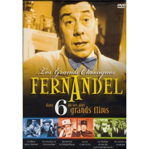
On of these films is S�n�chal le Magnifique (1957) and is presented in its colourized version, which is billed ingenuously as a "new colour restoration". The colourization is astonishing as French jobs usually are, meaning that the amount of detail is incredible, especially in the colours of complicated dress and decor patterns, wall hangings, paintings, the subtlety of lighting atmospheres, etc. The only detail that might give it away are the skin tones, which are sometimes too dark. But I still had to check the film's technical specifications on IMDb before finding out it was actually filmed in black and white.
Since this is not the first time I've experienced firsthand the quality of French colourization, I just have to know: Are they done by Legend Films?
I just purchased a Imavision (Quebec) three-DVD/6 films set of Fernandel films 1952-1963.
The original boxset is still available from www.amazon.com :
On of these films is S�n�chal le Magnifique (1957) and is presented in its colourized version, which is billed ingenuously as a "new colour restoration". The colourization is astonishing as French jobs usually are, meaning that the amount of detail is incredible, especially in the colours of complicated dress and decor patterns, wall hangings, paintings, the subtlety of lighting atmospheres, etc. The only detail that might give it away are the skin tones, which are sometimes too dark. But I still had to check the film's technical specifications on IMDb before finding out it was actually filmed in black and white.
Since this is not the first time I've experienced firsthand the quality of French colourization, I just have to know: Are they done by Legend Films?
07-09-07 | 11:44 AM
#296
Senior Member
Joined: Jan 2007
Posts: 260
Likes: 0
Received 0 Likes
on
0 Posts
Screen captures for share with forum members.
Hi Baracine
It was really shot in B&W, I researched. Could you send or post some screen captures of the colorized version. Would be interesting if everyone in this forum could see by thenselves, don't you agree?
I think you must look to the skin of characters. If the skin colors are too homogenous it's a signal that wasn't colorized by Legend Films, since they have the best skin colorization on market.
A.B
07-09-07 | 04:53 PM
#297
Thread Starter
Suspended
Originally Posted by Alfred Bergman
Hi Baracine
It was really shot in B&W, I researched. Could you send or post some screen captures of the colorized version. Would be interesting if everyone in this forum could see by thenselves, don't you agree?
I think you must look to the skin of characters. If the skin colors are too homogenous it's a signal that wasn't colorized by Legend Films, since they have the best skin colorization on market.
A.B
It was really shot in B&W, I researched. Could you send or post some screen captures of the colorized version. Would be interesting if everyone in this forum could see by thenselves, don't you agree?
I think you must look to the skin of characters. If the skin colors are too homogenous it's a signal that wasn't colorized by Legend Films, since they have the best skin colorization on market.
A.B


Last edited by baracine; 07-10-07 at 04:56 AM.

 07-10-07 | 03:35 PM
#300
Senior Member
Joined: Jan 2007
Posts: 260
Likes: 0
Received 0 Likes
on
0 Posts
Thanks for the captures Baracine
The color balance or color design it's really well made. Seens like they had access to original set color photos as reference, since each obeject color got well.
The contrast it's very adequate to colorization:
-It's not contrastin, since have good dynamic range, good tones in dark mediun and bright areas.
-It's not too brigh, like the ilumination usualy choosed for color films, while many B&W films from 40's and 50's used too strong ilumination.
-The middle range it's not flat, so allow a good aspect, important too for get color ok.
But I bet it's not Legend Films work. The very good results it's probably due the evidences I mentioned above. For me it's West Wing work.
Look with careful. The skins have very well choosed colors, but seens to be a simple variance of colors along grayscale, which it's just a few variances of hue and saturation from dark to brigh tones. Legend films Photo Real can Add more sophisticated color for skin.
See the mans face in the third capture. A bit too strong colors and seens too homogeneous along diferent face's sectors.
Also there is no evidence of 3D estimation. Check the White short coat on capture 7. It's more flat than Legend Films best works. West Wing forced a bit the hue variance along grayscale to try hide the flat look, but I can notice it.
Anyway I recognize West Wing have good color designer ability recreation purposes. West Wing's software have a tool to pick color, and the grayscale variation of Hue&saturation along, from color photos of the sets. This would allow good color recreations. Legend Films have some similar tool, I believe.
West Wing probablygot a fine Budget to this work, and when they feel that was need to split a object in a aditional area to add some bright reflex color, like the fire place upper edge in capture 2, they did it. Legend Films could do bether with a print like that and color references like the ones they probably had to work.
For me some Legend Films works on Shirley Temple films was bether colorized than others films of their own, at least in final result look. This impressions, valid for both companies it's cause:
Technology it's important for colorization, but the color design, or the choose of colors, print quality, and the contrast & make-up used in the photography direction, are also very important.
French films was always more realistic in photographic terms, without such luxurious of Hollywood. They often use less make-up, less ilunination extravagances and less color filter to specific enhance B&W contrast. So it was closer to a real natural environment. All those factors are positive to a final natural look after colorization.
A film shot in natural conditions get bether colorization. Remamber most people used to say that outdor scenes looked bether in Stooges colorized DVDs? Cause outdoor was a much more natural set.
One thing remambers the Ted Turner colorization times: People saw a work with proper characteristic, above mentioned, and imagined it was a dedicated work. While if they watched other work with same dedication, but with improper condition of print or photography & make-up direction, they imagine it was negligence of the colorization crew.
Require a bit of knowledge to properly judge a colorization.
A.B