


View Poll Results: Which "Dawn of the Dead" (2004) cover do you like the best?
R1 Director's: 


10
7.25%
R1 Theatrical: 


25
18.12%
R2 Japan Director's: 


7
5.07%
R2 Japan Director's Premium DTS: 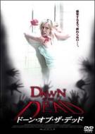


33
23.91%
R3 Exlusive Director's HK Version: 


22
15.94%
R3 Director's: 


27
19.57%
None, they all suck!
14
10.14%
Voters: 138. You may not vote on this poll
Which "Dawn of the Dead" (2004) cover do you like best?
 10-13-04 | 10:25 AM
#1
Thread Starter
TOTY Winner 2018 and Inane Thread Master
Joined: Dec 2003
Posts: 54,137
Received 1,725 Likes
on
1,415 Posts
From: "Are any of us really anywhere?"
Which "Dawn of the Dead" (2004) cover do you like best?
Their are so many different incarnations of the upcoming and already released Director's Cut/Theatrical Cut that I was wondering which you thought was the best looking.
I actually sold my R3 disc only and kept the art because I don't like the upcoming R1 art which is where this poll arises...
I actually sold my R3 disc only and kept the art because I don't like the upcoming R1 art which is where this poll arises...
 10-13-04 | 11:00 AM
#4
DVD Talk Godfather
Joined: Jul 2000
Posts: 54,199
Likes: 0
Received 1 Like
on
1 Post
From: City of the lakers.. riots.. and drug dealing cops.. los(t) Angel(e)s. ca.
Originally posted by TylerDurden_73
The region 3 version...SOmething about zombified girls, gets me every time
The region 3 version...SOmething about zombified girls, gets me every time

I liked that one as a poster, not so much as a dvd cover.
10-13-04 | 11:11 AM
#5
DVD Talk Limited Edition
The region 2 cover is a picture of Sarah Polley trying to escape from her bathroom window at the beginning of the film.... And the effect around the edges is tons of zombie hands grabbing towards her. I kinda like it, but prefer the original US Theatrical Poster, and the R3 theatrical dvd cover with the guy on it.
10-13-04 | 11:47 AM
#9
Even though it seems to be a poster for a different movie, I like this image the best.
I thought the Region 1 covers looked terrible, but looks like the cover to some lazy street cornor bootleg.
I assume that was Silly Groucho who proclaimed it his favorite.
I thought the Region 1 covers looked terrible, but
looks like the cover to some lazy street cornor bootleg.I assume that was Silly Groucho who proclaimed it his favorite.
 10-13-04 | 01:40 PM
#12
Thread Starter
TOTY Winner 2018 and Inane Thread Master
Joined: Dec 2003
Posts: 54,137
Received 1,725 Likes
on
1,415 Posts
From: "Are any of us really anywhere?"
i was going with the zombie girl too, but the eyes don't really look zombified and what is with the shapeshifting squares...seems more appropriate for "Resident Evil 1"...anyway i like the subtle, no reveal of the R2 Premium.
10-13-04 | 01:59 PM
#13
Moderator
Originally posted by Crocker Jarmen
I assume that was Silly Groucho who proclaimed it his favorite.
I assume that was Silly Groucho who proclaimed it his favorite.
Seantn, thanks for the description of the Region 2 cover. I can see it now.
10-13-04 | 02:21 PM
#15
DVD Talk Limited Edition
R3 without a doubt. I love that poster.
10-13-04 | 02:37 PM
#16
Originally posted by Numanoid
"a masterful horror pig"?
"a masterful horror pig"?
Forgive my literalness if you were just being silly.
 10-13-04 | 02:46 PM
#18
DVD Talk Hero
Joined: Aug 1999
Posts: 34,257
Received 2,052 Likes
on
1,394 Posts
From: Not necessarily Formerly known as Solid Snake
As of my vote for "None," the R3 Director's is leading with 14 votes and the R2 Premium is just 2 votes behind (12). "None" has 6 votes.
I guess the R1 stuff comes closest to capturing the essence of the movie (which is what a poster or cover should do). But none of them quite capture it . . . the blood spattered addition adds a little more, but the one zombie offset to the side of the cover is rather plain.
The R2 Premium looks like it should be for a made for TV movie with Judd Nelson . . .
. . . the zombie girl is neat to look at, but does little to convey any message.
The R2 Director's with Sarah Polley looks like it is straight from the 70's. While the composition is neat and the colors are meaningful, again it doesn't convery much about the movie.
10-13-04 | 03:09 PM
#19
DVD Talk Legend
r1 theatrical.
 10-13-04 | 06:24 PM
#22
Originally posted by Abob Teff
The R2 Premium looks like it should be for a made for TV movie with Judd Nelson . . .
The R2 Premium looks like it should be for a made for TV movie with Judd Nelson . . .

Originally posted by Daniel Windsor

Oh, I went ahead and went with R1 (Theatrical)
10-14-04 | 09:50 AM
#23
Thread Starter
TOTY Winner 2018 and Inane Thread Master
Joined: Dec 2003
Posts: 54,137
Received 1,725 Likes
on
1,415 Posts
From: "Are any of us really anywhere?"
why are the R1's so lame anyway? what's with the orange...any significance?
10-14-04 | 10:04 AM
#24
Originally posted by scott1598
why are the R1's so lame anyway? what's with the orange...any significance?
why are the R1's so lame anyway? what's with the orange...any significance?