


Work In Progress: Seinfeld
 01-19-07 | 01:54 PM
#1
Thread Starter
Senior Member
Joined: Dec 2001
Posts: 845
Likes: 0
Received 0 Likes
on
0 Posts
From: Tennessee
Work In Progress: Seinfeld
Well, I have had a hard time finding custom Seinfeld DVD Covers to my liking, so with that as my usual motivation and inspiration (along with a desire to maximize shelf space), I have set out to make my own.
I have decided to condense the series down to two volumes per 8 disc box (w/1" spine), so the series will be split into four cases: Seasons 1-3, 4-5, 6-7, and 8-9. This actually works well in terms of the four main characters, featuring one on each case. Also, this is my first attempt at a spanning spine image.
The background New York pics (which I have shaded blue) were actually taken by me and my wife on a trip in 2005.
Any comments or suggestions are welcome.
Last edited by Commander Dan; 02-20-07 at 12:06 PM.
 01-21-07 | 12:27 PM
#4
Bye
VERY nice, Dan!!!  I did something similar for my "Seinfeld Uncensored" DVD project for PDTV, and I'm curious... what fonts did you use for the text on the back? The ones I used were acceptable, but I don't think I got it exactly right.
I did something similar for my "Seinfeld Uncensored" DVD project for PDTV, and I'm curious... what fonts did you use for the text on the back? The ones I used were acceptable, but I don't think I got it exactly right.
01-23-07 | 03:36 PM
#5
Thread Starter
Senior Member
Joined: Dec 2001
Posts: 845
Likes: 0
Received 0 Likes
on
0 Posts
From: Tennessee
Originally Posted by Mike Adams
and I'm curious... what fonts did you use for the text on the back? The ones I used were acceptable, but I don't think I got it exactly right.
The covers should be available soon. I just need to look them over for any errors (feel free to post if you see any in the samples above), and do a final printing to make sure the spine image lines-up reasonably well.
01-23-07 | 03:53 PM
#6
DVD Talk Special Edition
Nice job, I really like your choices for the scenes on the back covers. I'm a graphic design student, and the only thing I might suggest is to try switching the color of the text on the far right from yellow outlined with red, to red outlined with yellow, it might make it look more consistent with the rest of the cover.
01-23-07 | 10:56 PM
#7
Bye
Originally Posted by Commander Dan
The font used throughout is Futura Medium.
01-24-07 | 12:47 PM
#8
Thread Starter
Senior Member
Joined: Dec 2001
Posts: 845
Likes: 0
Received 0 Likes
on
0 Posts
From: Tennessee
Many thanks to all for the kind words.
T-bone, I originally rendered the vertical text on the front-right of the cover red with the yellow border, but decided it was not as legible against the blue background as when I reversed the colors. Indeed, I am usually big on continuity. But in this case, I decided it would not be too big a deal since the text on the front is somewhat disassociated with the text on the spine and the back.
I still preferred the red text w/ yellow border on the spine and the back (largely due to legibility issues), and ultimately decided not to reverse those colors.
01-24-07 | 02:29 PM
#9
DVD Talk Godfather
I like the idea of Monk's in the background is great(something I considered for my set but couldn't find a usable image), but the characters, as it stands, don't work for me.
These are for standard 8 disc cases, right? If so, right now you have the characters spilling onto the front and back of the image. It looks fine laying flat in the previews, but it won't when wrapped around a case.
For reference:


Looks kinda odd with a stray eyeball on the left and really detracts from the design. As a matter of fact it is the first thing your eye sees because it doesn't flow properly.
These are for standard 8 disc cases, right? If so, right now you have the characters spilling onto the front and back of the image. It looks fine laying flat in the previews, but it won't when wrapped around a case.
For reference:
Looks kinda odd with a stray eyeball on the left and really detracts from the design. As a matter of fact it is the first thing your eye sees because it doesn't flow properly.
01-24-07 | 02:53 PM
#10
Bye
Originally Posted by Michael Corvin
These are for standard 8 disc cases, right? If so, right now you have the characters spilling onto the front and back of the image. It looks fine laying flat in the previews, but it won't when wrapped around a case.
...
Looks kinda odd with a stray eyeball on the left and really detracts from the design. As a matter of fact it is the first thing your eye sees because it doesn't flow properly.
...
Looks kinda odd with a stray eyeball on the left and really detracts from the design. As a matter of fact it is the first thing your eye sees because it doesn't flow properly.
(Doesn't show the back of course, but it's the only image I had readily available. I'll change the photo once I get home from work so you can see the full cover.)
Last edited by Mike Adams; 01-24-07 at 02:56 PM.
01-24-07 | 03:23 PM
#11
DVD Talk Godfather
T-bone, where are you going to school? What year are you? I graduated in 999-00 with a Graphics degree.
Please do. I did one for the bonus disc to match season 1 & 2 in the same style as the retail pack(and what you have there). Is that something you recorded yourself? I have three(I think) bonus discs myself, all official.
A few things I notice:
- it is a little too pastel purple for me looks Easter-ish.
- the "sticker" looks nice, but not covering so much of the image, it is encroaching on Jerry's head. Maybe a bit smaller
- the DVD logo should be at the bottom, I believe it is on 99.9% of covers and looks out of place at the top
- the spacing between the photo/seinfeld logo/uncensored text isn't consistent. There is a tiny gap, a small gap and then a bigger gap. The logo is too close to the photo.
- the photo looks washed out and may need some level adjustments, but isn't too bad
Well you got my worst. All constructive criticism of course.
Here are the ones I did: Corvin's Seinfeld Collection They are a year out of date, as you will notice the backs of most are the same with placeholder screen grabs. I need to update it. It's hard to tell from the low res preview, but the background is a low opacity layer of all the famous lines and -isms from the show.
Originally Posted by Mike Adams
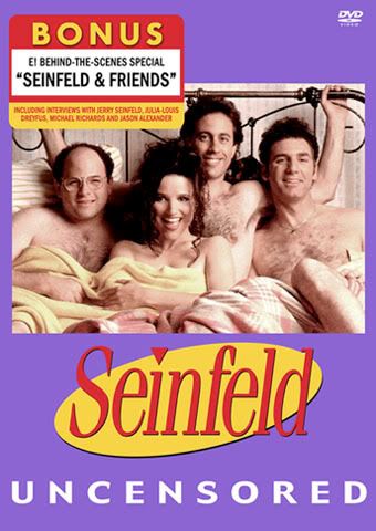
I agree. Didn't see that right away, but you're right. I'm curious to know what you'd think of my "Seinfeld Uncensored" cover:
(Doesn't show the back of course, but it's the only image I had readily available. I'll change the photo once I get home from work so you can see the full cover.)
(Doesn't show the back of course, but it's the only image I had readily available. I'll change the photo once I get home from work so you can see the full cover.)
A few things I notice:
- it is a little too pastel purple for me looks Easter-ish.
- the "sticker" looks nice, but not covering so much of the image, it is encroaching on Jerry's head. Maybe a bit smaller
- the DVD logo should be at the bottom, I believe it is on 99.9% of covers and looks out of place at the top
- the spacing between the photo/seinfeld logo/uncensored text isn't consistent. There is a tiny gap, a small gap and then a bigger gap. The logo is too close to the photo.
- the photo looks washed out and may need some level adjustments, but isn't too bad
Well you got my worst. All constructive criticism of course.
Here are the ones I did: Corvin's Seinfeld Collection They are a year out of date, as you will notice the backs of most are the same with placeholder screen grabs. I need to update it. It's hard to tell from the low res preview, but the background is a low opacity layer of all the famous lines and -isms from the show.
01-24-07 | 03:51 PM
#12
Thread Starter
Senior Member
Joined: Dec 2001
Posts: 845
Likes: 0
Received 0 Likes
on
0 Posts
From: Tennessee
Originally Posted by Michael Corvin
I like the idea of Monk's in the background is great(something I considered for my set but couldn't find a usable image), but the characters, as it stands, don't work for me.
These are for standard 8 disc cases, right? If so, right now you have the characters spilling onto the front and back of the image. It looks fine laying flat in the previews, but it won't when wrapped around a case.
Looks kinda odd with a stray eyeball on the left and really detracts from the design. As a matter of fact it is the first thing your eye sees because it doesn't flow properly.
It may indeed look odd, but this is a design choice of which I was fully aware when designing this layout. In fact, not only was I aware that the spine image would wrap around from front to back, I deliberately intended it that way.
The whole intent was to take the spine image and wrap a small portion of it around to the front and the back, where it would essentially serve as a left-hand border for the main image on the front, and a right-hand border for the info on the back. I have already done two test printings and I am more than satisfied with the look achieved when in the case.
Michael, if you are interested, I would be more than happy to send you a high rez image of my "Tom's Restaurant" pic, and in turn, you are welcome to use it. My wife and I hung around long enough to get a shot with relatively few people in it.
Last edited by Commander Dan; 01-25-07 at 09:50 AM.
01-24-07 | 03:58 PM
#13
Bye
Originally Posted by Michael Corvin
Please do. I did one for the bonus disc to match season 1 & 2 in the same style as the retail pack(and what you have there). Is that something you recorded yourself? I have three(I think) bonus discs myself, all official.
A few things I notice:
- it is a little too pastel purple for me looks Easter-ish.
- the "sticker" looks nice, but not covering so much of the image, it is encroaching on Jerry's head. Maybe a bit smaller
- the DVD logo should be at the bottom, I believe it is on 99.9% of covers and looks out of place at the top
- the spacing between the photo/seinfeld logo/uncensored text isn't consistent. There is a tiny gap, a small gap and then a bigger gap. The logo is too close to the photo.
- the photo looks washed out and may need some level adjustments, but isn't too bad
Well you got my worst. All constructive criticism of course.
- The color prints out slightly darker than shown on the screen. The key to doing covers of course is to design for print, not the web. ColorSync can only do so much.
 Still, I see your point. When I chose the color, only the first two volumes had been released, both in blue. I didn't scan the box and sample the color, but the purple I used was sort of based on the blue of the first two seasons, especially the shade that actually comes out of the printer. I actually had no idea the seasons would be different colors, but when Season 4 came out in what looked to me to be a bit of "Easter egg green", it seemed to support my choice of purple for "Uncensored" (In fact it matches Season 5 rather well when printed out). I'll fiddle around with the color when I'm scaling down the full cover to show you, and if I find a better shade, I might go with it. Copies have already been distributed as-is though, so it's pretty much set in stone.
- The idea for the "sticker" really came out of necessity -- there's a caption on the photo, so I had to cover it. I agree that design-wise it's not placed in an ideal spot, but it kind of adds realism, since encroachment on the photo wouldn't really be much of an issue with a factory-placed sticker. The real stickers on those sets are worse about that than mine. They're intended to be removed, so it's not so much of an issue. The only difference is that mine doesn't come off.
- The DVD logo is where it is to balance out the top half of the image. In fact, most of the season boxes (if not all) have the "Seinfeld" logo and other text at the top, but with mine I switched it to the bottom, again out of necessity because the sticker works better at the top (and the real ones are usually along the bottom). To use a term from the show, it's the "Bizarro" cover, in terms of color, composition, and just about everything else.
- You're probably right about the spacing issue, although I was looking at an actual cover when I did that. I can do some tweaking and see if making the space even between the elements looks better. It's been a long time so I don't really remember, but it could have been that having everything evenly-spaced looked too amateurish, like text without kerning. I probably squished things together in places for the sake of balance, but I may have failed.
- The photo is definitely the "problem child" of the design, as it was originally a low-res jpeg, and is actually the only non-vector item on the whole cover (except for another small photo on the spine). Still, the colors print darker than they are, and also because this was created on a Mac, it might not look quite right on a PC display. Seeing the real thing might help, but I will definitely take your advice into consideration when I look at the actual cover.
Here are the ones I did: Corvin's Seinfeld Collection They are a year out of date, as you will notice the backs of most are the same with placeholder screen grabs. I need to update it. It's hard to tell from the low res preview, but the background is a low opacity layer of all the famous lines and -isms from the show.
My luck in starting threads has been anything but good lately, but now that I've registered with photobucket, I'll start a thread for my covers so you and the other artists can share constructive criticism and also post theirs. See you over there!
Last edited by Mike Adams; 01-24-07 at 04:02 PM.
01-25-07 | 08:27 AM
#15
DVD Talk Godfather
there's a caption on the photo, so I had to cover it.
Here is mine in the vein of the original packaging: Corvin's Seinfeld Best Buy Bonus DVD Cover
As for the set, I saved a ton of magazines featuring Seinfeld over the course of it's run. All the caricatures came from Entertainment Weekly. Just scanned 'em in and cleaned 'em up.
Sorry about the hijack Commander Dan. Thanks for the photo offer, but since my set is done I doubt I will need it.
01-25-07 | 02:54 PM
#16
Bye
Originally Posted by Michael Corvin
Ahh, that explains a lot of what you have going.
Here is mine in the vein of the original packaging: Corvin's Seinfeld Best Buy Bonus DVD Cover
Here is mine in the vein of the original packaging: Corvin's Seinfeld Best Buy Bonus DVD Cover
Yep, I downloaded that cover from somewhere shortly after doing mine and went "Daaamn!" Pretty good work there.Don't forget to check out the other thread for the full version. One question, though. How do you create the 3D preview images (i.e., the cover wrapped around a 3D Amaray case)? That'd be great to do for my Yahoo group.
Last edited by Mike Adams; 01-25-07 at 03:00 PM.
01-26-07 | 09:58 AM
#17
DVD Talk Godfather
Well, the custom way is just to do it in photoshop. Distort the image at the right angle, add a border and shadows/highlights.
Or you can just use imandix located at the url of the same name.
Or you can just use imandix located at the url of the same name.
01-26-07 | 03:11 PM
#18
Bye
Originally Posted by Michael Corvin
Well, the custom way is just to do it in photoshop. Distort the image at the right angle, add a border and shadows/highlights.
Or you can just use imandix located at the url of the same name.
Or you can just use imandix located at the url of the same name.
I'd download imandix, but it's Windows-only, and I'm on a Mac (of course I could still run it under VirtualPC). I'll probably just start doing something like that in Lightwave once I find a good 3D model of an Amaray case. It's about time I started actually using the app since I've had it for years.
01-26-07 | 03:19 PM
#19
Bye
By the way Michael, I didn't mean to discourage you by offering a rebuttal to some of the points you brought up about my Seinfeld cover. I'm self-taught, but I recognize the value of advice from someone who's had years of education and training. I'll usually explain why I made the choices I did when someone offers criticism, but I don't necessarily assume they're correct, nor do I begrudge anyone for making suggestions.
With that said, check the "PDTV covers..." thread if you want to see the full Seinfeld Uncensored cover, among others.
With that said, check the "PDTV covers..." thread if you want to see the full Seinfeld Uncensored cover, among others.
01-26-07 | 03:58 PM
#20
Bye
Wow!!! 
I just downloaded imandix on my PC here at work (don't tell anyone), and it is freakin' AWESOME!!! OMG, it is so easy to use, and my covers look SO fantastic wrapped around a virtual Amaray case. I haven't played around with the settings much, but this is the best utility I've seen since Delicious Library!!!
Thanks SO much for telling me about that, Michael!
EXAMPLES:
Last edited by Mike Adams; 01-26-07 at 05:22 PM.
