


What's happening to the colours??!!


 09-13-07, 02:12 PM
#27
Suspended
Thread Starter
Originally Posted by devilshalo
You ever heard of Earl Scheib, homes?
I didn't know about tungsten film but I have always associated the too-blue look with heavy CGI work as if the the too-blue tint was somewhat associated with CGI effects, the worst example being Van Helsing, a film so dark and depressing in its CGI excess it can easily be mistaken with the film going on behind your own closed eyelids at any time.
Last edited by baracine; 09-13-07 at 02:23 PM.
09-13-07, 03:14 PM
#28
DVD Talk Legend
I've noticed a lot of this in the horror films of the past few years. A lot of them have that 'stained yellow' look, like the Texas Chainsaw Massacre remake. Or there's the contrasty look of things like recent Tony Scott films. I think a lot of this stuff is going to look dated in ten years, sort of like the overuse of colored lighting in late 80s/early 90s movies.
09-14-07, 08:13 AM
#29
Suspended
Thread Starter
Baracine's theory of "film gris-bleu"
This is just a maybe but maybe films have changed their looks because filmmakers are more and more cost-conscious and no one relies on sunny days or exotic locations in these days of climate change as everything can be shot on a crappy day in some backlot and later colour-corrected or else shot on blue(!)-screen and filled in with CGI and all through these complicated processes it is somewhat safer to set the scenes at night or indoors or in overcast weather and some technician is bound to confuse tungsten film with outdoor film...
So this means no more sunrises, no more sunsets, no more shooting at noon or in June, no more highly-paid actors standing under the hot sun (God forbid!) or painstakingly matching the changing shadows of late afternoon from shot to shot.
You also have to factor in that as more and more filmmakers and film technicians are computer geeks, they have probably never seen the sunshine or the great outdoors and it is not one of their top visual priorities.
The ironic thing is that as live-action films are getting greyer an greyer, CGI animation is getting better and better at conveying the impression of real sunshine, something conventional animation never did convincingly.
Last edited by baracine; 09-14-07 at 08:28 AM.
09-14-07, 10:10 AM
#30
Senior Member
Join Date: Apr 2002
Posts: 495
Likes: 0
Received 0 Likes
on
0 Posts
Originally Posted by DRG
I've noticed a lot of this in the horror films of the past few years. A lot of them have that 'stained yellow' look, like the Texas Chainsaw Massacre remake. Or there's the contrasty look of things like recent Tony Scott films. I think a lot of this stuff is going to look dated in ten years, sort of like the overuse of colored lighting in late 80s/early 90s movies.
i hate this orange-ish 'gritty' look, it's so overused. I miss the look of the 80's horror movies
Last edited by eiker_ir; 09-14-07 at 10:37 AM.
10-14-07, 10:11 AM
#33
DVD Talk Legend
Originally Posted by baracine
This is just a maybe but maybe films have changed their looks because filmmakers are more and more cost-conscious and no one relies on sunny days or exotic locations
and some technician is bound to confuse tungsten film with outdoor film...
Look at the film Payback. After the director was removed from the post-production, a decision to subdue the colors and add a blue tint to the print was made. For the more recent director's cut, the colors of the original negative were re-instated. It's obvious from this example that the color grading was a conscious decision made for stylistic reasons, neither unintentional nor made to compensate for technical shortcomings.
http://www.dvdtalk.com/reviews/read.php?ID=27248
10-14-07, 10:48 AM
#34
Suspended
Thread Starter
Originally Posted by Jay G.
That doesn't make sense, since color grading can work both ways; altering a scene to look bright and sunny can be done if wanted. Heck, I've seen scenes that looked like they were shot outside in the sunshine that were indoor set shots simulated with just lighting.
Look at the film Payback. After the director was removed from the post-production, a decision to subdue the colors and add a blue tint to the print was made. For the more recent director's cut, the colors of the original negative were re-instated. It's obvious from this example that the color grading was a conscious decision made for stylistic reasons, neither unintentional nor made to compensate for technical shortcomings.
http://www.dvdtalk.com/reviews/read.php?ID=27248
http://www.dvdtalk.com/reviews/read.php?ID=27248
On the DVD transfer front, however, we seem to have also more and more instances of computer-nerd-intervention contrary to the wishes of the director. The last scandal/debate, of course, is about Bram Stoker's Dracula whose latest SD/BR transfer has different colours from the colours everyone knows and loves and is so dark, about 55 % of the film is now unwatchable and a lot of very expensive and elaborate in-camera special effects are now invisible. Nobody pretends that the colours are not different and the film is not darker than it used to be but the company responsible for the transfer (Sony) argues that they followed the director's intentions by using his preferred answer print as a model.
As a translator, I translate this to mean: "We fucked up solid by letting the computer nerds in control of artistic decisions but no one is going to rock the boat by admitting that anything is wrong."
Last edited by baracine; 10-14-07 at 01:30 PM.
10-14-07, 11:00 AM
#35
Suspended
Thread Starter
Originally Posted by FRwL
What is it with orange/brown and 70s movies? Those colors were everywhere then.
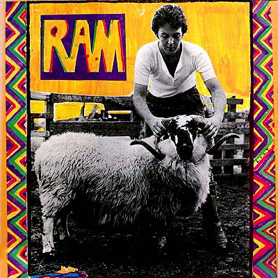
Paul and Linda McCartney's homemade cover for the LP "Ram" (1971)
The "back to nature" brown and orange combo found its way into fashion, furniture, telephones, drapes, linoleum, counter and desk tops, fridge doors, cars and even building facades. Another favourite universal colour was avocado, which was a survival of the sixties.

Organge and brown print dress (70's, http://paperdress.co.uk/index.php?ma...=index&cPath=3)
Oh, it was a dark age, all right!
I'm rewatching The Exorcist (1973) right now (the excellent 2000 transfer) and noticing that those colours are almost completely absent from the main characters' posh environment and wardrobe, in order to suggest Georgetown "class" and "respectability", and replaced by subdued greys, blues, beiges and ivories, with the occasional intrusion of salmon, coral, red, gold and deep chocolate brown. Outside the doctor'soffice whose carpet is burnt orange, brown and orange are practically only found in Regan's world: her bedroom drapes are yellow, white and orange, her childish decorations are orange and so are some of her artistic (and sometimes obscene) dabblings in plasticine sculpture. Of course, some of her pustules and vomit are also brown and orange.

Last edited by baracine; 10-14-07 at 01:27 PM.
10-14-07, 04:13 PM
#36
DVD Talk Godfather
Originally Posted by baracine
the film describes the sun going down on a snowy, overcast Dec. 23 in Delaware...(The film is really very, very atmospheric and believable.)
10-14-07, 05:12 PM
#37
Banned
Join Date: Feb 2002
Posts: 7,982
Likes: 0
Received 0 Likes
on
0 Posts
Originally Posted by baracine
So I'm watching Wind Chill (2007), a new rental with Emily Blunt which looks like it might develop into an OK thriller. I'm 20 minutes into the movie when I am totally distracted by the absence of TRUE COLOUR. Everything is too blue and too cold. There is no true red or yellow anywhere. I know the film is set in winter on a Delaware highway and that the colour (or absence of it) is supposed to add (or substract) to (from) the atmosphere. But I have this terrible sense of d�j� vu. I am reminded how all the recent Spielberg movies I hated are gradually being drained of all colour, how Peter Jackson's King Kong was a two-strip colour atrocity - mango and aquamarine - and even Lord of the Rings was at times altogether too icy blue and depressing. Too much Mordor and not enough Shire, for my taste.
And then there are the new DVD transfers of old movies that are all over the place colour-wise, but usually (it's the fashion right now, it'll pass) with way too much golden yellow and done in a way to move as far away as possible from the original Technicolor cheeriness.
Besides recommending I have my eyes checked, has anybody else noticed this and is there a name for it? Is digital film blueish just like cheap Eastmancolor used to be brownish? Do we just have to live with this or what?
I've written to Ebert and also Rouper and they never answered my question on this. Now at least I get my answer with this thread after asking this question to everyone since 2 years after THE MATRIX came out. Because that's when I started to notice t.v., movies, commercials and even print ads with the icy blue, greenish tint.
10-14-07, 05:25 PM
#38
DVD Talk Legend
Originally Posted by baracine
Is digital film blueish just like cheap Eastmancolor used to be brownish?
10-14-07, 05:27 PM
#39
Banned
Join Date: Feb 2002
Posts: 7,982
Likes: 0
Received 0 Likes
on
0 Posts
Originally Posted by baracine
This is just a theory on my part but you have omitted the second part of my reasoning, which I think balances it out and makes it at least plausible.
This is a true horror story.
On the DVD transfer front, however, we seem to have also more and more instances of computer-nerd-intervention contrary to the wishes of the director. The last scandal/debate, of course, is about Bram Stoker's Dracula whose latest SD/BR transfer has different colours from the colours everyone knows and loves and is so dark, about 55 % of the film is now unwatchable and a lot of very expensive and elaborate in-camera special effects are now invisible. Nobody pretends that the colours are not different and the film is not darker than it used to be but the company responsible for the transfer (Sony) argues that they followed the director's intentions by using his preferred answer print as a model.
As a translator, I translate this to mean: "We fucked up solid by letting the computer nerds in control of artistic decisions but no one is going to rock the boat by admitting that anything is wrong."
10-14-07, 06:36 PM
#40
I really don't like it when movies are tinted. I think The Matrix looks terrible but I actually really like what they did with the director's cut of Troy. I think it looks fantastic.
As for Traffic, Soderberg was the DP on that film. On the Criterion DVD he talks extensively about his decision to tint certain scenes blue and yellow. It's a great movie I absolutely love it.
As for Traffic, Soderberg was the DP on that film. On the Criterion DVD he talks extensively about his decision to tint certain scenes blue and yellow. It's a great movie I absolutely love it.
10-14-07, 08:18 PM
#41
DVD Talk Legend
Originally Posted by baracine
This is just a theory on my part but you have omitted the second part of my reasoning, which I think balances it out and makes it at least plausible.
On the DVD transfer front, however, we seem to have also more and more instances of computer-nerd-intervention contrary to the wishes of the director.
The last scandal/debate, of course, is about Bram Stoker's Dracula whose latest SD/BR transfer has different colours from the colours everyone knows and loves...
From the BD review on this site:
http://www.dvdtalk.com/reviews/review.php?ID=30820
Since my publication of this review, I have conversed with Kim Aubry, post production supervisor on the 1992 release of Dracula and freelance producer of the bonus content on this new release. According to Kim, "I was never satisfied that home video and TV editions of Dracula looked much like the release prints that were sent to movie theaters back in 1992....The feeling in the home video business was: the transfer had to be bright, it had to be saturated and colorful, it had to "punch" and it had to exist within the very limited palette of NTSC TV specifications. Allowing a diffuse shadowy background set to taper off to obscurity...that level of subtlety could not be seen or reproduced by most TVs, and so the levels were cranked up. TV versions of Dracula revealed much more of Dracula's castle set backgrounds than the original film prints did." Kim adds, "Simply put, the newer transfers are much closer to the final answer print which was the filmmaker's ideal at the time. What I can tell you is that this new HD transfer is as close (overall) to MY memory of the original film as anything that I have seen, and I worked round-the-clock completing Dracula in Summer-Fall 1992. (I saw a LOT of answer prints and release prints at a LOT of screenings.)" (Note: These comments are the sole opinion of Kim Aubry and are not to be considered official statements by Sony or American Zoetrope).
Furthermore, renowned film restorer Robert Harris (he of Lawrence of Arabia fame) also gave the transfer high marks, echoing many of Kim's comments, stating that the limitations of older televisions required home video editions that looked quite different from the original theatrical release. He goes on to call it "one of the most perfect [releases] to come from the Sony vaults."
Furthermore, renowned film restorer Robert Harris (he of Lawrence of Arabia fame) also gave the transfer high marks, echoing many of Kim's comments, stating that the limitations of older televisions required home video editions that looked quite different from the original theatrical release. He goes on to call it "one of the most perfect [releases] to come from the Sony vaults."
10-14-07, 08:44 PM
#42
Suspended
Thread Starter
Originally Posted by Jay G.
I wouldn't say everyone "knows and loves" the color saturation you're talking about, since previous video releases artificially enhanced the color and brightness in the film over what existed in the theatrical print, and from the director-approved Criterion LD. For people who saw the film in theaters, and for those who actually worked on the film, the BD release is apparently a much more accurate representation of the film's color palette than the video releases you've become accustomed to were.
From the BD review on this site:
http://www.dvdtalk.com/reviews/review.php?ID=30820
From the BD review on this site:
http://www.dvdtalk.com/reviews/review.php?ID=30820
You are also aware of the (totally arbitrary) colour changes that were done to Disney's Peter Pan's most recent DVD transfer. All in all, what started as a joke theory of mine (uneducated computer nerds who have never seen the sunshine other than in a video game are responsible for this mess) is starting to look more and more like a definite possiblity.
Last edited by baracine; 10-14-07 at 08:47 PM.
10-14-07, 10:30 PM
#43
Senior Member
Join Date: Jan 2004
Location: Simi Valley, CA
Posts: 570
Likes: 0
Received 0 Likes
on
0 Posts
Originally Posted by Jay G.
The blue-screen bit? That part's even less plausible, since digital compositing makes simulating daylight even easier, not harder. Star Wars Ep2 had digital composites that simulated outdoors at sunset, so it's not likely that the compositing is a limiting factor in the range of colors used.
Film to video transfers aren't an exact science of course; there's lots of fiddling that's needed to approximate the theatrical experience. However, I haven't heard of an instance where the "computer-nerds" doing the transfer drastically altered the color palette on a whim. In fact, all the instances of color desaturation or tinting you've cited existed in the original theatrical prints.
I wouldn't say everyone "knows and loves" the color saturation you're talking about, since previous video releases artificially enhanced the color and brightness in the film over what existed in the theatrical print, and from the director-approved Criterion LD. For people who saw the film in theaters, and for those who actually worked on the film, the BD release is apparently a much more accurate representation of the film's color palette than the video releases you've become accustomed to were.
From the BD review on this site:
http://www.dvdtalk.com/reviews/review.php?ID=30820
Yes, the transfer is different than the previous releases. No doubt. I believe the claim here is that this is the closest representation of the filmmakers ideal, and to the original theatrical release. I also believe they have said the previous transfers were not close to what the directed intended. If you don't like the new one, that�s fine. There are 2 other DVD releases that will probably fit your needs. But all this shit on these boards perpetuated by a few people here is asinine.
Last edited by Carcosa; 10-14-07 at 10:56 PM.
10-14-07, 11:42 PM
#44
DVD Talk Legend
Originally Posted by baracine
[The debate] rages on, of course, but I think it's been pretty well established that the reviewers are wrong, the Sony/Zoetrope representative....
The point is, this film was transfered to HD with the oversight of someone from Zoetrope who was there to represent Coppola's wishes, and has gained the approval of professionals who worked on the film for its original theatrical release. Even in the highly debatable possibility that these people are wrong, it's obvious the changes were made with the best of intentions, and not to usurp the original image with one some random person arbitrarily thought "better."
[F]urthermore, Robert Harris' arguments are totally gaga and contradictory. (He is essentially shilling for the people who gave him the multi-million dollar contract for the photo-chemical restoration of the Godfather trilogy...
....while not volunteering any information or even any opinion about the changes in colour...
http://www.hometheaterforum.com/htf/...d.php?t=262992
"The color in this release finally matches that of the original prints -- controlled, colorful when necessary -- but dark. The blacks on this release work well, and shadow detail, when needed is at hand.
Resolution is beautiful. Flesh tones, for both the living as well as the dead, replicate the original tones of the first 35mm prints."
He also says things like "film cannot be transferred to video" and a lot of other nonsense
"One cannot replicate film on video."
There's quite a difference between saying something can't be replicated on video and saying something can't be transferred to video. What Robert Harris actually said was correct: Film can't be replicated on video, it can only be approximated on video, given the constraints of the particular video format's resolution, contrast, and color capabilities. The new BD release is a closer approximation than previous video releases because previous video transfers had to deal with the technical limitations of inferior quality video.
You are also aware of the (totally arbitrary) colour changes that were done to Disney's Peter Pan's most recent DVD transfer.
That said, it's possible that the new Peter Pan release got the colors wrong. Again, though, it's highly doubtful that the changes were "totally arbitrary." Most likely they were made in an attempt to more accurately portray the original film print on video.
Also, what image is "better" or "worse" to one's eyes is totally arbitrary. For example, in the link below a poster at HTF posted a comparison between the '91 LD and '07 DVD as an example of the LD's superiority, when to my eyes the '07 DVD looks the better of the two (Wendy's bed sheets look appropriately white in the new release, as opposed the the blueish tint of the LD).
http://www.hometheaterforum.com/htf/...7&postcount=21
The point is that there are numerous examples of directors consciously using muted colors and various tints for their films, and just because you don't personally like them doesn't mean that such images are "wrong" or contrary to what the director intended or what was originally shown in theaters. Film and color restoration goes both ways: sometimes it restores the color to the higher saturation level of the original, and sometimes it restores the color to the more muted tones of the original.
10-15-07, 12:59 AM
#45
Senior Member
Join Date: Jan 2004
Location: Simi Valley, CA
Posts: 570
Likes: 0
Received 0 Likes
on
0 Posts
Here is the quote by Kim Aubrey....
"If the electronic transfer of the film that you are seeing reveals grain structure...that is, if you are SEEING the film grain, then by definition, you are seeing all of the sharpness that was captured by the film camera. We can�t manufacture sharpness or definition in the telecine process. It is true that in the standard definition home video era, it was common to dial in some electronic edge enhancement to overcome the limitations of NTSC Video and television receivers of that era. And it was common in pre HD transfers to �filter out� the grain giving movies more of a �TV look� which was considered desirable at that time. But the �detail enhancement� they used in that era was erzatz definition....fake. An illusion of detail. Again, if you are seeing �tons of grain� then you are seeing a faithful reproduction of the film element.
American Zoetrope, Francis Coppola�s company does not own (and has never owned) the facilities to do feature film telecine mastering...aka the film transfer. The studio that OWNS the title (in this case Columbia-Sony) owns Dracula and they commissioned and paid for the new transfer in (UPDATED) 2006 because they believed that the old one was wanting. I agreed with them. I was post production executive on the film in 1991-1992 and I always was horrified at what the home video and TV editions of Dracula looked like because they were so far from what Coppola and Ballhaus had done for the original release prints. So orange-y. So bright. Zoetrope�s role in the new transfer was to make sure that the transfer colorist had access to a pristine original �final answer print� to screen and refer to. A final answer print is a vaulted 35mm film print in Sony�s possession that bears a signature from the original production indicating that the director or director of photography was satisfied with the color timing and that this print was to be the gold standard...the reference for all 35mm release prints to be compared with and accepted/rejected. It was a controversial answer print at the time. It was dark. The soundtrack was considered very avant-garde. Coppola was breaking rules. Some critics appreciated it, others did not."
Boy, I can't believe these lying bastards expect us to believe THAT. They certainly have less credibility than those who are leveling the charges againt them.
Uh...yeah.
10-15-07, 03:32 AM
#46
DVD Talk Hall of Fame
Join Date: Aug 2002
Location: Sitting on a beach, earning 20%
Posts: 9,917
Likes: 0
Received 3 Likes
on
3 Posts
Originally Posted by The Bus
How can the film be interesting and believable? Nothing interesting happens in Delaware.
10-15-07, 05:26 AM
#47
Suspended
Thread Starter
Jay G, if you've followed the debate, no one is arguing (anymore) that the new transfer of Dracula follows the initial theatrical release's colours. And if they do, they are lying. Harris is guilty of saying both that the new transfer is more faithful to the original release AND that the way the film looked in theaters is no indication of the director's intentions AND "that there is no worse way to see a film than in a theatre" or some such nonsense (this guy doesn't take any chances: please see http://www.hometheaterforum.com/htf/...2&postcount=49 ). The only one who didn't speak about the new transfer so far is Coppola because he has everything to lose if he does. But the book Coppola and his scriptwriter authored in 1992 about the filming process is a very clear indication of the way the film should look. And no director insists on a transfer that hides the special effects he put so much time and effort in creating.
This is one example among many, many others. This is Davy Mack's capture of a scene that is supposed to show a superimposition of Harker's journal (on the left part of the image) over a scene of him lighting a candle and getting out of his room. The superimposition part is totally obscured - even in Torch Mode. Check it out. I've tried everything to make this disk "reveal" what it simply hasn't got. It goes without saying that people who haven't seen the film in its previous incarnations, people who dont know the film and people who don't care about the film will never notice this little missing detail, which is only one in a thousand.

Harris, furthermore, never says that he has seen the famous answer print, just that he trusts blindly in the competence of the DVD authors.
And, just to be clear, neither the latest incarnation of Dracula nor Peter Pan are restorations. They are simply transfers. The original film elements have not been altered, thank God. And have you even seen the new Dracula? It is truly an abomination. It is the first DVD I have ever encountered - except for cheap DVD bootlegs of VHS tape - whose shadow detail (when it is at all present and which is not often) can't be viewed properly in anything other than Torch Mode on a high-definition set.
As I said repeatedly, and I don't want to repeat here what has been said over 30 pages of debate in three different threads (one of which has been "locked down" by HTF) and the consensus that has been reached among the purchasers of the new version that they have been lied to and that this transfer is worthy of a recall if only for technical incompetence (the pixilation problem at the start of every chapter on the SD version), this is not malicious. It is simply the result of delegating an important job to people who were not involved in the artistic process and who have carte blanche to do what they want in the digital domain according to their limited knowledge and abilities and their misunderstanding of the director's original intentions.
Mr. Aubry has been lobbying to get as many reviewers as possible to change their original negative estimation of this disk (with form letters) and has only succeeded so far in intimidating the DVDTalk HD reviewer - who only did so under duress and with great reservations. Mr. Aubry didn't need to bother with the DVDTalk SD reviewer who had never even seen the original transfers.
And Harris may be getting paid by Paramount/Dreamworks but he is working with the Coppola people daily in his restoration of The Godfather. It is only to be expected that he would go to bat for the people he works with every day. But what he in fact says - and nothing else, really - is that people like you and me shouldn't bother to have an opinion.
P.S.: I have said everything I want to say on this subject and the prospect of explaining everything three times to people like Carcosa is just beyond my limited abilities.
This is one example among many, many others. This is Davy Mack's capture of a scene that is supposed to show a superimposition of Harker's journal (on the left part of the image) over a scene of him lighting a candle and getting out of his room. The superimposition part is totally obscured - even in Torch Mode. Check it out. I've tried everything to make this disk "reveal" what it simply hasn't got. It goes without saying that people who haven't seen the film in its previous incarnations, people who dont know the film and people who don't care about the film will never notice this little missing detail, which is only one in a thousand.
Harris, furthermore, never says that he has seen the famous answer print, just that he trusts blindly in the competence of the DVD authors.
And, just to be clear, neither the latest incarnation of Dracula nor Peter Pan are restorations. They are simply transfers. The original film elements have not been altered, thank God. And have you even seen the new Dracula? It is truly an abomination. It is the first DVD I have ever encountered - except for cheap DVD bootlegs of VHS tape - whose shadow detail (when it is at all present and which is not often) can't be viewed properly in anything other than Torch Mode on a high-definition set.
As I said repeatedly, and I don't want to repeat here what has been said over 30 pages of debate in three different threads (one of which has been "locked down" by HTF) and the consensus that has been reached among the purchasers of the new version that they have been lied to and that this transfer is worthy of a recall if only for technical incompetence (the pixilation problem at the start of every chapter on the SD version), this is not malicious. It is simply the result of delegating an important job to people who were not involved in the artistic process and who have carte blanche to do what they want in the digital domain according to their limited knowledge and abilities and their misunderstanding of the director's original intentions.
Mr. Aubry has been lobbying to get as many reviewers as possible to change their original negative estimation of this disk (with form letters) and has only succeeded so far in intimidating the DVDTalk HD reviewer - who only did so under duress and with great reservations. Mr. Aubry didn't need to bother with the DVDTalk SD reviewer who had never even seen the original transfers.
And Harris may be getting paid by Paramount/Dreamworks but he is working with the Coppola people daily in his restoration of The Godfather. It is only to be expected that he would go to bat for the people he works with every day. But what he in fact says - and nothing else, really - is that people like you and me shouldn't bother to have an opinion.
P.S.: I have said everything I want to say on this subject and the prospect of explaining everything three times to people like Carcosa is just beyond my limited abilities.
Last edited by baracine; 10-15-07 at 08:09 AM.
10-15-07, 08:10 AM
#48
DVD Talk Legend
Originally Posted by baracine
Jay G, if you've followed the debate, no one is arguing (anymore) that the new transfer of Dracula follows the initial theatrical release's colours. And if they do, they are lying. Harris is guilty of saying both that the new transfer is more faithful to the original release AND that the way the film looked in theaters is no indication of the director's intentions....
This is one example among many, many others. This is Davy Mack's capture of a scene that is supposed to show a superimposition of Harker's journal (on the left part of the image) over a scene of him lighting a candle and getting out of his room. The superimposition part is totally obscured - even in Torch Mode.
Harris, furthermore, never says that he has seen the famous answer print, just that he trusts blindly in the competence of the DVD authors.
And, just to be clear, neither the latest incarnation of Dracula nor Peter Pan are restorations. They are simply transfers.
"They've screened the original approved answer print and have meticulously matched the HD master to that print.
This is done in the same way that one would restore a film."
It is the first DVD I have ever encountered - except for cheap DVD bootlegs of VHS tape - whose shadow detail (when it is at all present and which is not often) can't be viewed properly in anything other than Torch Mode on a high-definition set.
It is simply the result of delegating an important job to people who were not involved in the artistic process and who have carte blanche to do what they want in the digital domain according to their limited knowledge and abilities and their misunderstanding of the director's original intentions.
And Harris may be getting paid by Paramount/Dreamworks but he is working with the Coppola people daily in his restoration of The Godfather. It is only to be expected that he would go to bat for the people he works with every day.
10-15-07, 08:45 AM
#49
Suspended
Thread Starter
Originally Posted by Jay G.
Except Carcosa's post proves that it wasn't Coppola, but Sony that made the Dracula transfer, so bad-mouthing it if it was truly bad shouldn't endanger his relationship there. Even if it did, It's Paramount that's paying him, as you said, and not Zoetrope, as you earlier implied.
Furthermore, Harris' specialty is film restoration not DVD authoring, despite his tendency to make general disheartening pronouncements like "film cannot be replicated on video" and it is quite clear that he is speaking out of turn - but out of loyalty - and only to save the reputation of everyone involved in this utter fiasco.
Once again, if you want to research this, you are welcome to peruse the dozens of pages that thave been written on the subject by far worthier people than yours truly. If you have any new information on this case or even an informed opinion, feel free to post on both those DVD Talk and HD Talk threads, which are still up and running - unlike the HTF thread which has been locked down and censored.
As for myself, I don't need anyone to question my video equipment or my ability to perceive colours. My advice to you is to check out the DVD transfer for yourself before you write another line and pray to God that you hair doesn't turn white with horror from the experience - or worse.
<object width="425" height="350"><param name="movie" value="http://www.youtube.com/v/bwYzyRfNFn0"></param><param name="wmode" value="transparent"></param><embed src="http://www.youtube.com/v/bwYzyRfNFn0" type="application/x-shockwave-flash" wmode="transparent" width="425" height="350"></embed></object>
I also refer you to our own Shannon Nutt's review of the Blu-Ray DVD on DVD Empire (http://www.dvdempire.com/Exec/v4_ite...or=1#topoftabs ):
See the title character shielding his eyes on the box cover for this Blu-ray release of Bram Stoker�s Dracula? That�s not because of the sunlight, that�s because he caught a glimpse of the horrible transfer Francis Ford Coppola�s movie has been given in high-def (and presumingly on the standard DVD special edition as well).
How bad is the video on this Blu-ray release? Well, if I hadn�t known going in, I would have swore I was watching a standard DVD...and a poor one at that. Not only is the picture �soft,� with tons of grain and little definition, but even the color that stood out in previous releases of Bram Stoker�s Dracula has been pulled back or removed all together for an earthier and muddier look.
How bad is the video on this Blu-ray release? Well, if I hadn�t known going in, I would have swore I was watching a standard DVD...and a poor one at that. Not only is the picture �soft,� with tons of grain and little definition, but even the color that stood out in previous releases of Bram Stoker�s Dracula has been pulled back or removed all together for an earthier and muddier look.
Last edited by baracine; 10-15-07 at 10:24 AM.
10-15-07, 12:19 PM
#50
Senior Member
Join Date: Jan 2004
Location: Simi Valley, CA
Posts: 570
Likes: 0
Received 0 Likes
on
0 Posts
Reading thru the statement for this argument for the �4th time�, I have to make note AGAIN the crux of the point seems to be (once again) accusing all those who claim that this transfer is correct of lying for various self serving reasons.
There is no proof of this. The accusers have NO inside knowledge of this. They have simply decided that this MUST be the case, as they see it. Since the transfer doesn't live up to memory or expectations, it is therefor simply wrong. All involved with this "fiasco" are wrong. Their opinions are based SOLEY on speculation and no actual facts of any kind. They have attempted to trash the reputation of the professionals involved based on NOTHING but their opinion that the transfer is NOT what its claimed to be.
It is clear that the poster doesn�t like the new transfer. If he thinks it sucks, that certainly is no problem. I haven�t compared it to the SuperBit DVD, and I will be buying it just to do so. The irony here is I may actually AGREE with the poster's preference regarding which edition is personally preferable. But I cannot accept the purely emotional argument that has been presented here. Its completely paranoid and illogical.