


Jan. 3rd 2019 Upgrade Master Thread
 01-03-19, 08:58 PM
#51
DVD Talk Godfather
Join Date: Oct 2003
Location: Home of 2013 NFL champion Seahawks
Posts: 52,634
Received 1,016 Likes
on
840 Posts
Re: Jan. 3rd 2019 Upgrade Master Thread
I had the all-caps issue with the old site.
Forum is completely unusable on IE11, and I know no one else uses IE, but it’s my default browser at work. But maybe it’s for the best as I shouldn’t be hanging out here during work hours anyway.
Forum is completely unusable on IE11, and I know no one else uses IE, but it’s my default browser at work. But maybe it’s for the best as I shouldn’t be hanging out here during work hours anyway.
 01-03-19, 09:20 PM
#53
DVD Talk Legend
Re: Jan. 3rd 2019 Upgrade Master Thread
It's unusable on Mozilla as well. Opera seems fine so far.
01-03-19, 09:40 PM
#54
Premium Member
Join Date: Jan 2000
Location: Grazing in a field somewhere...
Posts: 23,630
Received 695 Likes
on
465 Posts
Re: Jan. 3rd 2019 Upgrade Master Thread
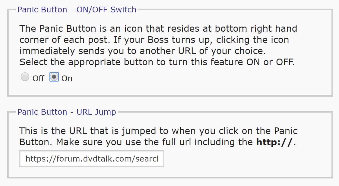
Boooo... The "Panic" button is gone. But the settings for it remain in the User CP. I used this all the time as my "New Posts" button and set it so the URL Jump didn't include the politics forum. BIG bummer.
01-03-19, 09:57 PM
#55
DVD Talk Limited Edition
Re: Jan. 3rd 2019 Upgrade Master Thread
I just tried editing a post and none of the buttons work once you get into it. I edited and then tried to save and the button does nothing. Same with cancel, go advanced, or delete.
01-03-19, 10:32 PM
#57
DVD Talk Hero
Re: Jan. 3rd 2019 Upgrade Master Thread
The forum looks clunky as shit now. The vast majority of time I spend here is done through my phone but I still use the “Full site” option. It looks like I’m going to have to get used to using the mobile site because this full site looks like ass. I’ll give it a few days to see if I can get used to it but if I don’t, I can see myself spending less and less time here.
 01-03-19, 10:50 PM
#59
Re: Jan. 3rd 2019 Upgrade Master Thread
I use Firefox 99% of the time with the rest split between IE and Edge (for specific sites I need at work). The site is partially broken with FF - the headers are completely missing (as shown in BigDave's post above - although the videogame section has always looked a bit different). It looks the same in Edge as it does with FF and is completely unusable with IE (though why anyone would use that browser unless absolutely required is a mystery).
I checked it on a chromebook I have for work testing. It looks the same as on FF but is glitchy and laggy. Scrolling the page is partially unresponsive, the parts that remain stationary (header for a minute and the side ad(s)) drag things down (I use uMatrix on FF and don't let any of that useless JAVA crap run so don't see those - just a huge white expanse).
The reviews section is almost completely broken. Links to reviews work but I've yet to find one that actually loads the review text.
Did anyone actually test this layout/design with *real* users? You know... people like us who don't design sites for a living (IMHO most of those folks have little idea about what makes good design sense and usability). The new design smacks of "Hey! Look what we can do! I bet people will love it!" crap so common in "modern" sites.
PLEASE - roll this "update" back to the prior design. It was usable and functional.
01-03-19, 10:59 PM
#60
DVD Talk Gold Edition
Re: Jan. 3rd 2019 Upgrade Master Thread
I'm using Chrome,and the forum has become unusable. i'm done posting here.
01-03-19, 11:21 PM
#63
DVD Talk God
Re: Jan. 3rd 2019 Upgrade Master Thread
It's not broken for me on Chrome. But, I'm not a fan of making the pages scroll all the way back to the 1st page. If it's a really long thread, it makes posting tedious.
01-04-19, 12:29 AM
#64
Banned
Join Date: May 2006
Location: Conducting miss-aisle drills and listening to their rock n roll
Posts: 20,052
Received 168 Likes
on
126 Posts
Re: Jan. 3rd 2019 Upgrade Master Thread
This is too drastically different all at once. I prefer the old desktop version. On my end the desktop version now looks like the mobile version. I would prefer it the way it used to look.
Also the font looks too big.
Also the font looks too big.
01-04-19, 12:30 AM
#65
Banned
Join Date: May 2006
Location: Conducting miss-aisle drills and listening to their rock n roll
Posts: 20,052
Received 168 Likes
on
126 Posts
Re: Jan. 3rd 2019 Upgrade Master Thread
And wheres the quick navigation to another sub forum?
it used to be in the bottom right of every page.
it used to be in the bottom right of every page.
01-04-19, 12:57 AM
#66
DVD Talk Legend
Re: Jan. 3rd 2019 Upgrade Master Thread
I agree, the new format sucks, but to be fair, many members regularly complained about the previous one.
01-04-19, 01:11 AM
#67
DVD Talk Limited Edition
Re: Jan. 3rd 2019 Upgrade Master Thread
Roll back the update. Don't care for this new format.
01-04-19, 02:51 AM
#68
Re: Jan. 3rd 2019 Upgrade Master Thread
I mostly use mobile. I can barely read a reply (small font). Can't tell which sections have new content. If it takes me longer to find content or view content, I will come here less. Most times I only have a few minutes to browse and this new format takes longer and is more difficult to find what I want to read.
01-04-19, 04:15 AM
#69
DVD Talk Ultimate Edition
Re: Jan. 3rd 2019 Upgrade Master Thread
People posting about white space on the right, do you have ad blocking? Cuz I’m getting ads over there. I’m using the iPad Chrome app which doesn’t have an ad block option.
01-04-19, 05:46 AM
#70
DVD Talk Legend
Re: Jan. 3rd 2019 Upgrade Master Thread
On my laptop, 15.4" WS LCD, 1366 x 768, 2.5" of white space over to the right with everything scrunched over to the left, the header looks ridiculous.
A lot of people use their home computers to access this site, you CAN'T leave them behind, they'll just stop coming here.
Still looks dumb as shit, you're already losing users.
A lot of people use their home computers to access this site, you CAN'T leave them behind, they'll just stop coming here.
Still looks dumb as shit, you're already losing users.
01-04-19, 06:08 AM
#71
DVD Talk Legend
Re: Jan. 3rd 2019 Upgrade Master Thread
Honestly, the site looks like a mess and the reason is because the update made the forum more ad friendly instead of user friendly. I don't mind ads on the side, top and bottom of the screen but I do mind the ads between the posts. Made everything harder to read and follow. At the end of the day, I don't see how this "update" improves anything and brings more users to this site.
01-04-19, 07:09 AM
#72
DVD Talk Legend
Re: Jan. 3rd 2019 Upgrade Master Thread
 01-04-19, 07:20 AM
#73
Re: Jan. 3rd 2019 Upgrade Master Thread
I'm going to let it grow on me a bit. If you're worried about the panic button, Alt-tab does just as good a job if you're going to get found out by the boss. I'd like the font to be a little bigger on the post typing screen. This old bastard has trouble seeing small things these days (no dick jokes please).
01-04-19, 07:21 AM
#74
DVD Talk Limited Edition
Re: Jan. 3rd 2019 Upgrade Master Thread
Yeah, between the ads between posts and on the side, there's way too much going on. It's a huge step backwards for the site.
01-04-19, 07:28 AM
#75
DVD Talk Legend
Re: Jan. 3rd 2019 Upgrade Master Thread
In some ways you can never win. How long were people complaining "Update your site, you are so behind the times!," then the site is updated and people are saying, "The old site was the best, why did you update it?!"
I'm going to let it grow on me a bit. If you're worried about the panic button, Alt-tab does just as good a job if you're going to get found out by the boss. I'd like the font to be a little bigger on the post typing screen. This old bastard has trouble seeing small things these days (no dick jokes please).
I'm going to let it grow on me a bit. If you're worried about the panic button, Alt-tab does just as good a job if you're going to get found out by the boss. I'd like the font to be a little bigger on the post typing screen. This old bastard has trouble seeing small things these days (no dick jokes please).