


Work in Progress: Twilight Zone custom covers
 08-04-03, 03:37 PM
#1
Member
Thread Starter
Join Date: May 2003
Posts: 194
Likes: 0
Received 0 Likes
on
0 Posts
Work in Progress: Twilight Zone custom covers
Seeing as I haven't had any luck getting thinpak scans, I decided to go another route...

Bigger version
This is still a work in progress. Those of you familiar with my Star Trek Next Gen and DS9 covers know that I like continuing spine shots. These will be designed for 6/7 disc cases. I have 46 volumes, including the American Masters special on Rod Serling that came with the 40th anniversary Gift Set. If I did my math right, that means 3 six disc cases and 4 seven disc cases. Those that do not have that can substitute a seven case for another sixer for a total of 45.
I imagine the fronts won't be anything special. They will probably be just like the fronts of the 9 disc Collector's sets. Maybe someday I will try collages on the fronts featuring the various episodes.
Anyway, hopefully I will have them done in a week or two. I'll be glad to have one uniform collection instead of the various size cases I have now. Not only was my collection mixed with thins and regular Amarays... the 40th Anniv Gift Set came in Jewel boxes!
Let me know what you think.
Ric
 08-31-03, 03:45 PM
#2
Senior Member
Join Date: Mar 2002
Location: Toledo, Ohio
Posts: 822
Likes: 0
Received 0 Likes
on
0 Posts
Very good Ric. I see you went for "darkness". And that you decided to use the whole area of the spines instead of framing it like I did. The only reason I used the white background was to match the white quintuple keepcases I decided to use. I'm curious about how many people, if any, downloaded my TZ cover set from the Greek's Site. I'm sure yours will be a roaring success since you are so well liked. I'm interested in what your fronts will look like.
08-31-03, 10:04 PM
#3
DVD Talk Godfather
Dragonslayers weren't bad. I liked 'em. I like these as well. I am interested to see the fronts and backs though before I make judgement.
I think these are a better way to go than printing 45 thins vs. 7. Economical.
As for the spine it almost makes me want to finish getting the set. I am 20 behind.
I think these are a better way to go than printing 45 thins vs. 7. Economical.
As for the spine it almost makes me want to finish getting the set. I am 20 behind.
09-01-03, 07:55 AM
#5
Member
Thread Starter
Join Date: May 2003
Posts: 194
Likes: 0
Received 0 Likes
on
0 Posts
Dragonslayer,
It was your excellent TZ set that inspired me to give it a shot. Although, t's such a big project that I have been avoiding it lately!
Ever think of uploading your TZ covers to DVD Cover Art? What I like about that site is that you can keep track of how many downloads your covers get.
I'll probably post an update later tonight of where I am on this project.
Ric
09-01-03, 09:52 AM
#6
Senior Member
Join Date: Mar 2002
Location: Toledo, Ohio
Posts: 822
Likes: 0
Received 0 Likes
on
0 Posts
Ever think of uploading your TZ covers to DVD Cover Art?
09-01-03, 10:36 AM
#7
Senior Member
Join Date: Mar 2002
Location: Toledo, Ohio
Posts: 822
Likes: 0
Received 0 Likes
on
0 Posts
So is anyone else converting to Thinpaks? I started my conversion by trimming the existing covers
09-01-03, 12:18 PM
#9
Member
Thread Starter
Join Date: May 2003
Posts: 194
Likes: 0
Received 0 Likes
on
0 Posts
I got the shots with Power DVD from the actual episodes.
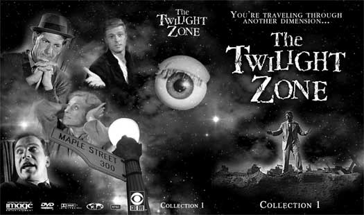
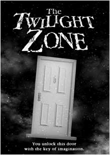
Here is my latest spine shot:
I decided to get rid of the giant TZ banner going across the whole thing. It was hard to get them to line up perfectly and this made more room to make the images bigger.
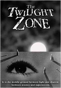
Here's what I have been doing with the covers...
Collection 1
Bigger View
Collection 2
Bigger View
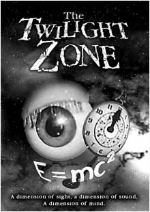
Collection 7
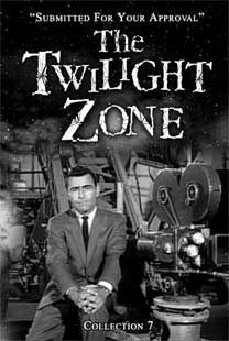
Bigger View
As you can see, I have been experimenting this different TZ Logos and fonts and where to put the "taglines"
I really like the TZ logo on Collection 2, but it was the one created for the 80's version of the TZ.
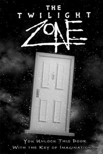
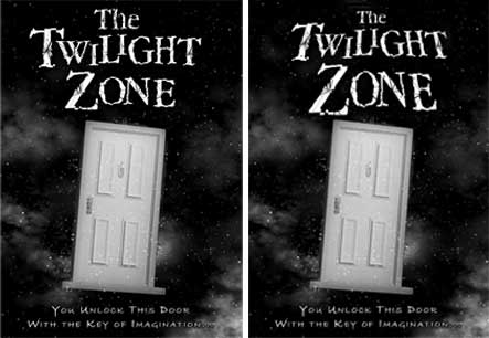
What I am leaning toward is not putting the collection number on the front, (just the spine) and having the tagline underneath the picture. I am also thinking of using the original logo, but just reworked and streamlined a bit for the fronts. Below is a shot of the before and after TZ logo.
Well, that's what I have done so far. Your thoughts are always welcome.
Ric
Here is my latest spine shot:
I decided to get rid of the giant TZ banner going across the whole thing. It was hard to get them to line up perfectly and this made more room to make the images bigger.
Here's what I have been doing with the covers...
Collection 1
Bigger View
Collection 2
Bigger View
Collection 7
Bigger View
As you can see, I have been experimenting this different TZ Logos and fonts and where to put the "taglines"
I really like the TZ logo on Collection 2, but it was the one created for the 80's version of the TZ.
What I am leaning toward is not putting the collection number on the front, (just the spine) and having the tagline underneath the picture. I am also thinking of using the original logo, but just reworked and streamlined a bit for the fronts. Below is a shot of the before and after TZ logo.
Well, that's what I have done so far. Your thoughts are always welcome.
Ric
09-01-03, 05:23 PM
#10
Senior Member
Join Date: Mar 2002
Location: Toledo, Ohio
Posts: 822
Likes: 0
Received 0 Likes
on
0 Posts
I got the shots with Power DVD from the actual episodes.
I decided to get rid of the giant TZ banner going across the whole thing. It was hard to get them to line up perfectly and this made more room to make the images bigger.
I personally don't like the banner & font on Collection 2. It doesn't have the "consistency" of appearance that the other one does.
What I am leaning toward is not putting the collection number on the front, (just the spine) and having the tagline underneath the picture
Perhaps I should have used Rod on the spinal image or the front cover images.
Are you going to list individual episodes on the back covers or use inserts for that job?
This thread seems to be a two-way conversation. It is looking real nice Ric.
Last edited by Dragonslayer; 09-01-03 at 05:26 PM.
09-01-03, 06:51 PM
#11
Member
Thread Starter
Join Date: May 2003
Posts: 194
Likes: 0
Received 0 Likes
on
0 Posts
This thread seems to be a two-way conversation.
What about the slightly modified logo on the side be side image of collection 2? Is that one alright... or will purists recoil in horror?
I'm also thinking of maybe changing the position of the tagline throughout the sets. It just seems that sometimes it works better at the top, or under the TZ, or at the bottom. Any thoughts on that? Does it need to always be in the same place for consistancy, or should I be able to move it around as the cover suits me?
About my taking the shots from the episodes with Power DVD, you said,
That's one way of doing it.
About my taking off the bigger banner on the spines... One of the reasons I did it was I was afraid it was looking too similar to yours! I think it works this way, and gives me more breathing room for the pix.
No episodes on the back... just collages. I suppose I will have to do inserts. I'll probably keep them very simple.
I imagine this is going to take me quite awhile, because I must go through a bunch of episodes picking out what I want to use for images. Hopefully, I will end up with something that looks like it was worth the effort.
Thanks for your comments Jeff, and if anyone else wants to give me their two cents... I'm listening!
Ric
Last edited by Ric Easton; 09-01-03 at 06:54 PM.
09-01-03, 11:23 PM
#12
Senior Member
Join Date: Mar 2002
Location: Toledo, Ohio
Posts: 822
Likes: 0
Received 0 Likes
on
0 Posts
What about the slightly modified logo on the side be side image of collection 2? Is that one alright... or will purists recoil in horror?
What's the other way? If there is an easier way... lemme know!
I'm also thinking of maybe changing the position of the tagline throughout the sets. It just seems that sometimes it works better at the top, or under the TZ, or at the bottom. Any thoughts on that? Does it need to always be in the same place for consistency, or should I be able to move it around as the cover suits me?
About my taking off the bigger banner on the spines... One of the reasons I did it was I was afraid it was looking too similar to yours! I think it works this way, and gives me more breathing room for the pix.
I suppose I will have to do inserts. I'll probably keep them very simple.
I imagine this is going to take me quite awhile, because I must go through a bunch of episodes picking out what I want to use for images. Hopefully, I will end up with something that looks like it was worth the effort.
quote:This thread seems to be a two-way conversation.
Well at least I'm no longer talking to myself!
Well at least I'm no longer talking to myself!
09-01-03, 11:55 PM
#13
Senior Member
Join Date: Mar 2002
Location: Toledo, Ohio
Posts: 822
Likes: 0
Received 0 Likes
on
0 Posts
You know Ric if I were to do my TZ cover over I'd do away with the circular image of Rod on the back. I was trying to mirror the circular "CBS DVD" circle from the front. In retrospect I don't think it looks that good. I'm not sure though what I'd do instead.
The hardest part of the whole project was getting the lettering of the episodes to be the same size. The text tool of Paint Shop Pro was not very helpful in doing that. It was very tedious & time consuming to get all the lettering the same size on every cover.
The hardest part of the whole project was getting the lettering of the episodes to be the same size. The text tool of Paint Shop Pro was not very helpful in doing that. It was very tedious & time consuming to get all the lettering the same size on every cover.
Last edited by Dragonslayer; 09-02-03 at 12:00 AM.
09-06-03, 06:24 PM
#15
Defunct Account
Join Date: Dec 1999
Location: State College, PA
Posts: 5,920
Likes: 0
Received 0 Likes
on
0 Posts
If I may add my $0.02 worth, I really like these covers. I bought these DVDs as they were released, so I have them in the original cases (except for the volumes that came in the gift set.) These are so nice, I'm thinking of converting to the 'bricks' when you are done.
One comment: I think a listing of the episodes in each volume on the back cover would be a big plus. The collages look great, but from a practical point it would be easier to find the episode you want if you didn't have to open up each case.
Here's an idea: What about a custom booklet with the episodes in each volume? You could have it so that you print out two sheets on both sides, fold and staple them. Then you'd have a cover, and one 'page' per volume. You could keep the book in the first volume. Hmmm, the more I think about it, the better I like it.
Keep up the good work.
-Videophile
Keep up the good work.
09-06-03, 06:35 PM
#16
Senior Member
Join Date: Mar 2002
Location: Toledo, Ohio
Posts: 822
Likes: 0
Received 0 Likes
on
0 Posts
One comment: I think a listing of the episodes in each volume on the back cover would be a big plus. The collages look great, but from a practical point it would be easier to find the episode you want if you didn't have to open up each case.

 09-06-03, 08:32 PM
#17
Member
Thread Starter
Join Date: May 2003
Posts: 194
Likes: 0
Received 0 Likes
on
0 Posts
NP, Dragonslayer!
Yours definately has its pluses, including the episode listings. I also like how you were able to colorize certain aspects of it.
As for mine, I had been thinking about making an insert for each one listing the episodes. But I also was thinking of trying to make a little booklet listing the episodes in broadcast order and which collection and disk it would be on.
I haven't worked on this thing at all lately, some projects just seem to big, ya know? I'll try to get back into it soon though.
Ric
09-13-03, 11:48 PM
#18
Member
Thread Starter
Join Date: May 2003
Posts: 194
Likes: 0
Received 0 Likes
on
0 Posts
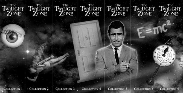
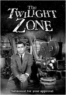
Here are the fronts of all 7 editions. To see them bigger including the spines and the back covers (which are collages from the episodes) click on the links below the covers.
#1

Bigger version including back cover
#2
Bigger Version
#3
Bigger Version
#4

Bigger Version
#5
Bigger Version
#6

Bigger Version
#7
Bigger Version
As you can see, I decided to go with listing the volumes on the spines, instead of calling them Collection 1, 2 etc. Maybe it will make it easier when trying to locate an episode.

The first 3 volumes would be six disc cases, the next 3 would be 7 disc cases. The final case would either be a six or a seven, that would include Volumes 40 -43 plus the two "Treasures of" collections (which for the sake of the spine, I am calling Volumes 44 and 45) and if you have it, The American Masters Documentary on Serling that came with the 40th Anniversary Gift Set.
I admit, the quality of some of the pictures leaves a little to be desired. I started taking screen caps from the DVDs, but that was incredibly labor intensive. So, many of the pictures I took from the web, and did what I could with them. I have them all printed up and sitting on my shelf, and overall, I think they look pretty good, though they may not be up to DVD Cover Art's high standards. I'll have to see if they accept them or not. But for anyone interested, I should have the Hi-res versions up on my site in a day or so.
I'll get to work on inserts after I recover!
Ric
#1
Bigger version including back cover
#2
Bigger Version
#3
Bigger Version
#4
Bigger Version
#5
Bigger Version
#6
Bigger Version
#7
Bigger Version
As you can see, I decided to go with listing the volumes on the spines, instead of calling them Collection 1, 2 etc. Maybe it will make it easier when trying to locate an episode.
The first 3 volumes would be six disc cases, the next 3 would be 7 disc cases. The final case would either be a six or a seven, that would include Volumes 40 -43 plus the two "Treasures of" collections (which for the sake of the spine, I am calling Volumes 44 and 45) and if you have it, The American Masters Documentary on Serling that came with the 40th Anniversary Gift Set.
I admit, the quality of some of the pictures leaves a little to be desired. I started taking screen caps from the DVDs, but that was incredibly labor intensive. So, many of the pictures I took from the web, and did what I could with them. I have them all printed up and sitting on my shelf, and overall, I think they look pretty good, though they may not be up to DVD Cover Art's high standards. I'll have to see if they accept them or not. But for anyone interested, I should have the Hi-res versions up on my site in a day or so.
I'll get to work on inserts after I recover!
Ric
Last edited by Ric Easton; 09-14-03 at 12:05 AM.
09-14-03, 03:36 PM
#19
Senior Member
Join Date: Mar 2002
Location: Toledo, Ohio
Posts: 822
Likes: 0
Received 0 Likes
on
0 Posts
Looks pretty good Ric. I used a starfield image that I found on the Internet for the background. The objects on the starfield came from a VHS tape box as did the lettering which I modified. I believe that giving the Volumes on the spine is better that saying Collections Ric.
