


View Poll Results: Which DVD Cover should Lion's Gate use for The Cookout


Voters: 194. You may not vote on this poll
Which DVD Cover for 'The Cookout' - YOU GET TO DECIDE <<< Vote Now
 09-13-04, 06:25 PM
#1
Registered
Thread Starter
Join Date: Jan 1999
Location: Marblehead, MA
Posts: 6,948
Likes: 0
Received 0 Likes
on
0 Posts
Which DVD Cover for 'The Cookout' - YOU GET TO DECIDE!
Lions Gate Home Entertainment needs your help. DVD Talkers get to vote for which DVD Cover they'll use for the DVD Release of 'The Cookout' (on DVD January 2005)
This is an EXCLUSIVE opportunity for you to help decide what cover this DVD will have.
Vote now:
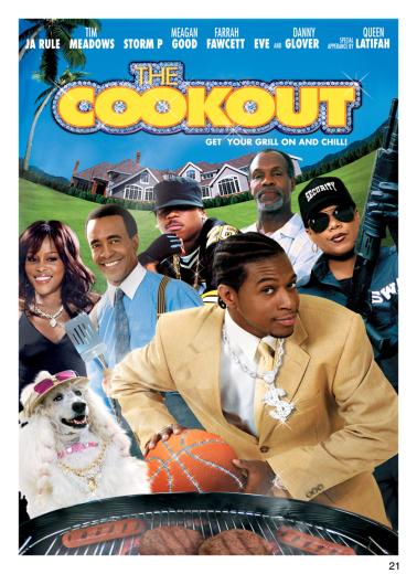
The Cookout Cover #1:
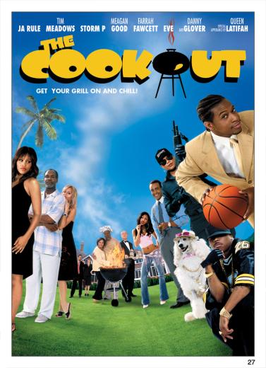
The Cookout Cover #2:

The Cookout Cover #3:
In addition to voting please post your thoughts on the covers and why you chose the one you chose.
Thanks!
Geoff
This is an EXCLUSIVE opportunity for you to help decide what cover this DVD will have.
Vote now:
The Cookout Cover #1:
The Cookout Cover #2:
The Cookout Cover #3:
In addition to voting please post your thoughts on the covers and why you chose the one you chose.
Thanks!
Geoff


 09-14-04, 10:30 AM
#14
Member
Join Date: Dec 2002
Location: Melbourne, FL
Posts: 187
Likes: 0
Received 0 Likes
on
0 Posts
Originally posted by MrE
Number 1 is the best of a so-so group, although they should use "The Cookout" logo for option 3. But none of them makes me salivate.
Number 1 is the best of a so-so group, although they should use "The Cookout" logo for option 3. But none of them makes me salivate.
09-14-04, 10:44 AM
#15
Member
Join Date: Mar 2004
Location: vienna/austria
Posts: 69
Likes: 0
Received 0 Likes
on
0 Posts
my vote: #2
number 1 is way too crowded... it'll disappear on the shelf... it's 'best-buy camouflage'
but none of the choices blew me away... standard fare... floating head overkill...
but what do i know, i'm a graphics designer, and clients choose the draft i deem the most ugly 9 out of 10 times...
number 1 is way too crowded... it'll disappear on the shelf... it's 'best-buy camouflage'
but none of the choices blew me away... standard fare... floating head overkill...
but what do i know, i'm a graphics designer, and clients choose the draft i deem the most ugly 9 out of 10 times...
09-14-04, 11:31 AM
#17
Moderator
These are all terrible. 2 & 3 are virtually identical. I abstain.
A better idea would be to get the cover art community to submit their ideas. I bet anybody over in the cover art forum could whip something better up in 5 minutes.
A better idea would be to get the cover art community to submit their ideas. I bet anybody over in the cover art forum could whip something better up in 5 minutes.
09-14-04, 02:53 PM
#20
Member
Join Date: Aug 2004
Location: 'cuse, NY
Posts: 153
Likes: 0
Received 0 Likes
on
0 Posts
Originally posted by MrE
Number 1 is the best of a so-so group, although they should use "The Cookout" logo for option 3. But none of them makes me salivate.
Number 1 is the best of a so-so group, although they should use "The Cookout" logo for option 3. But none of them makes me salivate.
09-14-04, 04:40 PM
#21
Senior Member
Join Date: Sep 2001
Location: D/FW, Texas
Posts: 961
Likes: 0
Received 0 Likes
on
0 Posts
I voted #3 because I hate the "Big Head Syndrome" of DVD covers. I would much prefer "wasted space" than the crowding of the first example. Not that I have any interest in this particular movie, but the whimsical font of the third cover also seemed most appropriate.
09-14-04, 07:26 PM
#22
Member
Join Date: Dec 2001
Location: At the 2.20 Aspect Ratio
Posts: 69
Likes: 0
Received 0 Likes
on
0 Posts
Why is the Ad Arts (movie posters, billboards, DVD covers, VHS covers, even the sticky wall snipes) for African-American cinema alway so damn chump?
The studios clock huge profit margins from these films, yet they get treated like dirty step children...
The studios clock huge profit margins from these films, yet they get treated like dirty step children...
09-14-04, 09:04 PM
#23
DVD Talk Special Edition
Join Date: Jul 2003
Location: Falls Church, VA
Posts: 1,038
Likes: 0
Received 0 Likes
on
0 Posts
#1 and #3. Absolutely hate the "bling-bling" title for the movie on #1, but the close-up on the characters is more appealing. Like the font used on the title for #3, and think the grill substituting for the o makes for a unique and easy way for the movie to stand out.
God, I just noticed the "diamonds" on the basketball. Horribly tacky. Make a fourth cover with the title/non-bling of #3 and the main photo of #1.
God, I just noticed the "diamonds" on the basketball. Horribly tacky. Make a fourth cover with the title/non-bling of #3 and the main photo of #1.