


20,000 Leagues Under the Sea Custom
 05-21-03, 05:47 PM
#1
DVD Talk Ultimate Edition
Thread Starter
20,000 Leagues Under the Sea Custom
I had nothing to do today, and I decided to make a custom cover for Disney's 20,000 LUTS.
Thoughts? Comments?

Thoughts? Comments?
 05-21-03, 05:56 PM
#2
DVD Talk Ultimate Edition
Thread Starter
Meant to ask this question, is there a way in Photoshop to fade text colors?
I ws thinking fading the special features text from that dark blue to white, because I'm not sure how well the white on very light blue will print.
I ws thinking fading the special features text from that dark blue to white, because I'm not sure how well the white on very light blue will print.
05-21-03, 06:03 PM
#3
DVD Talk Limited Edition
I think you can (I can in Paint shop Pro) but I would reconsider because if the background is going light blue to dark blue and the text is going the other way, somewhere in the middle the colors will be the same:
Bkgd: light blue --> medium blue -->blue-->dark blue-->very dark blue
Text: very dark blue-->dark blue-->blue-->medium blue-->light blue
Bkgd: light blue --> medium blue -->blue-->dark blue-->very dark blue
Text: very dark blue-->dark blue-->blue-->medium blue-->light blue
05-21-03, 11:08 PM
#6
DVD Talk Limited Edition
Join Date: Jan 2001
Location: Bay Area, CA
Posts: 5,069
Likes: 0
Received 0 Likes
on
0 Posts
It't not bad. Its plain and simple. But isnt the Nautilus on the front a little odd shaped? I dont remember it being so squished...
Anyone know what the original poster looked like??
Anyone know what the original poster looked like??
Last edited by Rammsteinfan; 05-21-03 at 11:56 PM.
05-21-03, 11:29 PM
#7
DVD Talk Ultimate Edition
Thread Starter
I couldn't find a good shot of the Nautilus, that is a shot of a CG version I found on the net:
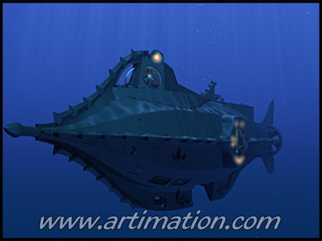
I found a Yahoo Group and I saw some nice looking posters, sadly nothing of use.
I found a Yahoo Group and I saw some nice looking posters, sadly nothing of use.
 05-31-03, 11:01 PM
#10
DVD Talk Ultimate Edition
Thread Starter
Update (and a completely new one)
Update from original:

New one:

The second one I made using a screen cap blown up to god knows how large (I stopped keeping track at 800%).
Up close it looks alright, nowhere near as stunning as it would be if it were an original scan.
Its a piece of conceptual artwork, with the 20K logo taken from a lobby card, and the tagline and actors name was a layout I took from another poster (I would have put their heads also like the original, but knowing everyone's fondness of floating heads I opted not to).
New one:
The second one I made using a screen cap blown up to god knows how large (I stopped keeping track at 800%).
Up close it looks alright, nowhere near as stunning as it would be if it were an original scan.
Its a piece of conceptual artwork, with the 20K logo taken from a lobby card, and the tagline and actors name was a layout I took from another poster (I would have put their heads also like the original, but knowing everyone's fondness of floating heads I opted not to).
06-03-03, 09:43 AM
#13
Senior Member
Join Date: May 1999
Posts: 286
Likes: 0
Received 0 Likes
on
0 Posts
2nd cover is great.
From my monitor, I can't tell if the background
is black or dark blue / grey?
Would you consider moving just off of black into
the dark blue / grey on the diver's suites?
A color a little darker than your first cover.
I loved how you were trying to simulate the
dark underwater effect.
From my monitor, I can't tell if the background
is black or dark blue / grey?
Would you consider moving just off of black into
the dark blue / grey on the diver's suites?
A color a little darker than your first cover.
I loved how you were trying to simulate the
dark underwater effect.
06-03-03, 09:49 AM
#14
DVD Talk Ultimate Edition
Thread Starter
The second cover is black.
I'll fiddle around with it and see what happens.
I haven't submitted it yet because I'm trying to make the front pic a little clearer.
I'll fiddle around with it and see what happens.
I haven't submitted it yet because I'm trying to make the front pic a little clearer.


 06-04-03, 02:20 PM
#17
DVD Talk Limited Edition
Join Date: Jan 2001
Location: Bay Area, CA
Posts: 5,069
Likes: 0
Received 0 Likes
on
0 Posts
I like #2 and #4! Maybe the text on the top of the front page could be a little brighter but maybe it is just tough to read on the preview... maybe its just me.
06-04-03, 03:14 PM
#19
Senior Member
Join Date: May 1999
Posts: 286
Likes: 0
Received 0 Likes
on
0 Posts
2 & 4 are very nice!
The texts on the back looks easier to read.
The red text on the front does look hard to read.
Maybe a foam green or yellow green????
Or maybe a silver like the moon's reflection
on the night's water surface???
The texts on the back looks easier to read.
The red text on the front does look hard to read.
Maybe a foam green or yellow green????
Or maybe a silver like the moon's reflection
on the night's water surface???
06-12-03, 12:54 AM
#22
DVD Talk Ultimate Edition
Thread Starter
Thanks
I haven't forgotten about this cover. I'm just waiting on a auction and to pick up a scanner and I'm gonna do some work.
I might use a different picture for the front, since that shot is really crap, and I doubt I could get it approved at DVDcoverart.
I haven't forgotten about this cover. I'm just waiting on a auction and to pick up a scanner and I'm gonna do some work.
I might use a different picture for the front, since that shot is really crap, and I doubt I could get it approved at DVDcoverart.
08-26-03, 02:55 PM
#23
DVD Talk Ultimate Edition
Thread Starter
Update (after many months)
Finally got a high-quality poster image.
Here are the finished ones I did:

I call this one Aqua

This is Aqua green with a coral back cover

And this one is Aqua green (don't ask why I named them this, just doing it for reference).
I am probably going to make the first one with a coral back also. They will be uploaded to DVDCA whenever they get their FTP opened up again.
Comments? Thoughts? I know its been a while, and I apologize for that.
Here are the finished ones I did:
I call this one Aqua
This is Aqua green with a coral back cover
And this one is Aqua green (don't ask why I named them this, just doing it for reference).
I am probably going to make the first one with a coral back also. They will be uploaded to DVDCA whenever they get their FTP opened up again.
Comments? Thoughts? I know its been a while, and I apologize for that.
Last edited by JoeyOhhhh; 08-26-03 at 04:16 PM.