


The NEW DC Logo
 01-19-12, 11:36 AM
#1
DVD Talk Legend
Thread Starter
Join Date: Sep 1999
Location: Building attractions one theme park at a time.
Posts: 10,800
Received 82 Likes
on
49 Posts
The NEW DC Logo
Starting on March titles....

Bleeding Cool
DC Comics Launches New Logo, Official, In Colour, Including Watchmen Variant
Written on January 19, 2012 by Rich Johnston in Comics, Recent Updates
Welcome to the new DC Comics logo…. that you saw first at Bleeding Cool, obviously. Revealed at Fast Company who ran an interview with Dan DiDio and Jim Lee earlier, this is the real deal. And they come in a variety of colours, and designs, including a Watchmen yellow-with-blood-splatter variety, that, presumably, will be on the new Watchmen prequel comic books.
Bleeding Cool also mentioned how the touchscreen, interactive and animated aspect of the new logo would be a major aspect of it, and you can see that in action below, revealing Green Lantern.

The article quotes Amit Desai, Senior Vice President of Franchise Management at DC, who we also revealed was behind the presentation to DC Comics internally, as saying “We didn’t want a static logo, but a living identity that could capture the power of our characters and storytelling. What is special about DC content is the notion of a dual identity. When you think about our DC Comics superheroes, there’s a secret identity. When you think about Vertigo, it’s this notion of good vs. evil in many of the stories. And so, in addition to flexibility, the new logo communicates this idea of dual identity: there’s more than meets the eye. You have to take a closer look to understand the richness of our characters and stories.”
The article also mentions DC Comics Executive Vice President of Sales John Rood’s involvement in the branding alongside Landor Associates. This man already has a tattoo of Texas on one ankle, we hope the new DC logo will join it on the other ankle.
And while there has been criticism, at least of the trademarked version of the logo, Desai states that this decision was taken after major focus group activities including comic book fans. So if you don’t like it, you are collectively to blame. They also confirm the font of the letters, as Gotham Bold.
And as for the blander, more corporate look that many criticised the trademarked version of the logo, that seems to be reserved for the more corporate, official arm, DC Entertainment.

Next, we await DC to reveal the animated version. Look to DC Source, I guess…
Written on January 19, 2012 by Rich Johnston in Comics, Recent Updates
Welcome to the new DC Comics logo…. that you saw first at Bleeding Cool, obviously. Revealed at Fast Company who ran an interview with Dan DiDio and Jim Lee earlier, this is the real deal. And they come in a variety of colours, and designs, including a Watchmen yellow-with-blood-splatter variety, that, presumably, will be on the new Watchmen prequel comic books.
Bleeding Cool also mentioned how the touchscreen, interactive and animated aspect of the new logo would be a major aspect of it, and you can see that in action below, revealing Green Lantern.
The article quotes Amit Desai, Senior Vice President of Franchise Management at DC, who we also revealed was behind the presentation to DC Comics internally, as saying “We didn’t want a static logo, but a living identity that could capture the power of our characters and storytelling. What is special about DC content is the notion of a dual identity. When you think about our DC Comics superheroes, there’s a secret identity. When you think about Vertigo, it’s this notion of good vs. evil in many of the stories. And so, in addition to flexibility, the new logo communicates this idea of dual identity: there’s more than meets the eye. You have to take a closer look to understand the richness of our characters and stories.”
The article also mentions DC Comics Executive Vice President of Sales John Rood’s involvement in the branding alongside Landor Associates. This man already has a tattoo of Texas on one ankle, we hope the new DC logo will join it on the other ankle.
And while there has been criticism, at least of the trademarked version of the logo, Desai states that this decision was taken after major focus group activities including comic book fans. So if you don’t like it, you are collectively to blame. They also confirm the font of the letters, as Gotham Bold.
And as for the blander, more corporate look that many criticised the trademarked version of the logo, that seems to be reserved for the more corporate, official arm, DC Entertainment.
Next, we await DC to reveal the animated version. Look to DC Source, I guess…
 01-19-12, 11:50 AM
#2
DVD Talk Gold Edition
Re: The NEW DC Logo
I'd say I hate it, but I hated the last one when it was revealed and it grew on me. I'll give it some time...
That said, I still like the bullet one best (from the '80's I believe).
That said, I still like the bullet one best (from the '80's I believe).
01-19-12, 11:58 AM
#3
Cool New Member
Join Date: Dec 2010
Posts: 32
Likes: 0
Received 0 Likes
on
0 Posts
Re: The NEW DC Logo
Do not want... That's one ugly logo, bring back the DC bullet, even the last new logo (which could be animated easily) is better than this new one.
It looks like the only animation the new logo permits is a peel back effect, which they probably want for some silly Iphone & Android app -- oooh a diagonal swipe to reveal a picture, everyone will be amazed by this.
It looks like the only animation the new logo permits is a peel back effect, which they probably want for some silly Iphone & Android app -- oooh a diagonal swipe to reveal a picture, everyone will be amazed by this.
01-19-12, 02:21 PM
#4
DVD Talk Legend
Thread Starter
Join Date: Sep 1999
Location: Building attractions one theme park at a time.
Posts: 10,800
Received 82 Likes
on
49 Posts
Re: The NEW DC Logo
DC had to dump the "swirl" logo because they were paying royalties to a shoe company after screwing up their Trademark paperwork. Short story: DC logo revealed. DC Shoe company reveals theirs. DC says it looks too much like theirs and sues. Shoe company discovers DC never properly registered the swirl. Turns around and sues DC for Trademark infringement. DC is forced to pay the shoe company to use swirl logo.
DC dumps swirl logo.
Sample of how the logo will look on a cover...

The Batman #708 is for mock up purposes only. DC is not going back to their old numbering system.
Overall, I love the look of the new logo. Not too crazy about the different color styles. Some work. Some don't. They really should have rolled this out with the relaunch. Feels like second-guessing now.

DC dumps swirl logo.
Sample of how the logo will look on a cover...
The Batman #708 is for mock up purposes only. DC is not going back to their old numbering system.
DC Comics has shown how their new logo will be used on current books and current branding. Looks like the edge of the D will be pushed hard against the spine of a comic, so the “peel” comes right off the edge of the comic.
The press release reads “DC Entertainment, a Warner Bros. Entertainment company and home to iconic brands DC Comics, Vertigo and MAD, revealed today a new brand identity. The new identity is reflective of the company’s mission to fully realize the value of a rich portfolio of brands, stories and characters, distinguished by incredible breadth and depth across publishing, media and merchandise. A new logo for DC Comics was also introduced, closely aligning with DC Entertainment’s new mark.”
Reading the rest of it, I think it’s going to be called the DC Flip. The Vertigo and MAD logos will also receive a From DC Entertainment line beneathe them.
They still aren’t revealing the animated version. That will come another day. Keep watching Youtube…
Overall, I love the look of the new logo. Not too crazy about the different color styles. Some work. Some don't. They really should have rolled this out with the relaunch. Feels like second-guessing now.
01-19-12, 02:37 PM
#6
DVD Talk Legend
Re: The NEW DC Logo
Meh it's not bad. It's kinda plain and I don't really love it but I guess I don't care too much. The content matters more than a logo.
01-19-12, 03:43 PM
#8
DVD Talk Hero
Re: The NEW DC Logo
I don't like it but I'm sure I'll stop noticing it soon enough. Does this come out in time for the first HCs/trades of the new 52? Because otherwise, the lack of uniformity in the volumes would bother me a bit (if I were collecting them)
01-19-12, 04:04 PM
#9
DVD Talk Special Edition
Re: The NEW DC Logo
I don't think it's a very good design, at least for comics. I think it was designed as an animated version first and foremost, where the "D" peels back to reveal the "C". D > C = DC Comics. Cool.
But in the the static version the "C" is prominent but the "D" isn't really there. It took me a while to figure out the peel-back concept (I didn't read the quote until after I had stared at the image for a while; criticize if you must, but that's how most consumers are going to encounter the new logo.) On its own, the static logo just doesn't say "DC" to me.
But in the the static version the "C" is prominent but the "D" isn't really there. It took me a while to figure out the peel-back concept (I didn't read the quote until after I had stared at the image for a while; criticize if you must, but that's how most consumers are going to encounter the new logo.) On its own, the static logo just doesn't say "DC" to me.
 01-19-12, 05:30 PM
#12
DVD Talk Legend
Re: The NEW DC Logo
Really not liking it on initial viewing, and, although it does look better on the cover than stand-alone, it doesn't stand out by itself very well.
01-20-12, 02:11 AM
#14
DVD Talk Hero
Re: The NEW DC Logo
It looks horrible as a static image and will be confusing to people who have no idea the company is called DC. This was obviously designed with one goal in mind, the logo being animated in digital versions and in movie trailers.
01-20-12, 07:31 AM
#15
DVD Talk Limited Edition
Re: The NEW DC Logo
I remember a lot of folks were anti the last redesign. After a while you stop seeing the logo, and then it sort of grows on you. I do agree that it would have made sense to role this out with the relaunch though.


 01-21-12, 02:44 PM
#23
DVD Talk Legend
Re: The NEW DC Logo
The bullet logo is still the coolest looking. I never really minded the one they had prior to this newest one though either. The original one is kinda plain and doesn't stand out very much.
01-21-12, 02:55 PM
#24
Re: The NEW DC Logo
I really like the new logo. However, it looks a little too sleek and sharp next to the cartoony covers. It doesn't go.
I hated the swirl logo though.
I hated the swirl logo though.
01-21-12, 02:56 PM
#25
Senior Member
Re: The NEW DC Logo
I don't mean to offend anyone here, but I follow different online communities for comic books, pro wrestling, video games, TV, etc. and by far comic book fans online are the worst. They over-react to every single little thing they disagree with and act like the sky is falling and every little move is going to be the end of comic books as we know it.
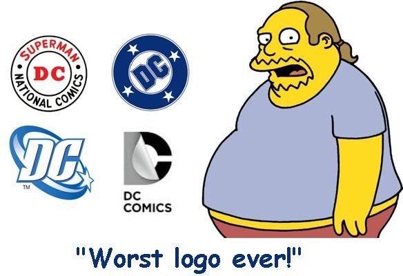
The DC Bullet logo is pretty classy, no doubt. Why DC wasn't happy with using that as their brand identification, I don't know.
The last logo from 2005 was okay. DC Comics had to pay DC Shoe Co. to use it though because DC Comics screwed up big time in a lawsuit. So while it hasn't been around long, I can understand them not wanting to pay to use their own logo.
The new logo is just fine. They can do a lot of cool things with its design and it'll probably look cool in animated form. Its a very clean, sleek, corporate type logo - and let's be honest, that's all DC Comics is. Its just an arm of Warner Bros. and just like Marvel it primarily exists to create IP for licensing, merchandising, and TV/Movies. The books themselves are merely put up with so Warner Bros. can reap the profits off the aforementioned things.
There have been a lot of new logo/rebranding debacles in businesses over the past handful of years, but I really don't think this will end up being one of them.
The only baffling part is why they didn't have this ready for the New 52 campaign back in October. That was 100% pure short sightedness on someone's part.